|
|
|
Showing 1531 - 1540 of ~3781 |
| Image |
Comment |
| 07/21/2015 12:26:31 PM | r i p p l e s by Ja-9Comment: *Hello from Sid and the Critique Club*
A pleasing image that meets the challenge
Swans are always a popular choice and in the context of this challenge a very suitable one. I like the mono processing with a full range of tones. The ripples are very enticing though I think I would prefer a little more sharpness in the ripples behind. I assume you were at the 300mm end of your lens given the aperture/DOF result?
The composition is good using the upper third but this is not the most flattering timing and we are unable to see its eyes which, with a magnificent bird such as this, is disappointing. The one thing that lets the image down is the overexposure particularly on the bird but also in some areas of the water behind it. You have retained a lot of detail in the birds plumage but there are significant areas on its tail, back, wing and neck where there is no detail which unfortunately mars the end result.
Thanks for submitting, Sid |  Photographer found comment helpful. Photographer found comment helpful. |
| 07/21/2015 11:36:00 AM | The man by GudjonottoComment: *Hello from Sid and the Critique Club*
Congratulations on your ribbon, well deserved and easily meeting the challenge brief
I seem to be having the pleasure of critiquing several of your excellent images and here we have another. Your choice of subject and processing very clearly meet the challenge objectives in an appealing and very competent way. I love that you have used mono allowing us to concentrate on the lovely tones throughout the image without the distraction of colour.
The viewpoint and the way the landscape leads us to our focal point, the man, is an excellent choice, his inclusion also gives us a sense of scale and a feeling of the insignificance of man against the grandeur of nature. The gorgeous backdrop of the stormy sky and diffused sun is magnificent and completes the image.
Although you have a high contrast image you have managed to retain detail throughout, except quite obviously the sun itself, well done. I think it is a well executed submission that has been justifiably appreciated here. Your making my job most enjoyable, thank you, Sid |
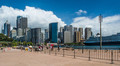
| 07/21/2015 11:20:43 AM | Sunny Harbour by tigerluongComment: *Hello from Sid and the Critique Club*
The lovely blue sky and white clouds adds an appealing backdrop to a rather ordinary snapshot.
Hope you had an enjoyable holiday in Sydney, I've never had the pleasure myself so I am unfamiliar with the area. Looking at your image I have several issues which stop me from appreciating it as much as you would probably like me to so I will try to address them in a constructive way that I hope you will feel of benefit to you.
First of all I do not have a strong focal point so my eyes are wandering randomly over the image trying to settle on something. The foreground is dominated by the empty paved area, in the distance there are red and yellow traffic features whose colours dominate, I am then confronted with a fence that is also acting as a barrier to me getting to the relatively more interesting parts of the image. When I get past that I have a telegraph pole that splits a huge boat in two that in itself has also had its stern chopped off.
Just looking at the space we have here I would have moved probably right to the waters edge so that I could remove all these unwanted distractions. I don't think I can use the telegraph pole as an interesting feature so I would have positioned myself to the left of it. I think there is potential to contrast the boat on the right of my frame with the skyscrapers simply due to its sheer size. I probably could only capture the front half but that has enough repetition of the windows to form a counterpoint to the windows of the buildings. So, I now have the front half of the boat on my right the harbour waters leading me into the buildings in the background, I think this would have made a much more interesting image.
This was probably just a holiday snap taken while enjoying everything your location has to offer but it is no excuse not to carefully weigh up all the options in front of you and then carefully check all the detail in your viewfinder before committing to the image. Although each digital image is effectively free of cost you should regard it as if you are using film and take your time to make every single image special, the more you do this the more you will learn and the more you will get out of your photography. Keep at it, Sid | | Photographer found comment helpful. |
| 07/21/2015 09:07:16 AM | Andrea in the gardenby boocowskiComment: *Hello from Sid and the Critique Club*
A lovely portrait of a lovely model
You have certainly isolated her well from the soft focus background with good focus on her face which is essential for any portrait where the eyes must be sharp. I wish your model had just a hint more of a smile to make it even more appealing.
As you say, the lighting is good and uniform enabling you to bring out all of the essential detail. Lovely colours throughout, nice blues and greens.
I like the idea of having a fern across her shoulder the way you have but perhaps a little less positioned a little lower would have made it a little less distracting and rather intrusive. She has lovely skin tones but I am a little bothered by the paler region nearer her chin which though not too obvious mars the end result just a little.
I'm glad to see you using the 50mm f1.8 lens it is a great and inexpensive though often underrated lens, well done Sid |
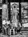
| 07/21/2015 08:33:20 AM | Expert Adviceby romilComment: *Hello from Sid and the Critique Club*
An interesting image with lots to get absorbed in.
The focal point for me is the character sitting on the floor, he looks such a happy chappy with his single tooth! I rather wish his attention was drawn to his mate rather than the camera itself though. The window tells us more about them and their locality and trade and in itself has lots of interesting stuff to add to the story.
You have a lovely full range of tones throughout which good old SFX has brought out the best of together with the detail. It appears to be fairly low light given your settings and the light from the bulb. It feels a bit of a grab shot that is making the most of the natural moment as opposed to anything planned.
I need to mention a few minor issues that may, or may not, help to improve the end result. I have a bit of a problem with the left hand edge and wish it wasn't there so that the edge of the frame was the brickwork itself, now you may well argue that would position the other man too close to the edge which would be fair comment. I think it might be worth having a quick look at that crop removing the top edge where two more problems can be eliminated ie., the two light sources at the very top and further down on the black frame. I would still include the light on the brickwork so some cloning of the black frame light might be needed.
All in all, a good attempt that deserved a higher score, Sid | | Photographer found comment helpful. |
| 07/20/2015 01:56:58 PM | Moussaby MAKComment: *Hello from Sid and the Critique Club*
First impressions, a stunning portrait with instant appeal.
I love the dark background and the way the mans black face appears from the black depths in the way that it does. The dark clothing also helps in the overall low key effect here.
The lighting is effective with good detail where it matters.
The only constructive criticism I can offer is that of the eyes and the focus. It is essential that the eyes of any portrait are pin sharp to engage with the viewer. Here the focus is on the nearest eye but the pupil is only partially visible in the corner of his eye. I think the important eye here is his right eye which unfortunately is a little on the soft side. You ought to have either used a smaller aperture to increase the DOF to include both eyes or moved your focus point more towards the bridge of the nose. Personally, I think I would favour the latter which would have softened the cheek and forehead where it merges into the dark background, that would have looked more effective than more sharpness throughout which would have looked more abrupt and probably less appealing.
All in all a very pleasing image, I look forward to more from you, Sid | | Photographer found comment helpful. |
| 07/20/2015 01:39:20 PM | Buckle, Button & Zipperby jayzundelComment: *Hello from Sid and the Critique Club*
First impressions, a well executed image that meets the challenge well.
You have produced a simple very pleasing image from an everyday item in such a way that it has impact and appeal, well done. The lighting and exposure are very good with sufficeint detail throughout.
The jeans and belt have a used look that enhances the effect it doesn't feel like a fashion shoot for a magazine intended to sell the goods. Probably the only minor irritant is the black label I feel it is very slightly distracting and might have been better to cover it up but I am sure there are many who would equally argue against such a move.
All in all a pleasing image that probably ought to have scored a little higher, well done, Sid | | Photographer found comment helpful. |
| 07/20/2015 01:28:25 PM | Water - the view from inside the bottleby posthumousComment: *Hello from Sid and the Critique Club*
First impressions, I like the abstract nature but I don't think it fulfils the challenge very well
Your title is crucial in guiding us as to what we are actually looking at, the image is so abstract it rather defies definition. The colours and tones are very pleasing and I like the soft focus. The image is so basic I am rather floundering in what I can constructively say about it that will help except that I do find it quite a pleasing image, sorry Sid. | | Photographer found comment helpful. |
| 07/20/2015 01:17:01 PM | B Is For ______ | Benby ZitaComment: *Hello from Sid and the Critique Club*
First impressions, a confusing image that I don't think meets the challenge
Whilst this challenge is in itself quite challenging having read the brief I cannot see how your entry meets the challenge unless I am missing something too subtle for me, the only possibility I can conjure up is outside the (coffin) box? Your title is not helping me at all, I just don't understand it at all.
The lettering has worn and it looks as though you have started to highlight the lettering by placing the fallen debris in the grooves of the lettering and given up. If this is not the case it is somewhat uncanny how the debris has ended up in the lettering for Ben and the start of his surname and then appears to be more random as you would expect.
The grass at the top centre of the image dominates and would have been better excluded. I'm not sure there is much else I can constructively add, sorry, Sid | | Photographer found comment helpful. |
| 07/20/2015 01:01:37 PM | Water Therapyby clickodakComment: *Hello from Sid and the Critique Club*
First impressions, full marks for an original approach that meets the challenge well.
I'm all for originality and I fully respect your attempt to produce an original image with impact but I have to say that it doesn't work for me, the image leaves me feeling a little uneasy. I think that simply having the profile of an isolated head completely disembodied like this is so unnatural that it just feels really awkward and difficult to come to terms with.
This composition just doesn't work, I need to see at least some of the persons body too, if its going to have any chance to work at all I think the head should be in the right third. A better composition would have been to take the image from the head so that we could easily see the closed eyes but with part or all of the rest of her body in soft focus in the rest of the frame.
Has it achieved your objective of peace and calm? Well I suppose it has but it is unfortunately dominated by the awkwardness of the concept and composition as detailed above.
If the lighting had been able to make the face stand out more from the water that might have helped. If the hair was wet with drops on her face perhaps that too may have helped a little but your original concept remains flawed for me anyway, sorry. Sid | | Photographer found comment helpful. |
|
Showing 1531 - 1540 of ~3781 |
Home -
Challenges -
Community -
League -
Photos -
Cameras -
Lenses -
Learn -
Help -
Terms of Use -
Privacy -
Top ^
DPChallenge, and website content and design, Copyright © 2001-2026 Challenging Technologies, LLC.
All digital photo copyrights belong to the photographers and may not be used without permission.
Current Server Time: 05/08/2026 03:28:34 AM EDT.
|