|
|
|
Showing 1491 - 1500 of ~3781 |
| Image |
Comment |
| 08/03/2015 08:24:14 AM | RAILINGby HUETHComment: *Hello from Sid and the Critique Club*
A fascinating abstract though not immediately obvious that it meets the challenge.
Because the subject is so abstract it is difficult to tell what we are looking at, so your title becomes essential in telling us. So now we know we are looking at a railing it could be taken at the same height as the railing as opposed to above so we have to take it at trust that the shot is above. This would have been a great shot for an abstract, bokeh or OOF challenge.
I do like the abstract nature of your image it is very effective, however, as you have already observed the top right is completely blown out so there is nothing you can do with it except crop it out. Towards that end I think a crop immediately below it would have given the shot a lot more impact with the focused area at the top of the frame but how well that would be interpreted in relation to the challenge theme is still in question.
It's quite a respectable score in respect of the comments I have made, thank you for an interesting submission, Sid |
| 08/03/2015 06:32:40 AM | Fast Food.by romilComment: *Hello from Sid and the Critique Club*
A colourful image that meets the challenge well.
Your viewpoint makes for an interesting contrast between the dark mysterious interior and the boldly coloured exterior forming a frame for the entire scene. The mystery is added to with the position of the napkins obscuring the mans face and the dim lighting that reluctantly reveals the ladies somewhat pensive face. The man's position within the space feels very dynamic, I especially like her position in the top corner.
The lighting is flat and the exposure is good creating a dimly lit interior that suits the subject well. It has been well appreciated here with a respectable score together with some very useful comments, I concur particularly with the comment from streetpigeon.
Thank you for an interesting submission, Sid |  Photographer found comment helpful. Photographer found comment helpful. |
| 08/03/2015 05:07:25 AM | Man with a Cameraby johnbrennanComment: *Hello from Sid and the Critique Club*
A pleasing portrait that meets the challenge well.
Thank you for your quirky and helpful notes, you have correctly identified the technical aspects of your shot that would benefit from altered settings, ie., aperture priority and lower ISO etc., Having said that the end result is not significantly affected and is still a pleasing result that needs little improvement
Your composition is good with empty space for the camera to look into, the background is neutral without any distractions and the generally high key effect is complimentary to the white hair of your subject. To be honest apart from the altered settings there's not a lot else to add, well done, Sid | | Photographer found comment helpful. |
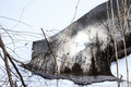
| 08/02/2015 08:18:05 AM | Forest firesby clickodakComment: *Hello from Sid and the Critique Club*
A very intriguing image that meets the challenge.
As with the other submissions I've critiqued for this challenge, I have to begin by admitting that I am not familiar enough with JJBeguin's work to be able to comment with any authority, however, I will do my best. Your comments are a good guide as to his and your aims with your work, thank you.
I have to say that after the initial confusion which made me look harder and then to see and appreciate better the image itself, I like what I see, I find it quite fascinating. You have done well to find the scene and transform it the way you have. quite simple yet effective. I love the shapes and the reflections and the eventual giveaway of the upside down nature of what we're looking at. Your exposure is good, you have got the snow white without too much sacrifice of the water's highlights, though I detect a blue tint that might benefit from some white balance correction.
I like your composition it works very well indeed and so to do the people here, a very respectable score for a very respectable entry, well done Sid. | | Photographer found comment helpful. |
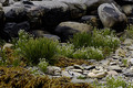
| 08/02/2015 05:27:20 AM | Flowers and Seaweed. Tough conditions !by josaaComment: *Hello from Sid and the Critique Club*
A generally pleasing image that meets the challenge.
You’ve met the challenge well in your choice of scene which clearly shows the natural; surroundings in which the flowers are growing. Given your shooting aperture I would have expected there to be a sharp DOF including all the foreground elements but there is softness, perhaps this was your intention? If not, it suggests that the focus point was too far into the image possibly even the background rocks?
You have queried whether you should have used an ordinary lens as opposed to this macro lens, to be honest this is only relevant if you are actually using the macro facility itself but you are not here, you are too far away. The idea of the macro is to enable you to get 1:1 or larger images when you are very close to your subject.
With regard to saturating the greens, I think you've done a pretty good job, its so eaasy to get carried away and overdo it, but these look quite natural, so well done. One good thing about overcast light you can get some good saturation without harsh contrasts so whilst the lighting is flat it works well colours wise too.
Thank you for submitting an interesting image, Sid |
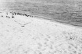
| 07/30/2015 09:03:23 AM | Events at Seasideby posthumousComment: *Hello from Sid and the Critique Club*
An action shot that may meet the challenge.
Without spending more time than I have exploring JJBeguin's images I have to admit that I am not familiar enough with his work to be able to judge your entry in the context of his work/the challenge brief, hence, I assume it meets the challenge. However, I do have the benefit of JJBeguin's comment who seems to approve so that's good enough for me!
As an image in its own right regardless of the challenge brief I do like the diagonal running through the image and I like that is mono and although it is intentionally high contrast there is still good detail throughout. What I am not so keen on is the focus which appears to be soft throughout which may be deliberate to meet the challenge brief? It would have more impact if the bird was flying towards us as opposed to away but again it may be deliberate? The overall composition is good.
I'm sorry your image doesn't appear to have been so well appreciated as you would have liked, perhaps that is an indication of how well, or otherwise, it fulfils the challenge brief? Anyway, thanks for your submission, Sid | | Photographer found comment helpful. |
| 07/30/2015 08:46:01 AM | Hot Lunchby MAKComment: *Hello from Sid and the Critique Club*
A candid shot that appears to meet the challenge.
Without spending more time than I have exploring JJBeguin's images I have to admit that I am not familiar enough with his work to be able to judge your entry in the context of his work/the challenge brief, hence, I assume it meets the challenge. However, I do have the benefit of all your commenters who obviously approve and seem to agree that it is in his style.
For myself, I am here to give you my honest opinion, and as an image in its own right I am not very attracted to it. You describe it as a snap which is how it feels to me, a grab shot that could be improved upon. I'm not really sure I want to see someone eating their takeaway in public and two people in the soft background that are obviously an intentional part of the composition but for me they do not add to the story whatever that may be.
I'm sorry I can't appreciate your image as much as everyone else appears to but I am obviously in the minority and glad that others here appreciate it in the way you intended, well done, Sid. | | Photographer found comment helpful. |
| 07/30/2015 05:55:46 AM | This Cowboy's Hatby pearlseyesComment: *Hello from Sid and the Critique Club*
A very pleasing image that meets the challenge well.
There are varying degrees of flare dependant upon the angle of the lens in relation to the light source, your flare is subtle but definitely there, I'm all for subtlety. I particularly like the rim lighting on your patient son, quietly counting down the shots, before he goes and get some more indians, good for him!
Your focus and DOF works well. It can be difficult to control the exposure shooting contre-jour as you are here, you have controlled it well. The tones are lovely throughout. His position is a little too central, I feel it would have improved the shot if he had been placed a little further over to the left, diagonally opposite the light source and flare.
I hope you have followed SandyP's words of wisdom and hung it on your wall? Thank you for your lovely submission, Sid | | Photographer found comment helpful. |
| 07/29/2015 05:02:17 PM | "You Name It!"by beachgirlComment: *Hello from Sid and the Critique Club*
A straightforward image that meets the challenge.
Your image records the scene in a documentary way that shows we have a sunken boat, and thats it. The lighting is even but unexciting. It just doesn't feel as though much of yourself has gone into this to excite us, the frame is fairly evenly split into sky, middle, water. If you had cropped most of the sky out and replaced it with water then I think you would have had a much more interesting image, especially given the poor quality of the sky, there appears to be some processing problems there. I'm sorry I can't be more positive about it.
So, I reckon its title time,
float my boat
Thanks for your submission, Sid |
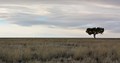
| 07/29/2015 03:47:39 PM | "You Name It"by jayzundelComment: *Hello from Sid and the Critique Club*
A straightforward landscape image that meets the challenge.
Thank goodness for your tree! Given the featureless landscape and the flat lighting without your tree it would have been difficult to inject an element of interest into it. I like your placing of the tree and the stretched landscape, though perhaps you had an opportunity to create something a bit different by creating a true panoramic broken up by a single solitary tree thus creating a real sense of the isolation of this one tree against the wide open landscape?
I'm looking at the balance of tree, sky, landscape and wishing that the tree was on the left where the higher clouds would have accommodated it as though they were wind blown over it settling to a lower level as they do on the right, it may have looked more harmonious.
So, title time, how about;
defiance
Thank you for your submission, Sid | | Photographer found comment helpful. |
|
Showing 1491 - 1500 of ~3781 |
Home -
Challenges -
Community -
League -
Photos -
Cameras -
Lenses -
Learn -
Help -
Terms of Use -
Privacy -
Top ^
DPChallenge, and website content and design, Copyright © 2001-2026 Challenging Technologies, LLC.
All digital photo copyrights belong to the photographers and may not be used without permission.
Current Server Time: 05/08/2026 04:36:47 AM EDT.
|