|
|
|
Showing 1401 - 1410 of ~3781 |
| Image |
Comment |
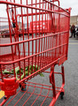
| 08/19/2015 06:45:56 AM | Rejectedby clickodakComment: *Hello from Sid and the Critique Club*
A basic shot that meets the challenge fully.
The main subject, the trolley, obviously meets the challenge brief in full. I like that you have chosen to represent the challenge in a way associated with the trolleys use to enable the shopper to get the groceries from the store to their vehicle and that this stick of celery didn't quite make it – it ended up rejected.
In view of my interpretation of your image you could argue that it should be taken as it is in the midst of the car park where it was left but to me your image has a lot of background distractions. The main one being the lorry, the person and not least the yellow line, of those I think only the person is a desirable element the others are not contributing to the end result. I've just realised what I thought was a lorry is in fact the trolley's owners name, ok, but I still think a different viewpoint closer in on the celery and its cage like surroundings through the corner in a more abstract fashion would have made it a stronger image with much less background distraction.
Sorry you didn't get any comments during the challenge, I hope mine makes up for it, Sid |  Photographer found comment helpful. Photographer found comment helpful. |
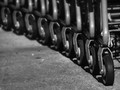
| 08/19/2015 06:30:52 AM | Waiting to be wheeled in....by Ja-9Comment: *Hello from Sid and the Critique Club*
An image that fits the challenge in an obvious sort of way.
I like that you have chosen to concentrate on a viewpoint that makes it immediately obvious what we are looking at but it just doesn't seem a very inspiring sort of image. As one of your commenters has pointed out the focus is on the second wheel throwing the lead one into soft focus which somewhat spoils the effect.
I think the repetition of the wheels would have been enhanced by cropping the front one so that we don't know its the first one but we have the illusion of a never-ending line of trolleys that just goes on ad infinitum. I like the diagonal of the composition but what I think would have also improved it would have been to go in close on the wheels looking up towards the rest of the trolley structure, this may have made it more interesting and engaging. The debris on the floor doesn't add to the shot and would have been better cleaned up either before or after the shot.
A good attempt Janine but not one of your best, Sid | | Photographer found comment helpful. |
| 08/18/2015 11:03:08 AM | Lost In Thoughtby PangurbanComment: *Hello from Sid and the Critique Club*
An excellent portrait that is assumed to fulfil the challenge.
A very striking portrait that, like all good photography, is all about the light. I like your low viewpoint which has allowed you to exclude potential distractions and isolate your subject against a plainer background. Your portrait is also about timing, you have captured a reflective moment that works well because it suggests a natural expression that shows a complete unawareness of the camera or anything else at that moment in time.
Your exposure is generally good with good detail throughout though I do feel that you are pushing close to the boundaries of overexposure in some rather important areas mainly the lady's forehead. If you had underexposed by a third of a stop I think you would have given just a bit more room without darkening her face too much though it is, I have to admit, I very fine line. There is possibly a little too much space above her head but her gaze needs some space to look into and because of it I think you just about get away with it.
It is a very appealing portrait that in any other related challenge would have done well but the nature of this particular challenge is lots of high quality entries to compete against. Well done, Sid | | Photographer found comment helpful. |
| 08/18/2015 10:49:42 AM | The Peace Bridgeby RodertComment: *Hello from Sid and the Critique Club*
A futuristic looking image that is assumed to meet the challenge
Your image has a very futuristic feel to and as has been observed amongst your commenters very clean lines that to me make it look like an architects proposed plans for a bridge project. That is not meant to be a negative remark but one that recognises the sharpness and DOF throughout. The red tones of the bridge make it stand out strongly against the cold blues of the rest of the image.
The composition is very good emphasising the unique bridge against the cityscape, the frozen river and the plain blue sky this all hangs together very well indeed. Looking carefully at the sky I am feeling that there may be some banding there but its very feint and unobtrusive.
All in all, an excellent submission that must have had some tough competition to place so low with such a respectable score. Thanks, Sid |
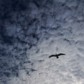
| 08/18/2015 10:31:39 AM | Soar Highby DigiFotoBuddyComment: *Hello from Sid and the Critique Club*
An appealing nature study that meets the challenge well.
The sky and clouds is an appealing image in its own right but the inclusion of the bird adds the strong focal point and interest. Given the nature of the challenge I like that the bird is relatively small in relation to the rest of the frame though challenge-wise I could easily live with it being even smaller.
There are a couple of things I have to add about it that I think would have helped it, the first is the composition, although it is not accurately central I feel it is too near the centre, I think for this challenge I would have composed it nearer to the bottom right, flying into the negative space to emphasise the vastness of that negative space more readily. The other is over-sharpening, the bird has a perfect halo all round it that makes it look like a cutout that has been pasted onto the image, for me it detracts in a major way.
Thanks for your submission, Sid | | Photographer found comment helpful. |
| 08/18/2015 10:10:58 AM | Red Roseby clickodakComment: *Hello from Sid and the Critique Club*
A flawed entry that meets the challenge well.
An interesting challenge and I like your composition with the rose occupying a minimal space leaving plenty of negative space. Like your commenter I feel because of the minimal space used for the rose it should not have been slightly cropped in the way that it has, we should be able to see all of the petals.
The biggest failing is what I assume to be sensor dust, if it is not then your background is soiled but there are several specks immediately above and to the right of the flower. The plain white background itself doesn't add anything to the overall image in the same way that say using the sky would have done. My preference would have been to compose this from below with the plain blue sky filling the rest of the frame or against a plain green grassy expanse, they would just look more natural and therefore more appealing.
Thanks for your submission, Sid | | Photographer found comment helpful. |
| 08/18/2015 09:57:30 AM | waiting for Cinderellaby avermaaComment: *Hello from Sid and the Critique Club*
An original and creative image that fully meets the challenge.
What an amazing pair of shoes, as you say, fit for a princess! I've often thought light and glass were made for each other, there is always potential within them for a good photography and here you have found it with your candle light and your own light painting, you have managed to light so many facets in interesting ways, well done.
I like the black background but like your commenter without knowing otherwise it is natural to perceive this as a reflection. This is where I think you had even more potential, it would have been nice to see the pair together reflected in the black glass of a table. As it is you still have a great image with a good well controlled exposure, very appealing. I think it deserved a higher place, I can only assume there was some amazing entries.
Thanks for an interesting submission, Sid |
| 08/17/2015 07:50:27 AM | playing dress upby jgirl57Comment: *Hello from Sid and the Critique Club*
A lovely take on the challenge that meets it well.
This is a lovely moment captured in a very natural sort of way which gives a real sense of the girls pleasure and fun that she is experiencing. Given the nature of the challenge I do think it would have been better to have a bit sharper focus on the shoes themselves but given the lovely image as a whole I think you were probably given a little leeway by the voters.
I think the background could have been improved but this feels a bit like one of those grab shots where capturing the moment and the expression has to take precedence, so well done with your capture – its magic.
I really like your write up and her amusing conclusion to modelling, methinks modellings loss paediatrics gain, I hope she enjoys her new chosen career path! Thanks for your lovely submission, Sid | | Photographer found comment helpful. |
| 08/17/2015 07:36:04 AM | | | Photographer found comment helpful. |
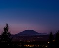
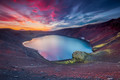
| 08/17/2015 06:40:48 AM | Ugly puddleby GudjonottoComment: *Hello from Sid and the Critique Club*
A beautiful natural scene that meets the challenge well.
A very colourful shot that has some glorious hues in both the landscape and the skyscape, an excellent capture. I'm intrigued by your sky given the five separate exposures, everything seems to register perfectly giving no hint at all that there are 5 exposures that make up the image, however you have done it, well done.
I like your composition with the jutting rock breaking up the uniform perimeter of the water as it does. I find the colours quite amazing but I know that your image is accurately representative of the amazing landscapes that are only to be found in this gorgeous corner of the world.
Like your commenters, I am baffled that this did not score higher than it did, there is no way it cannot be easily recognised as the golden hour. I can only think that those low voters have never seen Iceland for themselves and therefore find its colours beyond belief. Anyway, thank you for another excellent contribution, Sid | | Photographer found comment helpful. |
|
Showing 1401 - 1410 of ~3781 |
Home -
Challenges -
Community -
League -
Photos -
Cameras -
Lenses -
Learn -
Help -
Terms of Use -
Privacy -
Top ^
DPChallenge, and website content and design, Copyright © 2001-2026 Challenging Technologies, LLC.
All digital photo copyrights belong to the photographers and may not be used without permission.
Current Server Time: 05/07/2026 08:11:58 PM EDT.
|