|
|
|
Showing 1341 - 1350 of ~3781 |
| Image |
Comment |
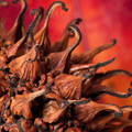
| 08/29/2015 01:11:10 PM | Sweet Gum Seed Pod - Liquidambar Styracifluaby aliquiComment: *Hello from Sid and the Critique Club*
An interesting image that meets the challenge well.
What an interesting plant you have here, I like it. The colours are very appealing especially against the lovely colour of the leaf.
Your lighting technique has worked well to give a generally uniform and even result though there are one or two brighter spots they are still well detailed. I am not so keen on the OOF areas in the foreground, I see you are either at or close to the limit with your aperture at f20. Given that I would have preferred for the focus point to have been moved closer so that they were in focus, this may well have made the background even softer but I think that would have been acceptable and preferable.
Apologies for the delayed critique, as they say, better late than never, Sid |  Photographer found comment helpful. Photographer found comment helpful. |
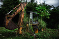
| 08/29/2015 06:25:06 AM | Mother Nature fights backby chrispyphotosComment: *Hello from Sid and the Critique Club*
An appealing image that meets the challenge.
A scene of decay and intrusion of mans ingenious devices to invade the dominion of nature will always ultimately be overcome by nature's ability to fight back as reflected in your title and comments, or at least we should hope it can. Your scene captures that sentiment well, a good find. I like the way the old machinery is forming a sort of static equivalent of a hanging basket for the vegetation.
Your composition is good with the machine dominating the foreground but I find all the colours just a little too saturated. The exposure is a little on the dark side but then that sort of fits the mood that you are trying to convey here. The detail is good throughout except for the black area on the right but that sort of adds to the mood.
Apologies for the delayed critique, better late than never, Sid |
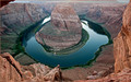
| 08/29/2015 06:02:20 AM | Horseshoe Frameby TonyTComment: *Hello from Sid and the Critique Club*
Congratulations for your high placing with this appealing landscape that meets the challenge well.
A classic scene captured in a classic way, this popular location once more delivers the goods! In terms of the challenge the river is perfectly and naturally framed by the surrounding cliffs. The water is well contrasted with the red stone of the surroundings.
The lighting is fairly flat but conducive to a good even exposure so you have good detail throughout, though the highlights on the water, particularly the left, look close to the limit they are a relatively small but important part of the scene. Your DOF is good with acceptable sharpness throughout. I find the top left corner a little distracting it intrudes in a way that doesn't add to the overall result and looks as though there is some CA with it too, I think it would have been better if you could have excluded it, though it looks as though it was probably difficult. I'm not keen on the red border, I would prefer it without.
Thanks for making such a significant contribution to the challenge, Sid | | Photographer found comment helpful. |
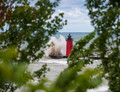
| 08/29/2015 05:39:14 AM | View Thru The Treesby DrakeComment: *Hello from Sid and the Critique Club*
An interesting image that meets the challenge fully.
Its good to see that you have looked for and found a location to enhance the scene with the natural foliage which, of course, fulfils the challenge brief. The only problem is that the foreground frame dominates the scene to the extent that there is too little of the actual scene itself. Given the nature of the scene with the breaking wave I think we should get a full and clear view of both the lighthouse and the wave at least. The walkway looks like an interesting structure I wish we could see more of.
Your timing is good in capturing the breaking wave as you have. Assuming you were in aperture priority the chosen aperture/ISO combination has given you a working shutter speed that captures the action whilst allowing some motion too. The foreground is sufficiently soft to direct attention through to where you want it. The red of the lighthouse stands out very effectively too.
It's unfortunate you didn't receive any comments during the challenge, I hope this makes up for it, thanks for your entry, Sid. |
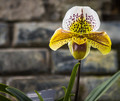
| 08/27/2015 01:40:38 PM | Waiting pollinatorby clickodakComment: *Hello from Sid and the Critique Club*
An appealing floral study that meets the challenge.
Your focus is clearly on the flower and your DOF is appropriate and the off-centre composition works well. I see one of your commenters has remarked about over-exposure, persoanlly I think you have taken it just about as far as is acceptable but by doing so you have got better whites with little or no loss of detail, which for me is fine. You do have some chromatic aberration on the white petal, there is green/blue fringe all round the edge, this ought to be rectified in ACR
Please forgive the long delay in this critique, I hope you feel the image and critique are both still relevant, Sid. | | Photographer found comment helpful. |
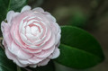
| 08/27/2015 07:53:41 AM | Nuccio’s Cameo - Camellia japonicaby Ja-9Comment: *Hello from Sid and the Critique Club*
An appealing flower study that meets the challenge well.
A very competent image of the camelia composed in an appealing off centre way. I disagree with one of your commenters I think the chosen aperture is most appropriate giving you a DOF with just the right amount of softness and detail.
I wouldn't mind seeing the occasional flower study without the seemingly obligatory water drops! It looks like you have used flash which is illuminating the front of the floor a little too much for me. I would prefer to see the natural hues and shadows, a lot of the natural delicate detail has been lost here through the use of flash.
Please forgive the long delay in this critique, I hope you feel the image and critique are both still relevant, Sid. | | Photographer found comment helpful. |
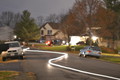
| 08/27/2015 07:40:14 AM | Light Swerveby PhotoshopedToiletComment: *Hello from Sid and the Critique Club*
Your entry meets the challenge well.
You have met the challenge well in that the main subject, the light trail, is illuminated and not by the sun. It is very low to the ground and obviously not a cycle light, is it a model car with a flashlight attached?
There is some potential for improvement that I would like to talk about. First the illuminated trail is over-exposed with no detail remaining. There is a large area of similarly over-exposed area that is not related to the main subject and is detracting from the main subject. The whole image would benefit from less exposure to darken the scene down to allow us to concentrate on just that which is relevant to the scene. The scene itself is not contributing to the image at all, a more relevant scene would be preferable. Within this scene there are elements such as the post box on the left edge of frame that really should not be there at all. There is a distracting green streak of light on the house that detracts and should not be there.
It's a shame you have not entered any challenges since this, please don't let this put you off, entering and learning from the community here. I've just noticed CEJ's comment, I concur wholeheartedly with his remarks, Sid |
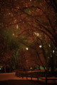
| 08/27/2015 06:56:45 AM | 20141218-Christmas_in_the_Gardens-001by onyx-cubeComment: *Hello from Sid and the Critique Club*
A very appealing image that fully meets he challenge.
Your excellent composition is very engaging, all the elements are working very well together here. The dominant tree makes the scene framing it with its arched boughs and the fence forms a very effective counterbalance. The specks of red light throughout are so uniformly repetitive they hold it all together. The red tinting is in keeping with the scene and the season.
There are some small details that I think could have given your lovely image even more impact. The two small specks of yellow at the top ought to be cropped out. The yellow at the lower left should be cloned or hued out. I am of the camp that prefers the green in the distance, however, I think it is a little too bold it dominates the lower half, it ought to be subdued with some dodging. The whites again would be better toned back to something more akin with those above them.
All in all, an excellent submission, thank you, Sid |
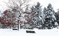
| 08/26/2015 05:07:01 PM | December parkby clickodakComment: *Hello from Sid and the Critique Club*
An appealing image that meets the challenge.
I love the high contrast you have here, some lovely whites, even though I think you have probably taken them a little too far there is a significant loss of detail but this, I think, is one of those rare occasions where it works to your advantage. I particularly love the foreground tree with its stark contrasts and the hint of red leaves against the near mono totality of the rest of the image.
Your composition is good with the foreground tree on the left and the back of the benches breaking up the whites. The DOF is also appropriate, there is no obvious evidence of camera shake from the slow shutter speed but there is a uniform softness that adds to the overall appeal.
I like everything you've done here, its an excellent submission, well done Marcel, Sid | | Photographer found comment helpful. |
| 08/26/2015 04:52:30 PM | F A C I N A T I O Nby Ja-9Comment: *Hello from Sid and the Critique Club*
A flower study that meets the challenge fully.
Whilst I have to own up to the fact that the end result of these filters rarely, if ever, appeals to me, I also acknowledge that the challenge probably dictates their use to achieve the painted feel of the challenge. I would imagine you could have some success trying to achieve a painterly feel in-camera which would be the challenge I would be attracted to but I suppose the voters may be swayed by those that appear the most painted and they are probably most likely to be the result of the use of filters.
I quite like the macro and composition with the heart of the flower off-centre. I find the shadows the most intriguing element of the image, very appealing. I think the edges appear sharper than would probably be the case if this had been painted, for example, the sharp diagonal of the top left corner I think this would be a softer transition without the boundary line running through it. The pinkish splodges do not appeal, for me they detract but they are not a major part of the image except towards the centre which is also where the eyes are drawn.
An understandable but unappealing use of filters, thanks for your submission, Sid | | Photographer found comment helpful. |
|
Showing 1341 - 1350 of ~3781 |
Home -
Challenges -
Community -
League -
Photos -
Cameras -
Lenses -
Learn -
Help -
Terms of Use -
Privacy -
Top ^
DPChallenge, and website content and design, Copyright © 2001-2026 Challenging Technologies, LLC.
All digital photo copyrights belong to the photographers and may not be used without permission.
Current Server Time: 05/07/2026 09:06:25 PM EDT.
|