|
|
|
Showing 1241 - 1250 of ~3781 |
| Image |
Comment |
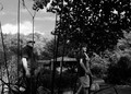
| 09/16/2015 07:11:57 AM | Mediating Aweby posthumousComment: *Hello from Sid and the Critique Club*
An interesting image that contributes to the open challenge.
Mediating or meditating? One texture of pocketbook? I like the mono presentation it works well. I think as far as composition is concerned I would have waited a fraction later when the men would not have the stalks of the foreground plants dissecting them. The expression of awe applies more to the front man rather than second as we cannot see his eyes. The ladies very colourful handbag is quite a dominant feature but we see nothing of her. When I first looked at this I though they were carrying the wooden structure in the background. The bright highlight on his arm is the one flaw in terms of overall exposure and tones it is really quite appealing in this respect.
Thank you for your submission, Sid |  Photographer found comment helpful. Photographer found comment helpful. |
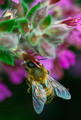
| 09/16/2015 07:02:16 AM | Lunchtimeby PangurbanComment: *Hello from Sid and the Critique Club*
An appealing image that contributes to the open challenge.
From your comments it sounds as though you were shooting in manual mode? I would strongly recommend trying aperture priority which would enable you to concentrate on DOF and know that the camera will at worst get a usable exposure for you. As I'm sure you appreciate the better you can get it in camera then the minimal processing needed will ultimately give you a better end result.
I like your composition with the bee in the lower half of the frame and his lovely iridescent wings against the black background. The colours throughout are quite appealing, I like the soft focus flower background but the buds in the front are not working quite so well but they are not a major issue. I think the heavy processing needed to correct the exposure has given a degree of noise and softness to the detail that lets it down a little which probably explains its low score.
Thanks for your submission, Sid | | Photographer found comment helpful. |
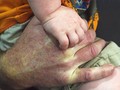
| 09/16/2015 06:49:43 AM | Danny's handby WonderDudeComment: *Hello from Sid and the Critique Club*
An appealing short of shot that meets the challenge well.
It always has an appeal to see a young child’s hands especially against the adults as you have here. The child’s hand feels the softer of the two, I am, of course talking about focus, I feel that it should be the other way around, ideally with a shallower DOF if possible that isolates the child’s hand from the adults. The pale patches of the adult hand are not adding appeal to the shot they are in fact quite distracting from the child's hand.
With the distracting colours of the clothing I think this is one that may have worked better in mono, it could be worth having a look? Also a crop to exclude most of the lower half up to a point near the fingers of the child's hand would probably improve it too.
Thank you for your submission, I'm sorry you didn't get any comments during the challenge, I hope this makes up for it, Sid | | Photographer found comment helpful. |
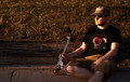
| 09/16/2015 06:38:58 AM | Long Day On the Scooterby AsocComment: *Hello from Sid and the Critique Club*
A fairly straightforward shot that meets the challenge.
Your entry is a normal sort of portrait that feels as though the scooter has been included to conform with the challenge brief, in other words it not a particularly inspiring sort of shot to be honest. We are not able to see your eyes 'the window of the soul' and as such it leaves us feeling somewhat let down. The one redeeming quality is the quality of the light, taken during the golden hour it has given the image an appealing golden glow. I like your composition and the way you are looking into the empty part of the frame as opposed to being boringly stuck in the middle of the frame.
I think a more dynamic sort if image would have been to have taken a shot of you riding the scooter which may have fared better for you. It's a shame you didn't get any comments during the challenge, I hope this critique makes up for it, Sid. |
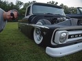
| 09/16/2015 06:08:42 AM | How low can you go?by WonderDudeComment: *Hello from Sid and the Critique Club*
An interesting image that meets the challenge.
I like your quirky style, certainly different and more appealing than the bog standard standing in front of the limo type shot that is normally created. Actually your title makes me think of another version, with just your feet sticking out from under! I've just read your comments, not possible! Perhaps imitating a strenuous effort to try and lift it up from the ground?
Its certainly an interesting looking motor but I find the peoples reflections in the headlamp a bit distracting. I think altering the composition so that there was only this motor and no people could have improved it. The image is well exposed, the uniform lighting has given you a nice even range of tones throughout.
Thanks for your submission, Sid | | Photographer found comment helpful. |
| 09/14/2015 09:43:43 AM | s p i r i t • c r e a t u r e s by Ja-9Comment: *Hello from Sid and the Critique Club*
An appealing image that is assumed to meet the challenge.
A lovely image of a lovely location, your exposure is spot on you have got good detail throughout though there is some tendency to blocking in the shadows I like the frame that it forms within the image, it is also much more preferable than blown highlights that would have resulted in trying to retain the detail. There are some amazing colours and textures here what an amazing location. There are many similar shots that I have seen, this ranks up there amongst the better ones, well done Janine, Sid | | Photographer found comment helpful. |
| 09/14/2015 08:09:13 AM | s,lǝᴉuɐp ʞɔɐſby KiritoComment: *Hello from Sid and the Critique Club*
An interesting image that meets the challenge well.
Well done, yours is one of the few attempts I have so far critiqued that has attempted to meet the challenge head on in camera as opposed to simply inverting an image. The end result is a quirky image that may well perplex and confuse many who view it, I like it. I see you have inverted the bottle before standing it next to the glass and then inverted the whole, it works well. And bonus, your attention to detail hasn't ended there, you've even made the title upside down, perhaps you've made a PS text inverted image from it?
The only thing that I think I need to draw attention to are the small blown highlights on the glass from the flash, they are not major but they are there and to me at least undesirable. I do commend you for your approach and feel it deserved a lot more appreciation here than it received.
Thanks for your submission and apologies for the delay, Sid |
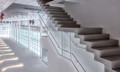
| 09/14/2015 05:51:52 AM | Midtown Ferry Terminal - Going Up?! by JakeKurdsjukComment: *Hello from Sid and the Critique Club*
Congratulations on your ribbon for a fascinating image that meets the challenge.
Very well seen and interpreted, this has a real Escher feel to it for me, it just feels however I look at it, it folds in on itself again, I love it. The image itself is very well executed, the exposure is spot on with great detail throughout. Like you, I would have been equally perplexed by the person in red, they are too close to the edge and looking out of frame which doesn't help either but for some curious reason it works well. Reds are always so dominant, your eye is always drawn to them perhaps its the unusual position of it within the frame that somehow goes against everything we know and probably adhere to too much. Thank you for the original and other version, by far, your interpretation here is also the best of them.
I'll be honest, I have already remarked on another flipped entry that I think the real challenge here was to create an upside down impression in camera and this would definitely have been my approach to the challenge but then that's probably why I've never ribboned! Well done, apologies for the delay, Sid. |
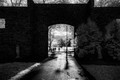
| 09/14/2015 05:31:09 AM | Last One Out, Turn Off The Lightsby JakeKurdsjukComment: *Hello from Sid and the Critique Club*
A very interesting image that needs the title to fulfil the challenge.
What a fascinating image, similar to one of your commenters, I am not that enthusiastic about infra red for the sake of it but this is one of those rare captures that the infra red really is adding another special quality to the image. Though there are no challenge details the feeling of the 'the end' is implied through your title. There is a great range of tones with good detail throughout, the path takes us to the doorway and the gorgeous light beyond, I like the inclusion of the figures and purposeful walk of the front person. I am a fence sitter regarding the crop, I quite like the top because the wall has some interesting shapes and the tops of the trees add to the feeling of space, but I can also see why the crop appeals as well, I like both.
The shadows and the ephemeral glow from the foliage is what makes this image work for me they are very appealing, it really does need the IR to make it work in this way. Congratulations on your high placing it has been a real pleasure to look at this image, thank you, Sid | | Photographer found comment helpful. |
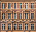
| 09/14/2015 05:09:31 AM | 3 Crows + 1 Open Windowby Dr.ConfuserComment: *Hello from Sid and the Critique Club*
An interesting image that meets the challenge.
This is an appealing image in all sorts of ways but the detail is what holds your interest well, the challenge of your title too I reckon! It is a lovely building with some lovely detail and lovely tones all very appealing. I don't agree with your commenter about it being slightly crooked I think what they are seeing is a very slight tendency towards converging verticals from your shooting position below. Hah, I see it yes, the top is askew he were right you know! Having said that the bottom is not, ok I give up!
Although it is a well executed image I think where it fails in terms of the challenge is that the DOF from use of f8 is not obvious and this is perhaps why it scored lower. I think for the purpose of this challenge you need to demonstrate the f8 aperture through a selective DOF and perspective. This could quite easily have been taken at f4 for example but because it is all on the same focal plane you wouldn't know the difference.
Thanks for your submission, Sid | | Photographer found comment helpful. |
|
Showing 1241 - 1250 of ~3781 |
Home -
Challenges -
Community -
League -
Photos -
Cameras -
Lenses -
Learn -
Help -
Terms of Use -
Privacy -
Top ^
DPChallenge, and website content and design, Copyright © 2001-2026 Challenging Technologies, LLC.
All digital photo copyrights belong to the photographers and may not be used without permission.
Current Server Time: 05/07/2026 04:39:16 PM EDT.
|