| Image |
Comment |
| 10/04/2015 02:05:51 PM |
Shoes and Lacesby clickodakComment: *Hello from Sid and the Critique Club*
An interesting image that meets the challenge well.
Shoes and laces do indeed go together and indeed they are not the same so well done with the idea. The composition is excellent I like it a lot, it shows everything off very well, we have all we need of the shoes with an emphasis on the laces with their lovely twining in and out of the shoes and together.
The lighting is good and uniform throughout with some nice tones too. The texture of the laces comes out well with a great choice of aperture that enables you to get just the right amount of DOF. It looks good in mono.
I think the score is fairly representative for the image, well done Marcel for a very good submission, Sid |
 Photographer found comment helpful. Photographer found comment helpful. |
| 10/04/2015 01:56:48 PM |
Fire and Iceby shadowdoc31Comment: *Hello from Sid and the Critique Club*
An interesting image that meets the challenge well.
This is a great idea, well thought out with a lot of your personal creativity coming through and generally well executed. I have to agree with one of your commenters about the blue and the red lights, I would like to see the blue light shining through the cubes from the base against the red flamed backdrop filling the space behind. Perhaps you may already have tried this and decided against it? I don't know, but it feels to me as though it would have added a lot more impact to your image.
Regardless of how the image scores here you have come up with a great idea, well done. Thanks for your submission, Sid |
| 09/30/2015 05:52:22 PM |
written in sandby posthumousComment: *Hello from Sid and the critique club*
An interesting challenge that meets the challenge.
This is a fascinating and very appealing abstract with the change of colours you have made its origins even less obvious but nevertheless still an interesting image. It's certainly frame filling and I like the graininess of it but the patterns themselves are quite absorbing. Its unlikely this sort of image would ever appeal enough to the voters here to ribbon but I like your creative approach.
Thanks for your submission, Sid |
| Photographer found comment helpful. |
| 09/30/2015 05:40:29 PM |
The Fisher's Priceless Family Portraitby WonderDudeComment: *Hello from Sid and the critique club*
An interesting image that does not meet the challenge fully.
I find the idea that you still have your childhood toys quite appealing and your crop has enabled you to fill most but not all of the frame and the areas where you are not filling the frame are more detrimental than beneficial to the image. The bokeh whilst normally desirable in this instance is quite distracting given the nature of the challenge but the worst area is that on the right which has no place in the context of this image. I think a square crop of the figures on the left would have worked much better than this it would have filled the frame more effectively without any of the aforementioned distractions.
Perhaps a little -EC would have improved the exposure in reducing the highlights and also saturating the colours more, though the pastel shades are themselves quite attractive.
Thanks for your submission, Sid |
| Photographer found comment helpful. |
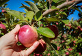
| 09/30/2015 04:28:39 PM |
Apple Picking in Fallby clickodakComment: *Hello from Sid and the critique club*
An appealing image that meets the challenge.
Your composition is very good, I like the way you have gone in close with good DOF on the apple and the hand together with the soft focus background of the abundant apple crop. It tells us that the apple is ripe and ready for picking which identifies it with the Northern hemisphere's season. The empty patch of blue sky is a little dominating and would probably benefit from some cropping. The exposure is good and the colours and detail look good too.
All in all, a very good submission Marcel, its a shame it didn't get any comments during the challenge, I hope this makes up for it, Sid |
| Photographer found comment helpful. |
| 09/29/2015 05:53:22 PM |
ambush babyby posthumousComment: *Hello from Sid and the critique club*
An appealing image that meets the challenge well.
I see her! Is she looking for her lost black halo? This works well for the challenge in mono, she is well hidden amongst the foliage, I love that here eye is illuminated by the sun and looking towards you, it works well. You have a lot of blown highlights from the intense sun but eliminating those may have also eliminated poor Sofie, and we don't want that do we! I think a better solution would have been to go back to portrait format and crop the path out completely, I think this would have improved your score too.
Nice one Don, thanks for your submission, Sid |
| Photographer found comment helpful. |
| 09/29/2015 05:44:49 PM |
Hydrangea Reflectionby PangurbanComment: *Hello from Sid and the critique club*
An appealing image that does not meet the challenge.
I find your image attractive but in terms of the challenge the subject and your title is so obvious that there is no element of surprise that should be associated with something obscure. We should be made to explore your image to find the hidden subject that is obscured in some way. I do like the reflection and the ripples and the shadows its all very appealing. As you say, it is very bright sunlight but I think you have controlled the exposure well, there is good detail throughout.
I'm sorry you didn't get any comments during the challenge I hope this makes up for it, Sid |
| Photographer found comment helpful. |
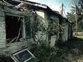
| 09/29/2015 05:35:31 PM |
"Wear" The Zombies Roamby WonderDudeComment: *Hello from Sid and the critique club*
An uninspiring image that partially meets the challenge.
Your interpretation of the challenge is presumably intended to reflect the ravages of weather wear and tear on the structure but I see this more as dereliction and decay rather than wear and tear which I would more readily associate with continued use as opposed to the abandonment of this scene. The lighting is very harsh with some extreme contrasts and blown out highlights, I think a stop of -EC would have worked well here to rescue those highlights, the shadows have enough latitude to enable it. I think your composition could have excluded the pole to the benefit of the overall result.
Thank you for your submission, Sid |
| Photographer found comment helpful. |
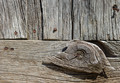
| 09/28/2015 06:00:32 PM |
Wear and Tear of timeby clickodakComment: *Hello from Sid and the critique club*
An appealing image that meets the challenge
A good choice of subject that displays the ravages of the elements the wood has endured over the years, your composition is good with the nailed knot of wood placed in its most obvious and effective position on the lower left thirds hotspot, it works well. The most obvious problem with it is the time of day it was taken it has been taken under strong overhead sunlight which is not the best choice especially to bring out the textures and characteristics of the aged wood. Under better light this would have a lot more impact.
I like that you have observed beyond the structure of the building and gone for more of an abstract approach that isolates the wood and nails with an interesting section such as you have, well done Marcel. |
| Photographer found comment helpful. |
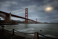
| 09/23/2015 03:22:44 PM |
_N1A5760aby chrispyphotosComment: *Hello from Sid and the Critique club*
An interesting image that contributes well to the open challenge.
Well, congratulations for a very impressive maiden entry and your high placing which was well justified. It is often difficult to do something different with a landmark of such popularity but your long exposure has done just that, you have motion blur in the water and softness in the sky that adds appeal to the image. The lighting is good with good detail throughout, the sun and its halo are nicely subdued adding a subtle element.
Contrary to the opinion of sacredspirit I feel I have a duty to attempt to add my own honest opinion, I feel the foreground fence is a barrier to the rest of the image, I would prefer it if you had eliminated it and gone closer to the water and panned further to the left bringing the right hand end of the bridge closer to the edge enabling you to reveal more of the fort. A title is a necessary part of the image in that it helps your viewer understand more of your motivation and/or emotion at the time of creating the image.
Apologies for the delay. Thanks for your submission, Sid |
Home -
Challenges -
Community -
League -
Photos -
Cameras -
Lenses -
Learn -
Help -
Terms of Use -
Privacy -
Top ^
DPChallenge, and website content and design, Copyright © 2001-2026 Challenging Technologies, LLC.
All digital photo copyrights belong to the photographers and may not be used without permission.
Current Server Time: 05/07/2026 09:25:37 AM EDT.