|
|
|
Showing 1181 - 1190 of ~3781 |
| Image |
Comment |
| 10/25/2015 05:22:19 PM | Sunset Lakeby ericpiComment: Greetings from the Critique club
An appealing image that contributes well to the open challenge
Your calm landscape taken during the golden hour has an instant appeal, the water reflections are the real strength of the image. I am not a huge fan of HDR but your use of it is reasonably subtle and enhancing. I am not keen on the composition it is too central and makes the image feel very ordinary and much less appealing. I find the twigs on the upper right detrimental to the overall result. I would suggest some serious cropping would go a long way towards rectifying this; crop to the level of the single tall tree on the right. The bulk of the overpoweringly blue sky will be removed, it will move the distant shoreline to the upper third at the same time removing all the detrimental stuff on the right and place the emphasis much more on the water reflections which is where it undoubtedly should be.
Apologies for the delayed critique, I hope it helps, Sid |  Photographer found comment helpful. Photographer found comment helpful. |
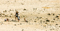
| 10/25/2015 03:05:09 PM | Exploring the Droughtby HUETHComment: Greetings from the Critique club
An interesting image that meets the challenge
You have definitely managed to convey the sense of drought here. A sensible decision to crop the water out, in fact the darker patch towards the upper right gives a sense that this is the very last remnant of water disappearing before your eyes. Although it has been taken at the worst possible time of day it really helps with your chosen theme. The high contrast also makes it feel a very hot environment. The family is also clearly conveyed with the presence of the two mothers and their offspring. I wish the two ladies were facing the other way you would then feel they were discussing the landscape and where has all the water gone, as it is their posture and position takes you out of the frame prematurely.
I'm sorry you didn't get any comments during the challenge, I hope this helps, Sid |
| 10/25/2015 02:51:35 PM | my princessby posthumousComment: Greetings from the Critique club
An appealing image that does not meet the challenge.
Ah the gorgeous Sophie, I recognised her straight away! Much as I love her and I know you obviously do too I am struggling to see how she conveys a feeling of family to a complete stranger. Yes, she is a very important family member to you but she could be a stray dog wandering alone on a beach, there is nothing in the way you have photographed her that makes me feel she belongs to anyone.
She is too central in the image for me, I would much prefer to see her higher in the frame so that I can see all of her shadow. I would prefer to see more detail of her in the shadows it is blocked out. I do love the low angled sunlight it is bringing some lovely detail in the sands surrounding her. I think a lower level image where we can see her eyes and the detail in her lovely face with this lovely beach around her was an opportunity lost.
Thanks for your submission, Sid | | Photographer found comment helpful. |
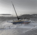
| 10/25/2015 02:36:43 PM | Wear of the Sea by seebrownComment: Greetings from the Critique club
An appealing image that is deemed to meet the challenge
Congratulations on your ribbon and welcome back! What a great result to come back with, a lovely boat surrounded by rough seas. If I am to be honest with my critique as I always try to be I have to say that I am quite surprised at the high placing. In terms of the challenge I find the boat's pristine condition fails to convey a feeling of wear and tear at all. The masking for the selective desat, which I fail to see the need for, seems very casually done with clear discrepancies in the seas around the boat. The crescent shape intrigued me, at first I thought it was attached to the rigging, until I found the surfer at the other end of it. I feel the object emerging from the water on the right would be better removed it is quite distracting.
On a more positive note I do like the breaking surf around the boat. I hope I don't come over too negative but I am trying to be honest and constructive, although it does have its merits the image just doesn't work for me in the context of the challenge.
Welcome back and continued success with your future entries, Sid | | Photographer found comment helpful. |
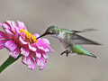
| 10/23/2015 11:24:33 AM | Sipping Nature's Nectarby shadowdoc31Comment: Hello from the Critique Club
An appealing image that is deemed to meet the challenge
My own perception of bokeh has always been much more clearly identified with specular highlights as opposed to soft or OOF areas which is where I would place your entry. The challenge brief would also seem to veer more towards the soft focus rendering than my own interpretation so feel free to ignore my comments.
This is a competent image of a feeding humming bird, the focus is good and the composition is good too, the soft focus background is devoid of detail and therefore unobtrusive and serves as a plain background against which the bird shows up well. The body and head are sharply captured and the blur in the bird's wings is very appealing. The exposure is good there is detail throughout but for me there is no bokeh at all.
Thanks for your submission, Sid |
| 10/23/2015 11:06:54 AM | Ocean's Powerby HUETHComment: An interesting and creative take on the challenge brief, well done, Sid
An image that indirectly meets the challenge.
I can see your thought process in your submission but the problem is that the theme of the challenge is not immediately obvious to the viewer and therefore suffers as a result because the photographers comments are not available during voting. I think you have a worthy idea but it is too obscure, the title helps as well as its beach location but it remains obscure. As for the object itself, I like the textures, the focus and the DOF the lighting looks as though it may be during the 'golden hour' which is sympathetic to the driftwood bringing out the textures well, the low viewpoint is good too. I agree with your comments it is interesting and inviting.
Thanks for your entry, Sid |
| 10/23/2015 10:38:16 AM | | | Photographer found comment helpful. |
| 10/23/2015 10:28:44 AM | Spark Shooterby TommyMoe21Comment: Hello from the Critique Club
An interesting image that meets the challenge
'Steel wool in a whisk on a chain', hmm, look like fun! I like that you have a dynamic moving subject although its not an obvious or strong diagonal the fact is he is holding the light source at an angle so it is more an implied diagonal. The individual light trails are very effective and appealing, they fill the space very well, I particularly like the way those that are hitting the ground have been recorded. There is obvious blow out of the highlights of the light source itself but obviously there is nothing you can do about this.
Your exposure is good with detail throughout. I'm intrigued and confused by your comments about the post processing, I don't know what you mean by 'stroked'?
An interesting and creative take on the challenge brief, well done, Sid | | Photographer found comment helpful. |
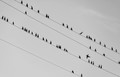
| 10/23/2015 10:16:34 AM | In Comingby Ja-9Comment: Hello from the Critique Club
An appealing image that meets the challenge well
A great natural study that keeps you captivated looking at all the birds. The diagonal of the lines is strong and dynamic and binds the image well but the piece de resistance is the bird about to land, sheer magic. The placement is perfect near the hotspot, the action blur is perfect too. I also like the other 'anomalies' the birds on the top wire one facing and the other looking the wrong way. The bottom wire with just two birds right on the lower edge, the alternation of full and near empty lines, its all so very appealing.
The mono presentation works well. I don't think there's anything I would change about it its all working well for me, beautiful, well done Janine.
Thanks for your submission, Sid | | Photographer found comment helpful. |
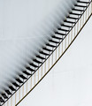
| 10/23/2015 10:01:52 AM | Stairs illusionby clickodakComment: Hello from the Critique Club
An appealing image that meets the challenge well.
A great example of simplicity working at its best, I love that you have had the creative vision to see the potential to invert the image and present it in this intriguing and appealing way, its adds much more interest to the image. The subtle lighting and tones are perfect for the subject with those gorgeous reflections of the treads, the golden tint of the rail supports, the lighter lower half against the darker upper half of the tank, its all working so well together.
There are no problems at all with your composition here Marcel, the diagonal is the binding and dynamic force that holds it all together, the portrait orientation is the right choice with the treads support going perfectly from corner to corner. The image shows that you have taken the time and care to get it right and its paid off hugely.
Your ribbon and new PB are both very well deserved and the satisfying thing is this all your own work, all entirely down to yourself alone without any pre-entry collaboration, very well done Marcel. Next goals, 7+ and a blue? Congratulations, Sid. | | Photographer found comment helpful. |
|
Showing 1181 - 1190 of ~3781 |
Home -
Challenges -
Community -
League -
Photos -
Cameras -
Lenses -
Learn -
Help -
Terms of Use -
Privacy -
Top ^
DPChallenge, and website content and design, Copyright © 2001-2026 Challenging Technologies, LLC.
All digital photo copyrights belong to the photographers and may not be used without permission.
Current Server Time: 05/07/2026 09:23:46 AM EDT.
|