DPChallenge: A Digital Photography Contest You are not logged in. (log in or register
 
Browse Settings
Currently viewing:
Registered Usernards656

Show comments:

Per page:

Order:

Comments:


Comments Made by nards656
Pages:   ... [74] [75] [76] [77] [78] [79] [80] ... [159]
Showing 761 - 770 of ~1585
Image Comment
Primitive
06/06/2006 05:10:57 PM
Primitive
by ltaylor

Comment:
==Greetings from the Critique Club==
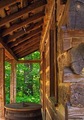
Composition
I really like the layout of the shot. The horizontal line at the far end of the porch breaks up the flow a little bit, but obviously it was beyond your control.

Camera Technicals
You've obviously benefited from the point&shoot capability for extremely deep depth of field, even with a large aperture. With an SLR, this shot would have a tremendously different appearance at f/2.8. This does work well, and you've got a great exposure. The shadows are there, but there is detail as well. The lighting is nice and even.

Post Processing
I think I would have desaturated the greens just a little bit, or used selective color to change the tone from that bright green that digital cameras so often substitute for the real green of nature. The green is just, well, in a way "wrong" for the tone of the shot. It distracts me. Muting it in some fashion would have really improved the shot for me.

Challenge
I don't personally think of log cabins as architecture, but I would not have voted you down for that. This comes across well as a "building", but not as the creative work of an architect. That's just my personal definition, and you may have suffered some from others thinking the same way.

Overall Impression
This is a nice image. It makes me look twice, but it doesn't seem to have a clear "subject", just a lot of nice objects in it. We don't see quite enough of the building to really get a feel for the "architect", but we do have a good idea of his construction methods. The distraction from the green hurts this image more than anything else I see.

Not a bad score, but a very nice image. Keep up the good work.

Please feel free to contact me by PM if you have questions. These are just my thoughts and impressions and are meant to be entirely constructive as opposed to insulting. I hope you find them to be beneficial and instructive!
Photographer found comment helpful.
Twinkle, Twinkle
05/31/2006 05:11:03 PM
Twinkle, Twinkle
by ericwoo

Comment:
Nice colors, nice starburst. It's a little distracting how the path of the cars just ends in the middle of the picture. It has a good balanced feel though, but the colors do need a touch more pop - IMHO.
Photographer found comment helpful.
Baited and Ready
05/31/2006 04:31:17 PM
Baited and Ready
by ericwoo

Comment:
I really like this shot, and I like the way you've treated the colors. This is a style of PP that I want to learn to do better myself.
Photographer found comment helpful.
'Til I'm Blue in the Face
05/12/2006 12:45:43 PM
'Til I'm Blue in the Face
by nards656

Comment:
The entire face being blue seemed too "cliche" in itself. We've seen that. Besides, I only had washable markers, not body paint.

Ever tried to draw on your own face in the mirror? Besides, I SUCK as an artist :)

Thanks so much for the comments.
Far from the madding crowd
05/11/2006 03:27:39 PM
Far from the madding crowd3rd Place
by Brin

Comment:
I wouldn't have thought this possible in basic editing, but you have done a tremendous job. Congratulations!
Photographer found comment helpful.
Up, up and away
05/10/2006 11:36:11 AM
Up, up and away
by ericwoo

Comment:
[[Trading Post]]

EXCLLENT use of light and congratulations on the finish! Not really much critique to offer except that the sky color is a little bit dark; however, it still works very well.
Photographer found comment helpful.
Staccato stilled; bass line lingers
05/10/2006 08:49:42 AM
Staccato stilled; bass line lingers
by Melethia

Comment:
[[Trading Post]]

You have done an excellent job with everything I see here - composition, color, exposure, processing, and so on. I think your score only suffered because the subject isn't intensely interesting.
Photographer found comment helpful.
Let sleeping bears lie...or else!
05/10/2006 08:36:32 AM
Let sleeping bears lie...or else!
by Kelli

Comment:
[[Trading Post]]

Again, that big horizontal line hurts you. I like this shot, and I like the bear's expression. I'm not "anti zoo shot", I just like to see really well done zoo shots. You've come very close here. A tighter crop, I think, would have been an improvement.
Photographer found comment helpful.
Careful, I spit
05/10/2006 08:35:12 AM
Careful, I spit
by Kelli

Comment:
[[Trading Post]]

This is funny, but it does come across a bit snapshotty. Since there's no context, the horizontal line of the trees cutting his head in half is sort of distracting.

All my opinion :)
Photographer found comment helpful.
Silk Flower Rhythm
05/10/2006 08:33:41 AM
Silk Flower Rhythm
by chalice

Comment:
[[Trading Post]]

OOOHH! My first thought was "wicked cool", tempered by some of the flaws in the railings in the background. There's also a color shift to green as I see the flowers go from front to back, and it confuses me. This is a great composition. The background might be a bit too pure white for the rest of the photo.
Photographer found comment helpful.
Pages:   ... [74] [75] [76] [77] [78] [79] [80] ... [159]
Showing 761 - 770 of ~1585


Home - Challenges - Community - League - Photos - Cameras - Lenses - Learn - Help - Terms of Use - Privacy - Top ^
DPChallenge, and website content and design, Copyright © 2001-2025 Challenging Technologies, LLC.
All digital photo copyrights belong to the photographers and may not be used without permission.
Current Server Time: 09/12/2025 06:10:26 AM EDT.