| Image |
Comment |
| 03/14/2005 02:46:54 PM |
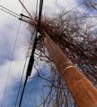
multiplicityby jmritzComment: I'm not a real fan of power lines, even if they are the subject of the photo, but this is hindered more by the "brush lines" than the power lines. By the way, EXCELLENT foreground color and detail on the pole! |
 Photographer found comment helpful. Photographer found comment helpful. |
| 03/08/2005 12:44:45 PM |
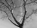
Tree and Clouds in Grant Parkby joroComment: Revisiting and explaining my lower scores - I hope to be helpful, not insulting.
I only rated this a 4 because, even with the tree, the photo doesn't seem to have a clear subject or purpose. The details are good - I'm really impressed this didn't become a silhouette, and so I'm bumping you to a 5 just for that. |
| Photographer found comment helpful. |
| 03/08/2005 12:43:17 PM |
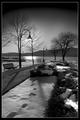
Walk In The Parkby atsxusComment: Revisiting and explaining my lower scores - I hope to be helpful, not insulting.
I only rated this a 4 because the footprints and the glare on the water really distract me. I know both were out of your control to a certain extent, but a different time of day would help some. Also, you've lost a good bit of foreground detail in the shrubbery to the right that I feel AA would have captured.
Trying to be helpful :) Best of luck. |
| Photographer found comment helpful. |
| 03/08/2005 12:41:25 PM |
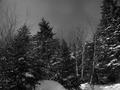
Mount Snow Vermontby ericndebComment: Revisiting and explaining my lower scores - I hope to be helpful, not insulting.
I only rated this a 4 because there is very little to no detail offered for me to see. I know this is a difficult type of shot to make, but the trees must have been moving slightly in the wind to "blur" themselves to this extent. The sky is well done but seems noisy, as though it could have benefited from some noise reduction to get more of the AA look.
Best of luck! |
| 03/08/2005 12:39:46 PM |
Tree in Park, My Mind in the Sierrasby hyperfocalComment: Revisiting and explaining my lower scores - I hope to be helpful, not insulting.
I only rated this a 4 because there seems to be too much detail that has been lost. Tonality is okay, but I think AA would have found more white to use, thus covering the entire histogram a little better. The shadows are distracting without adding value. |
| Photographer found comment helpful. |
| 03/08/2005 12:38:37 PM |
Rural Countrysideby HeavyComment: Revisiting and explaining my lower scores - I hope to be helpful, not insulting.
I only rated this a 4 because this is a decent shot of a beautiful view, but the foreground is somewhat blurry and indistinct, and that doesn't portray Ansel's style to me. You've done a nice job with the overall tonality, so I'm bumping you to a 5. Best of luck! |
| Photographer found comment helpful. |
| 03/08/2005 12:36:06 PM |
The Spring around the cornerby DigiFotoBuddyComment: Revisiting and explaining my lower scores - I hope to be helpful, not insulting.
I only rated this a 4 because the focus is wrong, somehow, leaving me with a soft pic, and the overhanging branches distract without helping anything. The bridge is very nice but is almost hidden in the road and the trees. I think you could have done better by moving more toward the end of the wall and singling out the bridge. That would have also eliminated the car, which is again distracting without any obvious purpose in the photo.
Hope this helps. Best of luck! |
| Photographer found comment helpful. |
| 03/08/2005 12:33:30 PM |
Contemplation (lover's leap)by holdingtimeComment: Revisiting and explaining my lower scores - I hope to be helpful, not insulting.
I only rated this a 4 because the photo feels cluttered, with no clear subject or purpose. The sky is somewhat overexposed, yet the snow is still somewhat dingy. Kind of tough to beat, but I think AA would have given us a slightly different look.
Best of luck! |
| Photographer found comment helpful. |
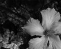
| 03/08/2005 12:32:06 PM |
Flower, Near Pacific, Californiaby jfaulknerComment: Revisiting and explaining my lower scores - I hope to be helpful, not insulting.
I only rated this a 4 because the whites are dull and grey. Compositionally you are in great shape, but the photo is just too dark overall, and would be greatly improved with a better exposure. |
| Photographer found comment helpful. |
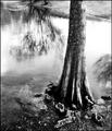
| 03/08/2005 12:30:30 PM |
Ansel's Backyardby loveComment: I feel like I'm missing something here. This is composed nicely, but seems entirely overprocessed. The reflection is distorted, and the base of the tree seems rather gunky, for lack of a better word.
Revisiting and explaining my lower scores - I hope to be helpful, not insulting.
I only rated this a 4 because it just doesn't come across as a quality photo. Nothing "snaps", even though you've used the rule of thirds nicely.
Sorry, again, trying to be helpful. |
Home -
Challenges -
Community -
League -
Photos -
Cameras -
Lenses -
Learn -
Help -
Terms of Use -
Privacy -
Top ^
DPChallenge, and website content and design, Copyright © 2001-2026 Challenging Technologies, LLC.
All digital photo copyrights belong to the photographers and may not be used without permission.
Current Server Time: 07/18/2026 02:04:50 PM EDT.