| Image |
Comment |
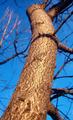
| 02/21/2004 06:06:25 AM |
Scalyby illywikinikyComment: The tree seems to just end in a freakish stump, you might try a more straight-ahead shot, making the tree a texturesrectangle with blue strips down the sides. :)
|
| 02/21/2004 06:04:52 AM |
Rust and dustby mijakComment: I like the composition, but the blow out doesn't add to the image. Crop that white out!
|
 Photographer found comment helpful. Photographer found comment helpful. |
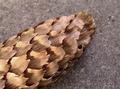
| 02/21/2004 06:03:54 AM |
Cone of Silenced Textureby MWittComment: The depth of field could be a bit wider and pulled towards the camera, you lose detail in the cone right as it gets close. :) |
| Photographer found comment helpful. |
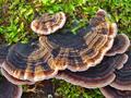
| 02/21/2004 05:58:45 AM |
Canopiesby ImagineerComment: Nice color! I feel like a slightly wider shot might have balanced the image a bit better, the arcs of the central shelves come very close to the edges. Pull back! The light on the top one is really nice, too... it enhances the *texture* and gets bonus points! |
| Photographer found comment helpful. |
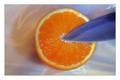
| 02/21/2004 05:55:46 AM |
Orangebladeby ChezComment: Nice subtle colors, and I like the simple composition. My two comments are about the lighting... the shadow is cast upwards, not a more natural downwards. Could you have rotated the whole scene 180 degrees and re-shot, then flipped it? Also, the left edge of the orange seems to be in shadow, perhaps tilting it ever so slightly would have brightented it up or even added a hilight. |
| Photographer found comment helpful. |
| 02/21/2004 05:53:00 AM |
money with lots of textureby nottogoodComment: The depth of field is way too narrow for a shot with so much detail around the edges. It also seems a bit underexposed, the mid-tones could be brought up a bit. |
| 02/21/2004 05:51:54 AM |
|
| Photographer found comment helpful. |
| 02/21/2004 05:51:02 AM |
"riet"by middelboschComment: Nice lighting, but I would have tried to get the horizontal weave perfectly horizontal. At this slight angle it looks too off-handed to be really striking, for me. You could try centering the black part in a strong Thirds location, to draw the eye to an interesting detail that's kind of lost up near the top. |
| Photographer found comment helpful. |
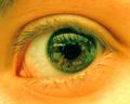
| 02/21/2004 05:48:02 AM |
Eye Witnessby nikon_girlComment: I love the freaked out color, and that you're not looking into the subject straight on. Their head appears to be at a substantial angle, and it adds a nice tension to the stare. I bet you're going to get hammered for an eye picture, though. :) |
| Photographer found comment helpful. |
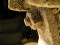
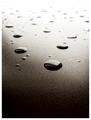
| 02/21/2004 05:45:44 AM |
Surface Textureby BukiosComment: Nice blow out! I wish the reflections in the drops were less detailed, and they seem a bit less then random in placement to me. You certainly pegged the dynamic range!
|
| Photographer found comment helpful. |
Home -
Challenges -
Community -
League -
Photos -
Cameras -
Lenses -
Learn -
Help -
Terms of Use -
Privacy -
Top ^
DPChallenge, and website content and design, Copyright © 2001-2026 Challenging Technologies, LLC.
All digital photo copyrights belong to the photographers and may not be used without permission.
Current Server Time: 07/16/2026 10:13:35 AM EDT.