| Image |
Comment |
| 11/15/2004 06:53:42 PM |
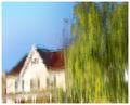
Suburban Impressionismby smokeditorComment: very nice effort, but unfortunately, it has the feeling of looking at a detail cropped out of a larger image. then again, you can't always control the size of the puddle. nice lighting and colors. balance of composition is off, though. |
 Photographer found comment helpful. Photographer found comment helpful. |
| 11/15/2004 06:50:50 PM |
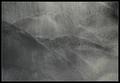
A Pale View Of The Hillsby e301Comment: this does have an interesting feel to it, especially in the textures. i think i would have preferred it in color, though. |
| Photographer found comment helpful. |
| 11/15/2004 06:46:29 PM |
Winter strollby geewhyComment: while you've captured the essence of impressionism, i think the leaves actually take away from the image. i'd probably enjoy gazing at this a little more if the details of the person were just a bit clearer. as is, i can't quite tell if they are holding an umbrella, or what. interesting image, none the less. |
| Photographer found comment helpful. |
| 11/15/2004 06:43:40 PM |
Lumiere de bougieby graphicfunkComment: very nice job. right on the money with composition, color, and lighting. the feeling is quite stirring, and the result is most pleasant. thanks for your effort here. |
| Photographer found comment helpful. |
| 11/15/2004 06:42:00 PM |
The Artist by scalvertComment: how clever. i'm going to mark this one up, just to help cover the cost of the glass. while some people will ps a shot to death, others will spare no expense in setting up a great shot. i hope others will appreciate the effort you made for this challenge, as well as the result you achieved. great job! |
| Photographer found comment helpful. |
| 11/15/2004 05:55:23 PM |
Goldby labudsComment: the color cast here is a little too much in-your-face for me to find enjoyable. maybe if it had been muted a little, so as to let the branch stand out? |
| 11/15/2004 05:34:59 PM |
foggy mornby ellamayComment: i like the basic idea, but feel the composition is missing something. maybe the birds are too close to the bottom, maybe there is a little too much or too little space at the top? i'm not sure, but something is just not engaging me here. |
| Photographer found comment helpful. |
| 11/15/2004 05:32:36 PM |
Windmillby marboComment: well, this is interesting...i guess i'll go on and call it a stunning composition! the colors are gorgeous, and i really enjoy the negative space. i'm not sure, but i think i would like it more with a hint of motion blur. i'll give this at least a 7. thanks for the effort. |
| Photographer found comment helpful. |
| 11/15/2004 05:28:53 PM |
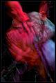
Sunshine Of Your Loveby jmsetzlerComment: i'm sure this was fun, as well as work. to a degree, i'd say the results were worth the effort. as i'm more of a fan of lighter impressionistic images, this one doesn't really engage and make me want spend a lot of time soaking it in. on the other hand, you have captured a certain vitality that is not easily discarded. |
| 11/15/2004 05:24:19 PM |
First Impressionby JeanComment: this is ok, but it doesn't really hold my interest. to me, this leans more towards the abstract than impressionistic, and i'm not getting enough detail to appreciate what i'm looking at, other than shapes and colors. |
| Photographer found comment helpful. |
Home -
Challenges -
Community -
League -
Photos -
Cameras -
Lenses -
Learn -
Help -
Terms of Use -
Privacy -
Top ^
DPChallenge, and website content and design, Copyright © 2001-2026 Challenging Technologies, LLC.
All digital photo copyrights belong to the photographers and may not be used without permission.
Current Server Time: 06/20/2026 04:46:16 AM EDT.