|
|
|
Showing 4041 - 4050 of ~6399 |
| Image |
Comment |
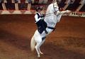
| 03/04/2005 04:13:14 AM | Theater Equus - Don't Miss the FUN!!by NeuferlandComment: ok, i am voting this challenge in 2 passes. in this pass, you will get a partial comment and a score. then i will come back to comment again. if you have any problem whatsoever with this comment, pm me and let me know. otherwise, take it with a grain of salt...i'm not trying to be a know-it-all, i'm just explaining where i'm coming from in voting this challenge. and, if this comment is NOT helpful (of if you think i'm full of $#!+), don't mark it helpful.
billboards are a science unto themselves. a lot of research has gone into determining just how much information a person can digest and retain in specific time spans. they use this information to develop formulas for determining the number of words and letters to use on billboards, as well as their sizes. they also determine the size and number of visual elements to include.
the graphics/photograph on a billboard are designed to get the point across in a moment. on the road, a driver will have less time with a billboard than a voter will give your image. this is a key element in the challenge: composing a shot that will get its point across quickly and succintly. along those lines, a strong composition will probably have few details and make strong use of negative space.
---------------------
i'm sure you've already been sufficiently hammered by the size-police, so i won't pile on. it's a nice image, and if shot a bit differently would be a great way to convey the dynamic fun to be had. the background is a bit of a distraction, and the composition is a bit too centered (another 'rule' for billboards is to lay them out left to right, with the graphics to the left and the verbiage to the right). good luck! |  Photographer found comment helpful. Photographer found comment helpful. |
| 03/04/2005 04:10:07 AM | You Gotta Play to Win (The Lottery)by Prof_FateComment: ok, i am voting this challenge in 2 passes. in this pass, you will get a partial comment and a score. then i will come back to comment again. if you have any problem whatsoever with this comment, pm me and let me know. otherwise, take it with a grain of salt...i'm not trying to be a know-it-all, i'm just explaining where i'm coming from in voting this challenge. and, if this comment is NOT helpful (of if you think i'm full of $#!+), don't mark it helpful.
billboards are a science unto themselves. a lot of research has gone into determining just how much information a person can digest and retain in specific time spans. they use this information to develop formulas for determining the number of words and letters to use on billboards, as well as their sizes. they also determine the size and number of visual elements to include.
the graphics/photograph on a billboard are designed to get the point across in a moment. on the road, a driver will have less time with a billboard than a voter will give your image. this is a key element in the challenge: composing a shot that will get its point across quickly and succintly. along those lines, a strong composition will probably have few details and make strong use of negative space.
------------------------
great idea for a billboard, one that i think would be (if it hasn't already been) effective. as for your image, the flash kills it. you might have been able to burn it in a bit, but all the same, this would be much better if the lighting was even all the way across. | | Photographer found comment helpful. |
| 03/04/2005 04:08:07 AM | Motorized Convertible Top ; Heated Leather Seats ; PORSCHE - Year Roundby wkoffelComment: ok, i am voting this challenge in 2 passes. in this pass, you will get a partial comment and a score. then i will come back to comment again. if you have any problem whatsoever with this comment, pm me and let me know. otherwise, take it with a grain of salt...i'm not trying to be a know-it-all, i'm just explaining where i'm coming from in voting this challenge. and, if this comment is NOT helpful (of if you think i'm full of $#!+), don't mark it helpful.
billboards are a science unto themselves. a lot of research has gone into determining just how much information a person can digest and retain in specific time spans. they use this information to develop formulas for determining the number of words and letters to use on billboards, as well as their sizes. they also determine the size and number of visual elements to include.
the graphics/photograph on a billboard are designed to get the point across in a moment. on the road, a driver will have less time with a billboard than a voter will give your image. this is a key element in the challenge: composing a shot that will get its point across quickly and succintly. along those lines, a strong composition will probably have few details and make strong use of negative space.
---------------
this is a nice idea for a billboard. i think the background is a bit of a distraction that a heavy gaussian blur could handle. i don't know if you had control over this or if you simply found it, but if possible, this would have been great if shot with an open field of snow for a background. | | Photographer found comment helpful. |
| 03/04/2005 03:58:37 AM | Year-Round Boat Storage. Low Rates!by glad2badadComment: ok, i am voting this challenge in 2 passes. in this pass, you will get a partial comment and a score. then i will come back to comment again. if you have any problem whatsoever with this comment, pm me and let me know. otherwise, take it with a grain of salt...i'm not trying to be a know-it-all, i'm just explaining where i'm coming from in voting this challenge. and, if this comment is NOT helpful (of if you think i'm full of $#!+), don't mark it helpful.
billboards are a science unto themselves. a lot of research has gone into determining just how much information a person can digest and retain in specific time spans. they use this information to develop formulas for determining the number of words and letters to use on billboards, as well as their sizes. they also determine the size and number of visual elements to include.
the graphics/photograph on a billboard are designed to get the point across in a moment. on the road, a driver will have less time with a billboard than a voter will give your image. this is a key element in the challenge: composing a shot that will get its point across quickly and succintly. along those lines, a strong composition will probably have few details and make strong use of negative space.
--------------------
this is a nice idea, but as a billboard it would have to be placed somewhere where the user would have time to look at it. there is a bit too much detail to get the point across quickly. | | Photographer found comment helpful. |
| 03/03/2005 11:54:55 PM | Socially inhibited? ... This way, please!by s_kazakovaComment: this was so unbelievably overlooked and under-rated. do NOT let this score slow you down! it's a shame that images like this easily get lost in the shuffle of larger challenges when people don't give them the time they need. |
| 03/03/2005 06:14:46 AM | Start your day with Nutellaby srdanzComment: ok, i am voting this challenge in 2 passes. in this pass, you will get a partial comment and a score. then i will come back to comment again. if you have any problem whatsoever with this comment, pm me and let me know. otherwise, take it with a grain of salt...i'm not trying to be a know-it-all, i'm just explaining where i'm coming from in voting this challenge. and, if this comment is NOT helpful (of if you think i'm full of $#!+), don't mark it helpful.
billboards are a science unto themselves. a lot of research has gone into determining just how much information a person can digest and retain in specific time spans. they use this information to develop formulas for determining the number of words and letters to use on billboards, as well as their sizes. they also determine the size and number of visual elements to include.
the graphics/photograph on a billboard are designed to get the point across in a moment. on the road, a driver will have less time with a billboard than a voter will give your image. this is a key element in the challenge: composing a shot that will get its point across quickly and succintly. along those lines, a strong composition will probably have few details and make strong use of negative space.
--------------------
great idea for a billboard, and a nice capture to help get your message across. i think it would have been stronger compositionally if it wasn't so centered (another 'rule' of billboards is that they are typically laid out left to right, with the graphics on the left, leading to the verbiage to the right. your were on the right track, just needing a bit more negative space to the right.) hope this works well for you. good luck! | | Photographer found comment helpful. |
| 03/03/2005 06:12:08 AM | Monte Alban Tequilaby cheekymunkyComment: oouuu, i'm telling! you put TEXT on your entry. i'm deducting one point for each letter! your dimensions are 640x356, not the RECOMMENDED 640x320; i'm deducting a point for each pixel off. so, let's see, that's gives you a 10 - 57 = -47! (just to be fair, i had to count spaces and punctuation.)
--- ok, following is two more comments, a general one, then a specific one ------
ok, i am voting this challenge in 2 passes. in this pass, you will get a partial comment and a score. then i will come back to comment again. if you have any problem whatsoever with this comment, pm me and let me know. otherwise, take it with a grain of salt...i'm not trying to be a know-it-all, i'm just explaining where i'm coming from in voting this challenge. and, if this comment is NOT helpful (of if you think i'm full of $#!+), don't mark it helpful.
billboards are a science unto themselves. a lot of research has gone into determining just how much information a person can digest and retain in specific time spans. they use this information to develop formulas for determining the number of words and letters to use on billboards, as well as their sizes. they also determine the size and number of visual elements to include.
the graphics/photograph on a billboard are designed to get the point across in a moment. on the road, a driver will have less time with a billboard than a voter will give your image. this is a key element in the challenge: composing a shot that will get its point across quickly and succintly. along those lines, a strong composition will probably have few details and make strong use of negative space.
----------------------
great billboard! not to keen about your choice of fonts, but that's nit-picking. i also think you know you could have saved yourself a lot of anguish by leaving out the text...the image by itself works perfectly. hope you aren't getting beaten up too badly! | | Photographer found comment helpful. |
| 03/03/2005 06:09:37 AM | Adoption - Every child deserves a familyby JoziComment: ok, i am voting this challenge in 2 passes. in this pass, you will get a partial comment and a score. then i will come back to comment again. if you have any problem whatsoever with this comment, pm me and let me know. otherwise, take it with a grain of salt...i'm not trying to be a know-it-all, i'm just explaining where i'm coming from in voting this challenge. and, if this comment is NOT helpful (of if you think i'm full of $#!+), don't mark it helpful.
billboards are a science unto themselves. a lot of research has gone into determining just how much information a person can digest and retain in specific time spans. they use this information to develop formulas for determining the number of words and letters to use on billboards, as well as their sizes. they also determine the size and number of visual elements to include.
the graphics/photograph on a billboard are designed to get the point across in a moment. on the road, a driver will have less time with a billboard than a voter will give your image. this is a key element in the challenge: composing a shot that will get its point across quickly and succintly. along those lines, a strong composition will probably have few details and make strong use of negative space.
-----------------------
nice idea for a billboard. the image definitely would work to get your message across. this is one time where the soft focus doesn't really matter, because you have enough detail for the image to come across at a distance, even at a high speed. good work there. compositionally, it is a bit tightly cropped, and a little too much full-frame. you need to be mindful of where the text would actually go if this were to be a billboard. all the same, i hope this does well for you. good luck! | | Photographer found comment helpful. |
| 03/03/2005 06:07:04 AM | Wireless Skiesby zagmanComment: ok, i am voting this challenge in 2 passes. in this pass, you will get a partial comment and a score. then i will come back to comment again. if you have any problem whatsoever with this comment, pm me and let me know. otherwise, take it with a grain of salt...i'm not trying to be a know-it-all, i'm just explaining where i'm coming from in voting this challenge. and, if this comment is NOT helpful (of if you think i'm full of $#!+), don't mark it helpful.
billboards are a science unto themselves. a lot of research has gone into determining just how much information a person can digest and retain in specific time spans. they use this information to develop formulas for determining the number of words and letters to use on billboards, as well as their sizes. they also determine the size and number of visual elements to include.
the graphics/photograph on a billboard are designed to get the point across in a moment. on the road, a driver will have less time with a billboard than a voter will give your image. this is a key element in the challenge: composing a shot that will get its point across quickly and succintly. along those lines, a strong composition will probably have few details and make strong use of negative space.
--------------------
nice idea for a billboard. simple, succinct, and defintely gets your message across. compositionally, it would be more effective if it was less centered. also, it appears you have some serious pixelation going on on the left hand side. all the same, nice effot. good luck! |
| 03/03/2005 06:04:47 AM | Say it with flowersby KiwiChrisComment: ok, i am voting this challenge in 2 passes. in this pass, you will get a partial comment and a score. then i will come back to comment again. if you have any problem whatsoever with this comment, pm me and let me know. otherwise, take it with a grain of salt...i'm not trying to be a know-it-all, i'm just explaining where i'm coming from in voting this challenge. and, if this comment is NOT helpful (of if you think i'm full of $#!+), don't mark it helpful.
billboards are a science unto themselves. a lot of research has gone into determining just how much information a person can digest and retain in specific time spans. they use this information to develop formulas for determining the number of words and letters to use on billboards, as well as their sizes. they also determine the size and number of visual elements to include.
the graphics/photograph on a billboard are designed to get the point across in a moment. on the road, a driver will have less time with a billboard than a voter will give your image. this is a key element in the challenge: composing a shot that will get its point across quickly and succintly. along those lines, a strong composition will probably have few details and make strong use of negative space.
----------------
nice idea for a billboard. love the colors and composition. this looks like it would get your message across, even at 80 mph! really hope this does well for you. good luck! | | Photographer found comment helpful. |
|
Showing 4041 - 4050 of ~6399 |
Home -
Challenges -
Community -
League -
Photos -
Cameras -
Lenses -
Learn -
Help -
Terms of Use -
Privacy -
Top ^
DPChallenge, and website content and design, Copyright © 2001-2026 Challenging Technologies, LLC.
All digital photo copyrights belong to the photographers and may not be used without permission.
Current Server Time: 07/16/2026 08:20:55 PM EDT.
|