| Image |
Comment |
| 04/25/2005 12:09:02 AM |
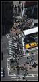
Crosswalkby ManicComment: excellent shot, matt, deserved much better. my guess would be that it was just too 'impersonal' for most voters. |
 Photographer found comment helpful. Photographer found comment helpful. |
| 04/24/2005 09:26:02 PM |
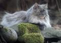
Little Lionby Judith PolakoffComment: what a capture. love the muted tones--they really bring out the features and character of your subject. |
| Photographer found comment helpful. |
| 04/24/2005 09:24:26 PM |
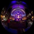
Lady in Redby doctornickComment: well, this sure is an attention getter. i would suggest a slight shadow/highlight adjustment, just to keep it from being so overly dark, as well as to bring out just a bit more detail. considering you're not allowed to carry tripods in here, this is a rather remarkable capture. hope it does well for you. thanks for sharing! |
| Photographer found comment helpful. |
| 04/24/2005 09:21:24 PM |
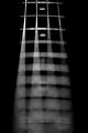
A New Beginningby dwterryComment: cool shot. love the composition and treatment. i'll be surprised to find if this isn't a mavrik shot--it has his fingerprints all over it. hope it does well for you. |
| Photographer found comment helpful. |
| 04/24/2005 09:19:30 PM |
Fall to Chaos...by mexicoComment: i think i would like this much more with different colors. there is just something about the colors and lighting here that makes this feel less of a photograph and more of a piece of art. maybe that's what you intended, but, as is, it doesn't really do anything for me. |
| Photographer found comment helpful. |
| 04/24/2005 09:15:41 PM |
Elizabethby twm122Comment: i think the strong backlighting is really competing with your soft focus, and that it is really taking away from what could be a very lovely image. she is a doll. i think if you had cropped out the background completely, you'd probably have picked up a full point in the voting. as is, the bright background makes her face appear a bit too dark, and the background offers many competing elements. |
| Photographer found comment helpful. |
| 04/24/2005 09:12:35 PM |
Spring Thawby dphillipsComment: i am quite sure you had the best of intentions, but this is really not what i would consider a strong free-study entry. even though the image could use a little work, the bigger issue is using the challenges to put for images that will engage the viewer and keep them looking. the longer you can hold someone's attention, the more likely you will get a good score. here, there is nothing that says look at me, look at me. |
| 04/24/2005 09:10:02 PM |
primo beans (silky jazz)by chuck50124Comment: i see what you're after, but feel you're execution is a bit short. the center arm really needs to be in focus. it's also a bit on the darkside, which robs the image of the textures in the beans. |
| Photographer found comment helpful. |
| 04/24/2005 09:06:28 PM |
Jerry Posesby SchuffComment: cool cat shot, great focus. not too keen on the centered composition, though, as it doesn't really give the image any dynamic. the colors are wonderful. really like you're being down to that level. good luck! |
| Photographer found comment helpful. |
| 04/24/2005 08:54:16 PM |
Bassby hstegComment: while this is an interesting image, it does appear to be a little out of balance. maybe it's an optical illusion, or maybe it is a bit skewed. i like the idea and the treatment, and hope this does well for you. good luck! |
| Photographer found comment helpful. |
Home -
Challenges -
Community -
League -
Photos -
Cameras -
Lenses -
Learn -
Help -
Terms of Use -
Privacy -
Top ^
DPChallenge, and website content and design, Copyright © 2001-2026 Challenging Technologies, LLC.
All digital photo copyrights belong to the photographers and may not be used without permission.
Current Server Time: 07/21/2026 10:55:20 AM EDT.