| Image |
Comment |
| 01/14/2003 11:43:03 PM |
My Eyes Adored You by Frankie Valliby MagsCoyoteComment: Critique Club Comment :
Composition : The 'suggestion of thirds' worked well here, adding to the child's face as the main focus. The crop seems a little tight at the head and toes. And the rug (welcome mat?) in the background kept pulling me off the child's face. Expressions like the one he has are priceless and need to be photographed... It's just a shame that kids won't do those expressions when they have better backgrounds... I've taken to telling my daughter (4) "Don't be cute right now, there are power-lines behind you"... But she just says "Stop being so silly Dad"... You can't win :)
Exposure : The light from the window at the left overexposed the rug a little, but not too bad.
Focus / DoF : You can count the stitches in the knit sweater so I'd have to say Focus is not a problem here :)
Post Processing : It does seem a little grainy / noisey... There is a program (I think it's called NeatImage) that might help clean it up a bit.
Challenge / Interest : Personally I think you should have gone with your honorable mention song title. When I saw the title, the next line popped into my head (every time) 'Though I never laid a hand on you' and it didn't fit as well as "Just the Two of Us" would have. But that's way to picky... Don't listen to me.
My opinion : I have to ask... Is this the same child as in "Mommy's Joke on Dad" reflection entry? If so, he is getting so Big! It's amazing watching the kids grow up here :) |
| 01/14/2003 11:17:14 PM |
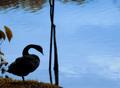
All by myself - Celine Dionby icemarnComment: Critique Club Comment :
Composition : I like the placement of the lonely goose. Conforms well to the "suggestion of thirds". I'm a little distracted by the balance of the left half of the shot to the right half. The left side looks fairly crowded, with the foliage and the goose, while the right side is virtually empty. The tree down the middle seems to add to the division and makes the balance issue even more dramatic.
Exposure : While some may feel the goose is a little underexposed, I would disagree. I think it really adds to the 'lonely' aspect of the shot. Well done!
Focus / DoF : No issue here. Focus is well done.
Challenge / Interest : As I was studying this shot, preparing to do the critique, the song played over and over in my mind... The challenge is met and then some :)
My opinion : With the exception of the balance issues, I felt this was a very well done shot. |
| 01/14/2003 09:57:53 PM |
Whither?by yrkrishiComment: Critique Club Comment :
Sorry this is so late. It's been a rough week.
Composition : I've always loved strong lines and this has them. Simple and well composed.
Exposure : The side of the arch that is in the light is a little over exposed, but not horribly so.
Focus / DoF : It seems a little on the soft side, but that might be due more to resolution then to the focus.
Post Processing : This shot suffers from a lot of grain and noise. Since you were shooting fairly fast and with 100 ISO, I have to assume it was caused by resizing (I could be wrong). There are some very impressive software packages that remove a lot of the noise and grain from shots. Perhaps this image would benefit from one of them.
Challenge / Interest : Challenge is certainly met. This structure is one of the most easily recognized landmarks in the US.
My opinion : I like the simplicity of this shot. Strong lines. But the grain and noise really hurt this shot badly. Very nice entry. |
 Photographer found comment helpful. Photographer found comment helpful. |
| 01/14/2003 09:42:33 PM |
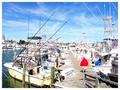
Harborby GraciousComment: Critique Club Comment :
Sorry this is so late... It's been a bad week :)
Composition : A lot of what I'm going to say about composition assumes that you can hover over water. Please feel free to disregard this if that isn't among your talents :) If this could have been taken from about 3 or 4 feet to your left, I think it would have made the dock a strong diagonal into the shot under the diagonals of the poles of the boats... (I don't know if that makes sense or not). As it is the dock slants slightly right to left (from bottom to top) and doesn't generate the same WoW that either a straight line or a more dramatic slant might have. Again, if you haven't learned to hover, ignore this :) I do like the Red jacket dead on the third point. I hadn't noticed the feet until Gordon mentioned it, but I think he has a point.
Exposure : My monitor had the opposite problem, which I was able to correct largely by stealing my wife's monitor. Knowing that your monitor shows darker then standard, you may want to adjust your pictures to be a little darker than you would like. This shot did suffer from the exposure.
Focus / DoF : Focus was well done. No problems.
Post Processing : Last word on your monitor problem... Put this shot on a floppy and bring it to a computer store. Tell the salesman you want to look at monitors and look at this on a different monitor. It may help you adjust your future shots.
Challenge / Interest : Challenge clearly met.
My opinion : I'd like to see this shot again if you could process it on a different monitor. I think it has great potential with the strong lines and the jacket. |
| 01/14/2003 09:11:54 PM |
Celestial Christmasby Mrs. POTUSComment: Critique Club Comment :
Sorry this is so late... It's been a rough week.
Composition : I like the use of negative space (sky) against the positive (building). Very well done. There is just enough foreground(bush) to make for a very pleasing shot.
Exposure : I'm very impressed with how the exposure looks. I REALLY wish you had included the Aperture / Shutter speed / ISO information! The building is a little bright, but considering the challenges of this kind of night shot, that's a very minor point.
Focus / DoF : The lights on the bushes are a little off focus, but I think it adds a dream-like state to the shot. It wasn't a distraction for me.
Challenge / Interest : Challenge certainly met.
My opinion : Great shot :) Please try to include the Shutter speed, etc. in future entries. It's a big help to everyone :) |
| 01/14/2003 08:54:32 PM |
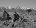
Colorado High Countryby vtruanComment: Critique Club Comment :
Note : Sorry this is so late... It's been a bad week :)
Composition : Strong diagonals and nice divisions... I like the balance between foreground, mountains and sky... Excellently done. The tree on the right is beautifully placed (although I know you didn't plant it).
Exposure : You picked a great time of day for this. The shadows add depth without distracting.
Focus / DoF : Wonderful.
Post Processing : I wonder what this looked like in color. Although that is not to say I don't like the duo-tone. I do, very much... I'm just curious what the color version looked like.
Challenge / Interest : No doubt about meeting the challenge. Even if this is in your backyard, this photo could be in a travel brochure.
My opinion : I didn't give many 10's this week, but yours was one of them. Excellent shot. Congratulations! |
| Photographer found comment helpful. |
| 01/14/2003 04:28:52 AM |
|
| Photographer found comment helpful. |
| 01/13/2003 03:46:40 AM |
|
| 12/31/2002 03:40:09 PM |
Called to Dutyby AaronComment: Tremendous potential in the shot I think you were going for. Post-processing really hurt it for me though. Without the title, I doubt I would have known what you were aiming for. |
| Photographer found comment helpful. |
| 12/31/2002 03:32:48 PM |
Just Around the Bendby karmatComment: I've been trying to develop an appreciation for these kinds of shots, but they still don't work for me. |
| Photographer found comment helpful. |
Home -
Challenges -
Community -
League -
Photos -
Cameras -
Lenses -
Learn -
Help -
Terms of Use -
Privacy -
Top ^
DPChallenge, and website content and design, Copyright © 2001-2026 Challenging Technologies, LLC.
All digital photo copyrights belong to the photographers and may not be used without permission.
Current Server Time: 06/23/2026 10:03:08 AM EDT.