| Image |
Comment |
| 05/26/2003 03:34:23 PM |
Black & Copper Baroqueby amonteforteComment: I'm not sure you understood the challenge. It's a very nice photo, but misses the mark for the challenge by a long shot. |
| 05/16/2003 11:54:17 PM |
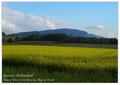
Geneva countrysideby jjbeguinComment: ~ Critique Club Comment ~
Composition : Very nice composition with a "banded" feel. There are several bands of alternating light and dark that work well to my eye. The clouds on the left seem to throw the balance off just a tad, but that's certainly nothing you had control over.
Exposure / Lighting : Lack of EXIF (Aperture/shutter/ISO) data limits anything I would say about exposure or focus. I wish I had that info since my critique is severely limited without it.
Focus : See Exposure.
Post Processing : Nice choice of font and the border is simple and very effective. Any other changes you've made are not apparent and thus were well done :)
Challenge / Wow : Challenge was certainly met. I can easily imagine this as a postcard in a shop. |
| 05/16/2003 10:41:05 PM |
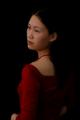
Young-Girlby terry139Comment: Terry... Your obviously very talented. I can't wait to see your future submissions... As I think most everyone has said, this would have been a 10 in a portrait challenge. |
| 05/16/2003 01:51:43 PM |
Divinityby magnusComment: ~ Critique Club Comment ~
Composition : I don't know if anyone mentioned this, but GREAT job with the framing :) It may or may not have been nice to move a tad to the right so the left side of the Chapel was in frame, but I certainly don't think the shot was hurt by the position you took. The steeple climbing into the frame was a master stroke. Very well done composition!
Exposure / Lighting : I like the exposure very much. The frame has enough detail to peak interest, but fades nicely to a pure black of a "border". Kind of a "Where does the picture end and the frame begin" kind of thing. The Chapel, grass and sky are all nicely exposed as well. Did you have to wait long for those clouds? They really made the shot for me.
Focus : Your choice of aperture gave you nice focus on the dark details of your frame as well as keeping the building well focused. Great job.
Post Processing : The bottom border you added looks so much a part of your natural frame that it gave the illusion of "border or framing?" that many commented on. Well done.
Challenge / Wow : No problem imagining this sitting in the Harvard bookstore. You may even want to print up a few as postcards and see if any local tourist vendors want to sell it.
|
 Photographer found comment helpful. Photographer found comment helpful. |
| 05/16/2003 01:32:16 PM |
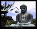
Great Buddahby AntithesisComment: ~ Critique Club Comment ~
Composition : Extraordinary... The positioning of Buddha's head on the "rule of thirds" grid is achieved with a certain something that makes it look very natural and un-contrived. The rest of the frame is filled with interesting curves and lines. Wonderfully done!
Exposure / Lighting : I think the people that mentioned the lack of light on Buddha's face have a point. That may have been the "little extra" needed to escalate this shot to the top. I have never had the pleasure to visit this site, so I'm not sure if a different time of day would have given you better lighting or not. But if you have an opportunity to spend more time here, you may want to shoot a few at different times of day. Particularly early morning or late afternoon, depending on which direction he is facing.
Focus : Flawless.
Post Processing : Extremely professional looking border. Very well done.
Challenge / Wow : The challenge is certainly nailed here. I could easily imagine this shot on a postcard at a vendor. A slightly better lighting situation would have truly nailed the "wow" as well.
My opinion : Great shot! One very small nitpick and I'm not even certain I'm right... Is the title misspelled? I thought it was "Buddha"... I could be wrong and it doesn't make much difference either way :) |
| Photographer found comment helpful. |
| 05/15/2003 10:03:04 PM |
3 cowboysby redhedComment: This had great potential... There are a few problems though. The cowboy on the right has the barrel of his gun chopped off. The black circle thing in the upper left is also distracting. And there is something on the left hand side as well. The focus needs a little work too. Creative idea :) |
| Photographer found comment helpful. |
| 05/10/2003 07:58:01 PM |
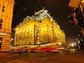
budapest tramby narcboyComment: ~ Critique Club Comment ~
Composition : Extraordinary! I've been wondering if it could have been even more impressive with a tighter crop on the right side. Using a straight-edge, I cropped almost to the building on the right and a bit off the top and to my eye it improved a little. But I could be wrong. What do you think?
Exposure / Lighting : Masterfully done!
Focus : The sharp background building and the motion of the train are perfect. What else can I say?
Challenge / Wow : The challenge is certainly nailed and it certainly has plenty of Wow... |
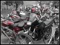
| 05/10/2003 06:43:18 PM |
Odd One Outby starblazerComment: ~ Critique Club Comment ~
Composition : I found it a little difficult to pick out which was the "odd" one. First glance, I thought it was the black bike in the center. Then I thought the bicycle might be the subject and wondered why the front was cut off. From your comment, I see you weren't happy with it either. The background didn't really add anything for me either.
Exposure / Lighting : There is a good range of tones and nothing is over/under-exposed. The lighting seems to lend a 1950's kind of feel to it.
Focus : The unfortunate quality setting really hurt you. The low-res pixelation makes it look out of focus even though it isn't. But you already know that, so I won't harp on it.
Post Processing : 2 post processes stand out here. The border and the de-saturation. The border was well done and added to the photo. This coming from someone that usually doesn't like borders. It was simple and clean. The de-saturation didn't work as well (to my eye). I think maybe there were too many red objects to make it effective. Also the turn signals had some red in them and the de-saturation left them kind of dirty brown. For me, de-saturation works best when you have one object (the subject) that will remain in color. Here the subject got desaturated. While this might work, I didn't feel it worked for you here.
Challenge / Wow : Certainly on target challenge-wise... It was a little too cluttered and low-res to really carry much Wow.
My opinion : Nice effort, but it suffered from the mistaken settings and lack of attention to composition. |
| Photographer found comment helpful. |
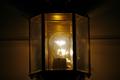
| 05/10/2003 01:18:13 AM |
Imprisoned for lightby autumngirl786Comment: The size of the photo itself hurt this photo for me. You can have up to 640 pixals on the longest side and up to 150 kb total. You lost a lot more of your shot then you needed to by trimming down this small. |
| Photographer found comment helpful. |
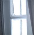
| 05/10/2003 01:15:35 AM |
Painted Glassby CountryGirl03Comment: Clever concept / title. The execution fell a bit short though... The trim on the left is very distracting (the slant) and the white (curtain?) on the right doesn't really add anything. |
| Photographer found comment helpful. |
Home -
Challenges -
Community -
League -
Photos -
Cameras -
Lenses -
Learn -
Help -
Terms of Use -
Privacy -
Top ^
DPChallenge, and website content and design, Copyright © 2001-2026 Challenging Technologies, LLC.
All digital photo copyrights belong to the photographers and may not be used without permission.
Current Server Time: 06/22/2026 04:32:25 PM EDT.