| Image |
Comment |
| 08/07/2002 10:36:00 AM |
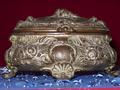
KEEPER OF DREAMSby karolComment: Not quite sure what the blue material is, but it's kinda neat. The diagonal red thingy at the bottom is distracting. The flash lighting is quite harsh, too-- but that thing sure does look old! --5-- sohr |
| 08/11/2002 11:24:00 PM |
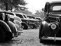
Happy Daysby lecalanComment: I just love this... perfect composition, good contrast and clarity. The B&W is nice and not overdone here. --10-- sohr |
| 08/07/2002 02:43:00 PM |
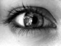
wise eyesby subtleComment: Interesting take on the challenge... these eyes look great-- but not at all old! I love the slight reflection in the eye, and the overall contrast. A great photo... but would've done better in a different challenge. --6-- sohr |
| 08/07/2002 10:37:00 AM |
The Choice of An Old Generationby csbComment: Somewhat dark, and the image doesn't emphasize the age of the subject that much. Still, an interesting inerpration of the challenge. --5-- sohr |
| 08/09/2002 05:51:00 PM |
|
| 08/07/2002 10:20:00 AM |
Kettleby jkiolbasaComment: Lighting is a bit harsh-- the bottom is quite bright while the top is too dark. I know the kettle is old, but that apsect really hasn't been emphasized here (for instance, by focusing on the chips and scratches in the kettle). --5-- jsohr |
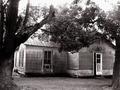
| 08/07/2002 10:45:00 AM |
Decayby FrooberComment: This is one old house! The black and white make this photo look a little flat. The upper portion is a bit overexposed, and the trees framing the house don't seem to help here. --4-- sohr |
 Photographer found comment helpful. Photographer found comment helpful. |
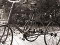
| 08/07/2002 10:10:00 AM |
A Tricycle for the agesby jimmspComment: Definitely looks old! The sepia is a bit overdone here, and there isn't much contrast here. Also, cutting the bike out of the frame in both tires and the handle bars is a bit distracting. --5-- sohr |
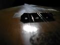
| 08/07/2002 02:45:00 PM |
Baglama's True Dreamby conqComment: This is way too dark to make out much of anything. Unfortunately the most prominent feature in the image is the bit of glare below the fret... --3-- sohr |
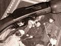
| 08/07/2002 10:41:00 AM |
Family Heirloomby Nswenson0Comment: Nice effort! I love the layout and the composition. The sepia effect seems a bit too strong, and everything (even the antique gun) looks way too smooth to give the impression of being old. --6-- sohr |
Home -
Challenges -
Community -
League -
Photos -
Cameras -
Lenses -
Learn -
Help -
Terms of Use -
Privacy -
Top ^
DPChallenge, and website content and design, Copyright © 2001-2026 Challenging Technologies, LLC.
All digital photo copyrights belong to the photographers and may not be used without permission.
Current Server Time: 07/15/2026 10:34:55 PM EDT.