| Image |
Comment |
| 09/18/2002 11:50:00 AM |
Basic Pool Thermometerby spidermanComment: Greate concept. A bit more finger would have been nice. But I must say this appears to be a well groomed finger... Lighting and focus are good. Good use of negative space. |
| 09/17/2002 11:28:00 AM |
|
| 09/17/2002 08:35:00 AM |
Keyholeby shutterflyComment: Interesting idea. Might have been better if there was something on the other side of the keyhole. Maybe an eye? The focus seems a bit strange, in focus in the middle, out of focus on top. |
| 09/20/2002 10:17:00 AM |
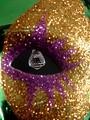
Mask Eyesby SwashbucklerComment: Being the slow person that I am, it took me a minute to realize that this was a mask. Duh. I think that the photo might look better if the mask was just a bit more out of focus. I would have also moved the crystal back just a bit more. I'd like to see just a bit more of it. I like the overall effect of this image. waltoml 7 |
 Photographer found comment helpful. Photographer found comment helpful. |
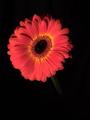
| 09/17/2002 11:19:00 AM |
Midnight Flowerby tapnhodgComment: Interesting Photo. Nice use of negative space. Lighting is good. Focus seems to be off just a bit. |
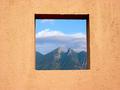
| 09/20/2002 10:18:00 AM |
Framedby lmhrComment: This is a great picture. You have done a great job of using negative space. Lighting and focus are good. Your subject matter is great... (3 greats in one comment... Wow....) waltoml 9 |
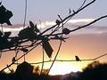
| 09/16/2002 01:20:00 PM |
Find the birdyby smshatsComment: I found the birdie and he seems a bit out of focus. Interesting shot though. I like the lighting. Meets the challenge. |
| 09/17/2002 11:27:00 AM |
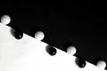
Contrastsby GraciousComment: I like the idea behind this photo. Might have looked better if the lighting was more directly over the black marbles. The shadows kind of take away from the affect. Focus looks good. Good usage of negative space. 7 |
| 09/17/2002 08:34:00 AM |
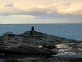
Romantic spotby habesComment: Nice picture. I think it would be better if the foreground was a bit brighter. It could use just a bit of sharpening too. Your subject matter is good and I like the presentation. |
| 09/16/2002 01:22:00 PM |
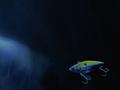
Open Wideby David EyComment: Interesting photo. Seems a bit too dark to me. Focus and lighting are good. Meets the subject challenge. |
| Photographer found comment helpful. |
Home -
Challenges -
Community -
League -
Photos -
Cameras -
Lenses -
Learn -
Help -
Terms of Use -
Privacy -
Top ^
DPChallenge, and website content and design, Copyright © 2001-2026 Challenging Technologies, LLC.
All digital photo copyrights belong to the photographers and may not be used without permission.
Current Server Time: 07/16/2026 05:13:39 AM EDT.