| Image |
Comment |
| 06/07/2004 04:09:52 PM |
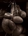
1952 U.S. Olympic Boxing Team by fluxnComment: nice low key shot (I have a soft spot for low key images). I probably would have lit it a bit more from the side to get a little more of the detail in the left hand glove. |
 Photographer found comment helpful. Photographer found comment helpful. |
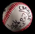
| 06/07/2004 04:08:53 PM |
|
| Photographer found comment helpful. |
| 06/07/2004 04:08:16 PM |
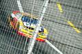
Caged CATby redmondson01Comment: Interesting perspective - I would have preferred the shot if the poll on the fence wan't obscuring the car, and perhaps if the the focus was more on the car, and less on the fence. |
| Photographer found comment helpful. |
| 06/07/2004 04:07:00 PM |
Tap-inby spydrComment: Very nice shallow depth of field shot... |
| Photographer found comment helpful. |
| 06/07/2004 04:06:21 PM |
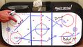
Team USA Trialsby Prof_FateComment: Very intriguing composition! Lots of great color- I like this one a lot even though it seems to be a bit fuzzy at points. |
| Photographer found comment helpful. |
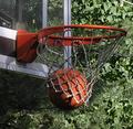
| 06/07/2004 04:05:11 PM |
3 pointerby MarkComment: Hard to get a good moving shot of a basketball through a hoop; the focus seems to be more on the busy background than the hoop and ball, though. |
| Photographer found comment helpful. |
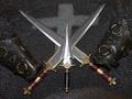
| 06/07/2004 04:04:15 PM |
Before Football Players Wore Armourby theSajComment: hmmm - the 'team' concept isn't entirely clear - three musketeers, perhaps? a little too much shine on the knives, and not enough light on the leather parts, imo... |
| Photographer found comment helpful. |
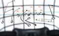
| 06/07/2004 04:02:42 PM |
2 tries and 7 yards to doby menardmamComment: Interesting composition! It's not clear what the 'grid' effect is - I suspect that we are supposed to feel like we are looking through the helmet at the outlined play. The grid and padding at the bottom of picture. Somehow, this picture feels a bit solitary, though... |
| Photographer found comment helpful. |
| 06/07/2004 04:01:03 PM |
Blades of Steelby Toby-DogComment: Content is not clear; while the lens flare is interesting, the rest of the photo seems a bit underexposed. |
| Photographer found comment helpful. |
| 06/07/2004 04:00:22 PM |
Pride of the East Side Rangersby fisheyeComment: Nice photograph - I really like the "tri-color" (red/black/white) effect! The shadow on the right hand side seems a little too dark only because there is writing (the 'Jack' portion). |
| Photographer found comment helpful. |
Home -
Challenges -
Community -
League -
Photos -
Cameras -
Lenses -
Learn -
Help -
Terms of Use -
Privacy -
Top ^
DPChallenge, and website content and design, Copyright © 2001-2026 Challenging Technologies, LLC.
All digital photo copyrights belong to the photographers and may not be used without permission.
Current Server Time: 07/16/2026 06:02:48 PM EDT.