| Image |
Comment |
| 12/19/2004 04:09:59 AM |
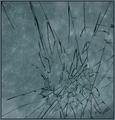
Rail Failby charmayneComment: Clever title and nice composition. I think you handled the exposure on this image quite nicely, given the bright reflection off the surface of the water. |
 Photographer found comment helpful. Photographer found comment helpful. |
| 12/19/2004 03:51:48 AM |
|
| Photographer found comment helpful. |
| 12/19/2004 03:48:50 AM |
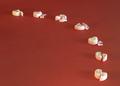
Fallen but Redeemedby Dr.ConfuserComment: Clever presentation and wonderfully creative! Scores well artistically, and there is nothing that I would suggest for improvement, technically.
One other comment. I wonder how this would look against an orange or yellow-orange backdrop...or perhaps an ivory backdrop. I think the red works, but to me it clashes with the theme of redemption. |
| Photographer found comment helpful. |
| 12/19/2004 03:30:25 AM |
|
| Photographer found comment helpful. |
| 12/19/2004 03:28:05 AM |
Pencil's broken...Spirit is not!by glad2badadComment: Very catchy presentation. :)
I like the frame. Some I suspect will comment negatively on it. Overall the lighting was a bit problematic in this shot. The light is a bit harsh, and there's quite a bit of fall-off, with resulting uneven illumination. Colors are vibrant in the foreground, but along with the light, fades away. |
| Photographer found comment helpful. |
| 12/19/2004 03:21:40 AM |
Leaving a trail of broken heartsby dsa157Comment: Excellent creativity, and well executed. I like the framing and layout. The red color is appropriate for the theme and the message. From a technical point of view, I wonder if a soft, diffused light source from directly overhead might have worked better in softening up or eliminating the shadows. The directional lighting from the right side is a bit harsh. |
| Photographer found comment helpful. |
| 12/19/2004 03:17:26 AM |
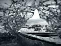
broken into darknessby theodor38Comment: Appears to be glass. Quite interesting. Not sure how you set this up. Would love to read the explanation. Lighting is somewhat harsh. Gives this a raw, gritty feel overall, which I find to be effective. |
| 12/19/2004 03:14:04 AM |
From Where I Sitby tgordonComment: ...a wreck's perspective. I find this photograph to be wonderfully creative. Love the framing. Well done. |
| Photographer found comment helpful. |
| 12/19/2004 03:12:09 AM |
Collisionby thatcloudthereComment: Looks like a stroller in the ditch. Stark, contrast tastefully adjusted. I think this is an appropriate interpretation of the challenge. Wonder if a bit of toning could give this image more emotion, perhaps a steel blue. Of course I like it the way it is. |
| Photographer found comment helpful. |
| 12/19/2004 03:07:07 AM |
The Curseby soccerdadComment: I hope this is not lost on too many DPC'ers. I think you did a creative job interpreting the theme. Perhaps the red channel is a bit oversaturated but doesn't significantly detract from the quality of the picture. Well done. |
| Photographer found comment helpful. |
Home -
Challenges -
Community -
League -
Photos -
Cameras -
Lenses -
Learn -
Help -
Terms of Use -
Privacy -
Top ^
DPChallenge, and website content and design, Copyright © 2001-2026 Challenging Technologies, LLC.
All digital photo copyrights belong to the photographers and may not be used without permission.
Current Server Time: 07/22/2026 05:38:19 PM EDT.