| Image |
Comment |
| 02/02/2005 03:48:01 PM |
|
 Photographer found comment helpful. Photographer found comment helpful. |
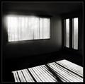
| 02/02/2005 03:46:38 PM |
Sunlitby mocabelaComment: What a fantastic idea. What would have really worked better is if there was something more interesting immediately ouside the window, casting a shadow into the room. Still, this is a nice, clean, graphic composition. Well done, 8 |
| Photographer found comment helpful. |
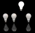
| 02/02/2005 03:44:24 PM |
Lightestby dan_pendletonComment: I love the simplicity of the composition. Quite effective and cropped just right. I like how the position of the lightest bulb corresponds to the shadow position of the other three bulbs. Well done. 7 |
| Photographer found comment helpful. |
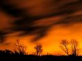
| 02/02/2005 03:41:37 PM |
By the Light of the Moonby tazzaComment: Have you considered a hue shift? I wonder how this would appear in an electric blue. I think the stars save this exposure, as the lower right is a bit hot. Had you decreased the exposure length, perhaps those stars might have not manifested itself. Overall a very dramatic and mysterious entry. 7 |
| Photographer found comment helpful. |
| 02/02/2005 03:38:17 PM |
Mom? They 're back!by drydocComment: I really like this. Great contrast of ice cold blue interior and glowing hot (lightbulb?) underneath the bed. 7 |
| 02/02/2005 03:35:37 PM |
Dawn's Early Lightby CantiqueComment: Fantastic exposure. Excellent tonal range with subtle shades of blue/purple hills and magical glow in the sky. Perhaps a hair more sky and a hair less house/roof, or selectively silhouette the buildings below. I'll score this one a 7 |
| Photographer found comment helpful. |
| 02/02/2005 03:33:14 PM |
The Light of Zarthaby real_ndnComment: Wild plasma glow. I have no idea what this is, or who or what Zartha is, but this image just has a lot of WOW. Very well captured. 8 |
| 02/02/2005 03:31:25 PM |
... As a Featherby md8speedComment: Excellent high key exposure. Simplicity can be very effective as you have shown here. My only recommendation would be to soften the edges of the shadows which were more sharply demarcated after your post processing, and perhaps to remove the border, or have a thin solid black one. Very well done overall. 7 |
| 02/02/2005 03:28:21 PM |
Source of Lightby mpalitangComment: Sometimes simplicity is the answer, and I think you've effectively utilized it.
I like this entry but I feel this could be improved if it was focused a tad bit better, or selectively sharpened a hair more at the screw. The grey backdrop is not very flattering. I suggest going for a more high key approach, or a low key, perhaps a black backdrop. Still, overall a good entry. |
| Photographer found comment helpful. |
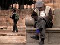
| 02/02/2005 03:23:11 PM |
Light Afternoon Napby MalokataComment: Nice take on this challenge. Very imaginative and your composition of the contrasting figures is quite excellent. Perhaps if you had shot a tad bit wider, to put more space between the elderly gentleman's head and the edge of the frame, the image would not be as claustrophobic. Especially given his dozing pose, he really looks cramped :-)
Overall I really like this one and I will score this one an 8. |
Home -
Challenges -
Community -
League -
Photos -
Cameras -
Lenses -
Learn -
Help -
Terms of Use -
Privacy -
Top ^
DPChallenge, and website content and design, Copyright © 2001-2026 Challenging Technologies, LLC.
All digital photo copyrights belong to the photographers and may not be used without permission.
Current Server Time: 07/18/2026 02:31:40 AM EDT.