|
|
|
Showing 1081 - 1090 of ~1363 |
| Image |
Comment |
| 11/26/2004 03:55:52 AM | Remember 1939-1945by simbambaComment: This photo does not readily make a strong connection with the challenge theme, perhaps more of a symbolic link. This entry has many strong points, especially artistically and technically. The foreground subjects are adequately in focus, and display good detail. There is good tonal range with interesting shadows. The crop and point of view is good and there is a harmony of proportions to my eye.
This photo would probably have been stronger in a challenge called "Remembrance". |  Photographer found comment helpful. Photographer found comment helpful. |
| 11/26/2004 03:52:41 AM | Demanding your presenceby panoramixComment: Connection with challenge theme: strong, obvious, concrete.
Technical: No glaring deficits. The focus, detail, tonal range, and color are adequate.
Artistic: Here's where I would deduct some points. Overall I think you chose a strong subject for this entry, as the beckoning finger has obvious implied authority. I feel though that the white backdrop and tight crop of the hand does not have enough visual impact. Perhaps if you told more of the story, by including a face, or a second subject who is on the receiving end of the finger, this entry would draw more interest.
Overall a good photograph on technical merits. | | Photographer found comment helpful. |
| 11/26/2004 03:44:26 AM | Tybee Lightby ejonesComment: Connection with challenge theme: low, symbolic, concrete, obscure.
"Ordered by General James Oglethorpe, Governor of the 13th colony, in 1732, the Tybee Island Light Station has been guiding mariners safe entrance into the Savannah River for over 270 years." (www.tybeelighthouse.org). This particular symbolic landmark has implied authority. Unfortunately, 99.935% of viewers will miss the point.
Technical:
(+) points: focus, exposure, tonal range, saturation, detail.
(-) points: nothing overtly glaring.
Artistic: I'm a fan of lighthouses. I wish you had not used this particular angle. Ideally, a lighthouse should be shot from afar at a near horizontal angle with a large telephoto lens, and with an interesting sky/horizon as a backdrop. You cropped off/excluded the bottom of the lighthouse, which is a shame. The flag is quite interesting visually. The sky is rather mundane and adds little to this photo.
Overall: You chose a rather obscure symbolic tie with authority which may not be readily associated by the casual observer. The photograph has technical integrity but points were accordingly taken for the above stated artistic shortcomings.
Recommendations: A different title other than "Tybee Light" may have steered the viewer to make an easier connection with this shot. Other recommendations as stated in the artistic section. Overall I think you chose an interesting subject but it could have been more visually distinctive had you used a different point of view. |
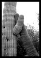
| 11/26/2004 03:23:15 AM | Big Daddyby alphakappaComment: Connection with challenge theme: low, symbolic, concrete.
Technical:
(+) focus, tonal range of midtones and shadows, cropping.
(-) some loss of detail on the cacti, blown out sky.
Artistic:
I think the overall composition is to the point you are conveying (concrete vs abstract). You chose a rather interesting take on this challenge. I disagree with utilizing these two particular cacti as symbolic of 'father figure' authority. Perhaps if that 'big daddy' was spanking junior, or displaying a gesture of authority, your interpretive entry would hold more strength.
Overall: Your symbolic yet concrete entry is not readily a display of authority, and thus the connection with theme is rather low. There are some technical details which detract from the overall merits of this photo, and points were accordingly taken. Your entry has strengths which may have been better utilized in a different challenge.
Recommendations: Take care not to blow out highlights...utilize all areas of the photo to its greatest potential, unless you are blowing out highlights as an artistic gesture. Stronger sharpening may have brought out more details. This entry would be stronger in a challenge called "Sympathy".
| | Photographer found comment helpful. |
| 11/26/2004 03:05:55 AM | "He's always watching"by jmassungComment: Nice saturation of colors. Soft focus, but along with the warm lighting gives this a characteristic mood. Overall a good entry.
The challenge allows you to make use of 640 pixel dimensions...gives the image more visual impact to make full use of the allowance. | | Photographer found comment helpful. |
| 11/25/2004 05:07:52 AM | Lost in Timeby kirbicComment: Connection with challenge theme: apparent, symbolic, concrete.
Technical merits: Focus is inadequate, and slightly overexposed. Color is somewhat problematic with a strong reddish cast in the shadows and greenish cast in the highlights. Shadows lack detail due to overwhelming dynamic range.
Artistic merits: Couple conveys your message very well. Some unnecessary and distracting elements in the framing to the left and uppermost edge. I think a different angle may have served you better.
Overall: I like your approach (concrete symbolic) to this challenge theme. The execution was somewhat flawed on technical grounds, as well as artistic grounds as outlined above and points were taken from both arenas. | | Photographer found comment helpful. |
| 11/25/2004 04:56:46 AM | passing timeby speaseComment: Connection with challenge theme: Strong, literal/concrete
Technical merits: Good focus and detail. Sharpened adequately. Lots of scratches and imperfections which could have been rectified under advanced editing rules. A levels adjustment or contrast adjustment would have given this more punch as well as darken the numerals. Cropping is somewhat inadequate in the sense that there is a fair amount of dead space to the right.
Artistic merits: I think you chose a good clock to work with. This image has a lot of potential. I think the shadow on the top portion should have been eliminated by repositioning the clock face or adjusting your lighting.
Overall: You took a literal take on the challenge theme and used a concrete approach which was flawed by technical and artistic issues as described above. |
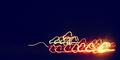
| 11/25/2004 04:48:09 AM | ZiP!by jmleliiComment: Connection with challenge theme: strong, literal, abstract
Technical merits: Focused, sharp. Slightly overexposed. Some extraneous detail surrounding the digits detracts.
Artistic merits: Good cropping, and the blue luminescent motion trails add flair. You've taken a literal approach to the challenge theme with an abstract spin.
Overall: This is a rather interesting approach which works fairly well, but some points were taken for technical reasons as outlined above. | | Photographer found comment helpful. |
| 11/25/2004 04:28:32 AM | Winter Migrationby GeneralEComment: Not quite sure of the connection with the challenge theme.
Concerning the technical merits of this photo: The lights are quite a blur and appear haphazard and the subejct is not readily discernable (translation: what am I looking at here?). Whatever this photograph is portraying, the focus appears to be good and the image has adequate sharpness. This is overall much too abstract and while I like abstract, there has to be a certain level of "frame of reference" upon which the viewer can make a judgement. Sorry. | | Photographer found comment helpful. |
| 11/25/2004 04:23:08 AM | Tender Momentsby crabappl3Comment: This photograph fares well on technical merits: the focus, tonal range, detail, and post processing is good.
What is not readily apparent is the connection with the challenge theme. Perhaps this would have been better served in a different challenge. | | Photographer found comment helpful. |
|
Showing 1081 - 1090 of ~1363 |
Home -
Challenges -
Community -
League -
Photos -
Cameras -
Lenses -
Learn -
Help -
Terms of Use -
Privacy -
Top ^
DPChallenge, and website content and design, Copyright © 2001-2026 Challenging Technologies, LLC.
All digital photo copyrights belong to the photographers and may not be used without permission.
Current Server Time: 07/18/2026 07:53:39 AM EDT.
|