| Image |
Comment |
| 12/03/2007 09:02:49 PM |
|
 Photographer found comment helpful. Photographer found comment helpful. |
| 12/03/2007 09:01:31 PM |
|
| 12/03/2007 08:52:56 PM |
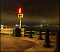
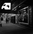
A Sharp Leftby RulerZigzagComment: I really like the light above the city. Maybe if you had stood to the left of the sign, the arrow could have pointed to it. Who knows, but I like the shot. I think having that little piece of the sky lit really helps move the eye around the image. |
| Photographer found comment helpful. |
| 12/03/2007 08:49:52 PM |
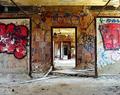
Colonialby RulerZigzagComment: For the challenge, I don't know if it worked so well. But as an image not bound by challenge constraints I think it is really cool. A case where a centered crop makes it harder to comprehend as my eye doesn't know where to go. It has wonderful oddness I can't quite place. |
| Photographer found comment helpful. |
| 12/03/2007 08:46:27 PM |
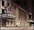
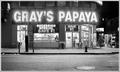
Recession Specialsby RulerZigzagComment: I think this is one of those you could point to years down the road and it would be a good hallmark of the way it was. |
| Photographer found comment helpful. |
| 12/03/2007 08:45:18 PM |
|
| Photographer found comment helpful. |
| 12/03/2007 08:43:43 PM |
|
| Photographer found comment helpful. |
| 12/03/2007 08:42:52 PM |
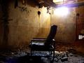
Illuminateby RulerZigzagComment: I like this alot, especially the light reflecting off the seat, I think if you could have moved the chair and framed the shot without the light it would be perfect, I could be wrong as I do like it the way it is too. :) |
| Photographer found comment helpful. |
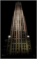
| 12/03/2007 08:40:58 PM |
Rockerfeller's Officeby RulerZigzagComment: I like this and I am no good speler and wouldn't have noticed the title.
I noticed a few people said it would have been better off to one side, I disagree, I think it would have been cool dead center, but make sure it is perfectly vertical, it seems to be leaning to the right. it has a nice ominous feel to it. |
| Photographer found comment helpful. |
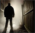
| 12/03/2007 08:37:27 PM |
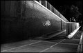
the Point of no Returnby RulerZigzagComment: Congrats on your top ten, I spy the bbq, maybe you were up for a heavenly cook off :P
Kidding aside, this is great work with natural elements and not setting up some lights. |
| Photographer found comment helpful. |
Home -
Challenges -
Community -
League -
Photos -
Cameras -
Lenses -
Learn -
Help -
Terms of Use -
Privacy -
Top ^
DPChallenge, and website content and design, Copyright © 2001-2026 Challenging Technologies, LLC.
All digital photo copyrights belong to the photographers and may not be used without permission.
Current Server Time: 06/26/2026 06:39:12 PM EDT.