| Image |
Comment |
| 01/16/2006 10:21:49 AM |
|
 Photographer found comment helpful. Photographer found comment helpful. |
| 01/16/2006 10:20:27 AM |
|
| Photographer found comment helpful. |
| 01/16/2006 09:27:37 AM |
|
| Photographer found comment helpful. |
| 01/16/2006 09:26:57 AM |
|
| Photographer found comment helpful. |
| 01/13/2006 02:49:15 PM |
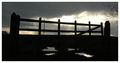
Gateby NigelBComment: CRITIQUE CLUB!
i think this was a great idea for this challenge. the primary issue i see is that you don't really focus on any one particular shape for the viewer to lock onto. the center fence posts and rails have strong shapes, particularly in silhouette, and it might be more effective to crop into that area.
the reflection in the puddle is also nice, but it presents another shape in the photo that compromises the viewer's focus.
i think using the color in the lower left of the sky would also help beautify the shot as well. everyone likes cool sky colors.
rob |
| 01/13/2006 02:43:14 PM |
Morning Dew by PoobaComment: CRITIQUE CLUB!
well, there's not a lot i can say about this great image. it's really well-done and was perfect for this challenge.
the only comments i have are that the bright white area to the left pulls the viewer's eye that way somewhat, and the shapes in the background also detract from the web itself (i keep wondering what that is back there?) i wonder if recomposing the shot so that the web and drops are the only significant shapes would give it more impact? just curious.
in any case, congrats on a fine shot and your first ribbon. |
| Photographer found comment helpful. |
| 01/13/2006 02:39:58 PM |
Above It Allby adyusComment: CRITIQUE CLUB!
i think this is a fine skyline view, but i'm not sure this is the most effective type of shot for this challenge.
this is a great point of view of a city, but to me it doesn't say a lot about life within the city itself. the image itself is full of different places to look, but leaves the viewer without a single focal point on which to concentrate. perhaps trying to isolate a few of the more interesting buildings might have been better?
i would also try to increase the contrast of the image. the colors all seem very flat -- it appears that the day was kind of hazy anyway, but you can boost the range of tones throughout the image and give it a bit more impact.
rob |
| 01/13/2006 02:36:27 PM |
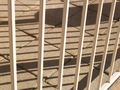
bars and concreteby blacksheepComment: CRITIQUE CLUB!
i think the use of the bars and the shadows is a very effective way to meet this challenge. an image with such striking lines as this one would work well. however, there are a couple of things that might be better.
cropping the image so that the lower right corner might help, as that bit of wall (?) detracts from the patterns in the rest of the image. it would also be more effective if the shadows were only of the bars in the fence; the large shadow towards the top takes away from the rest of the shadow pattern. finally, the image itself is a little small. something like this with strong lines and good patterns deserves a larger canvas. plus, lots of voters tend to vote down images that don't meet the 640px maximum size in at least one direction.
good choice of topic, though. keep shooting!
rob
|
| Photographer found comment helpful. |
| 01/13/2006 02:33:00 PM |
non-dynamic duoby gocComment: CRITIQUE CLUB!
i think using these lamps was a really good idea for the challenge. however, i am not sure this is the most effective composition. as it is, it seems to lack impact, and there doesn't seem to be a single focal point for the viewer to refer to.
i like that you used the rule of thirds to some extent -- the lights are above the horizontal center of the image. perhaps a more effective use might have been a long vertical image with the shape of one of the lamps in the bottom third? just an idea.
i hope this helps. i'd like to see some more shots using these shapes, perhaps in pure black and white, and perhaps with one of the lamps shining on something else that has a strong shape.
rob |
| Photographer found comment helpful. |
| 01/12/2006 04:18:50 PM |
Smile!by slo007Comment: this is a good shot, but not for this challenge and it's too small. |
| Photographer found comment helpful. |
Home -
Challenges -
Community -
League -
Photos -
Cameras -
Lenses -
Learn -
Help -
Terms of Use -
Privacy -
Top ^
DPChallenge, and website content and design, Copyright © 2001-2026 Challenging Technologies, LLC.
All digital photo copyrights belong to the photographers and may not be used without permission.
Current Server Time: 07/22/2026 09:03:23 PM EDT.