| Image |
Comment |
| 02/25/2003 10:24:59 PM |
|
 Photographer found comment helpful. Photographer found comment helpful. |
| 02/25/2003 10:24:31 PM |
|
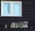
| 02/25/2003 10:24:10 PM |
Plimsol Lineby FreebieComment: Unique shot with great appeal. I don't know what that heap of stuff on the right of the shelf is, but it knid of distracts. Otherwise, I just wish the colors of the shoes were varied more so that it brought more contrast between them. |
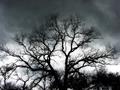
| 02/25/2003 10:21:08 PM |
Before the Stormby xertionComment: I love the halo around the individual branches. I'd love to know how you shot and post-processed this. |
| Photographer found comment helpful. |
| 02/25/2003 10:20:40 PM |
Communicate hereby vjozComment: Perfect stock photo image. My only comment is that the crop might be too tight for a stock photo (us wacky designers just love to do our own cropping), but I'm not holding that against you. This is a very nice image and at a great angle. |
| Photographer found comment helpful. |
| 02/25/2003 10:19:22 PM |
Snowstormby chakkobboComment: I would like to see this image so that the colors weren't so washed out. Otherwise, this is really a great image that I could definitely see multiple uses for. If you have Photoshop, try playing with the Levels to make the color of the photo really pop from the white of the snow. |
| 02/25/2003 10:14:55 PM |
America's Bad Boyby psychephylaxComment: CRITIQUE CLUB! (Mmmmmmm...critique club *drooooool*)
Great idea and a unique submission to the Yellow challenge.
I'm a big fan of DOF and think that it was very well-done in this image.
I'm with the commenters that say the placement of the figurine might have been better if it had included all of the picture of the family or, at least, Homer rather than Bart in that image. Still, the way it's superimposed on the photo is great.
My only other little nitpick -- and it is little -- is that the color of Santa's Little Helper in the photo almost blends in to the red of the figurine's shirt. DOH! I know it's minor, but it's just one of those things that you notice when you stare at a picture for a while.
I'm actually surprised that there weren't more similar entries in the challenge, but I think this was just perfect. And, better still, it really popped out at me from the thumbnail page.
Rob |
| Photographer found comment helpful. |
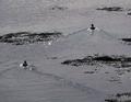
| 02/25/2003 10:09:54 PM |
Untitledby KarenBComment: CRITIQUE CLUB!
I hate critiquing photos of people I know -- I'm just sure they're going to get upset. Sorry in advance.
What I like:
I love the ducks in motion -- their trails are really just perfect for this challenge, although it's something I probably wouldn't have thought of. Very enjoyable idea.
What I don't like:
The breaks in the water -- I can't tell what they are. Shallow water around grasses? Sandbars? I don't know. Unfortunately, they detract from the ducks which are the focus. Also, the two ducks going in similar but definitely different directions throws off the "rhythm" of the photo. If I didn't know what the challenge topic was, I'd probably not pick up on rhythm being the theme.
Suggestions:
Maybe zooming in closer on one duck and focusing the frame on his wake? Or, if multiple ducks were the goal, maybe capturing them without the grasses would help the negative space define the wakes so they'd stand out more?
Very nice idea, though. I do think that the wakes were a great interpretation of the topic.
:)
Rob |
| Photographer found comment helpful. |
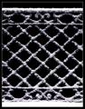
| 02/25/2003 10:03:15 PM |
Benched Snowby crabappl3Comment: CRITIQUE CLUB!
See, now there you have it. This was one of my top picks for the challenge. I always end up critiquing the photos that I think were really good to begin with.
Two comments here, really. First -- the shadows on the lower right of the wires. I'm not sure what the background is here, but the shadows blend right into it. I would like to see them pop from the background more -- if for nothing else than to just give a sense of depth. Secondly, and you may think I'm nuts, but for this challenge I think a closer crop on the top and the bottom (so that just the bench back is showing) would be better. This would fill the frame with the "rhythm" that is, after all, the subject.
Nicely done. If you're aching for more snow to shoot, I've got 14 inches on top of 1.5" of ice in my yard. Knock yourself out. BYO shovel. :)
Rob |
| Photographer found comment helpful. |
| 02/25/2003 09:59:17 PM |
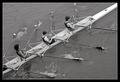
Stroke!by GordonComment: CRITIQUE CLUB!
There's really not much here for me to say. This is a well-done image, perfect in black and white, btw, and really makes me miss my crew days at IU.
My main irk is in the framing -- I'm not sure why the person on the left got cropped out (or just left out of the shot), but it does seem somewhat abrupt and leaves his oars out hanging. I would also like to see this with a little bit more of a severe contrast to see if the waterbreaks could be more like whitecaps and generally make the boat separated from the water more. Did that make sense?
Lovely photo. I can't wait to shoot outside again.
Rob |
Home -
Challenges -
Community -
League -
Photos -
Cameras -
Lenses -
Learn -
Help -
Terms of Use -
Privacy -
Top ^
DPChallenge, and website content and design, Copyright © 2001-2026 Challenging Technologies, LLC.
All digital photo copyrights belong to the photographers and may not be used without permission.
Current Server Time: 07/18/2026 12:41:24 AM EDT.