| Image |
Comment |
| 08/10/2003 04:31:09 PM |
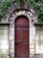
Mausoleumby drydocComment: Greetings from the Critique Club (and congratulations on having such a fine camera ;) )
What I like about this shot: Interesting subject and well-framed by the vines. Makes the viewer wonder what's in there, or what the door leads too. Coloring and focus are both very well-done.
My only suggestion, really, would be the composition of the photo. Having the door dead-center (no pun intended) makes the photo seems somewhat dull and doesn't lend itself to much creativity. If it had been me, I would have tried some shots from a lower angle to make the door seem more massive or eerie.
Great shot and good score. Keep up the good work. Make us DiMAGE people look good...
Rob |
| 08/10/2003 04:27:17 PM |
Take A Chanceby Faye PekasComment: Greetings from the Critique Club
I want to start out by saying that I think this is a crack-up and if it had been done just a little bit better would have been the perfect photo for this challenge. Quite ingenious, actually.
Some suggestions:
Lighting -- it appears that a flash was used (?), which led to the uneven lighting of the eagle in front and the muddy colors of the other animals around the periphery of the frame.
Focus -- the animals at the top of the heap show some signs of hand-shake of the camera when the photo was taken.
Framing -- for this challenge in particular, it would really help if the pile of animals alone was in the frame. Showing the claw and the ceiling at the top interrupt the effect of the animal pile.
Great idea -- keep on trying
Rob |
| 08/10/2003 04:14:56 PM |
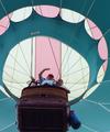
Up Up and Awayby TerryGeeComment: Hi from the Critique Club --
Side Note: I was going to try and go to a hot air balloon race in the early morning last week but when I got up (at the crack of dawn -- *yawn*) the weather was all crummy. DANG! I'm glad you had better luck.
Overall this is a great photo. Detail and subject are both excellent, and I really enjoy the angle from which this was shot.
My only comment, really, would be that it's kind of dark. I know that you were in the shadows, but a lot of the basket's detail is lost, unfortunately.
Congratulations on a great photo. I'm sure you have lots of fun captures from the balloon festival.
Rob |
 Photographer found comment helpful. Photographer found comment helpful. |
| 08/10/2003 04:12:18 PM |
Get That Thing Out Of My Faceby spillerComment: Hi from the Critique Club --
Great capture. I hope that no photographers were injured in the making of this photo.
What I Like: Focus, detail, and cropping are all excellent. The cat is off-center, which makes it more interesting. Congrats on not falling in the "center the snapshot in the frame" trap.
What Could Be Better: Playing with the lighting or levels might make the white fur pop a little bit more. As it is now, the colors and contrast are relatively muted overall. And, as a cat owner myself, I just try to get away from the standard pet photo. Push yourself to find something different to shoot. Sometimes it's difficult to have a stand out photo when there are already 5 cat shots in the same challenge. This is just my opinion.
Congratulations on a great capture.
Rob |
| Photographer found comment helpful. |
| 08/10/2003 04:09:05 PM |
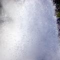
qssssssss....by vignirComment: Greetings from the Critique Club --
My main concern with this photo is that the subject is very difficult to discern. I'm all for abstract photography, but this looks like you were actually trying to frame a subject and just didn't quite do it. One suggestion would be to not have such a tight crop; this would allow the viewer to put the subject in perspective and see that it's a hot spring. It would also allow them to see the scale of the water burst.
On the right side of the photo, the detail, focus, and lighting are just excellent -- really exemplary. If the subject were better defined, this would make a much better photo.
Rob |
| Photographer found comment helpful. |
| 08/10/2003 04:05:48 PM |
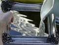
Filling The Frameby GarrickStaggsComment: Greetings from the Critique Club.
Well, I'm going to start out by saying one thing: I personally dislike "Play on Words" photos. That's just me, and I don't represent DPC in any way.
What I like: For being a hardy-har-har type photo, this is actually pretty good. The frame and pitcher are both pleasing and interesting pieces, and the water background adds great depth (no pun intended) to the photo.
What I don't like: First, the photo is too small. With your soopa-camera, you should be able to submit a 640x480 image easily. Secondly, the color is washed out. This wouldn't be so noticeable except for the hand in the photo -- it definitely looks shadowed. Try not using auto-levels in Photoshop -- it's a mathematical calculation. Try instead manually adjusting the levels to see the variations. It's very cool. (In one of my "How'd They Do That?"s I mention my hatred of auto-levels -- here's a link.)
Overall, a great start. Welcome to DPC and keep at it.
Rob |
| 08/10/2003 11:18:19 AM |
Book Pages Cascadeby nathaliedooComment: Hi from the Critique Club --
Overall, this is a great macro image with excellent focus and lighting. I really enjoy the color on this as well.
What I like: perfect subject -- nice abstract and well-done. The repetitive pattern of the pages is well thought-out and not too rigid. I also like the shallow angle so that you cannot actually read any words on the pages -- the mystery there is nice.
What I don't like: really, there's not much to dislike. The only part that i see that detracts from the image is the section on the lower right where you've actually shot THROUGH the book and can see the lighting and backdrop. It's not that this is bad, but it interrupts the pattern that is the focus of the photo.
Congratulations on a great entry and a very good score.
Rob |
| 08/08/2003 11:44:22 AM |
Shed Doorby patriciabrown2001Comment: the lighting in this photo is a little dingy. the photo could pop more if you played with the levels. |
| Photographer found comment helpful. |
| 08/08/2003 11:39:16 AM |
|
| Photographer found comment helpful. |
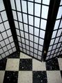
| 08/08/2003 11:38:00 AM |
Made in Taiwanby GeorgesBogaertComment: IMHO the screen by itself without the floor would have looked better (like on a plain backdrop). i really like the angle of the shot, but the additional squares on the floor turn this image into more of a jumble. |
| Photographer found comment helpful. |
Home -
Challenges -
Community -
League -
Photos -
Cameras -
Lenses -
Learn -
Help -
Terms of Use -
Privacy -
Top ^
DPChallenge, and website content and design, Copyright © 2001-2026 Challenging Technologies, LLC.
All digital photo copyrights belong to the photographers and may not be used without permission.
Current Server Time: 07/18/2026 04:18:21 PM EDT.