| Image |
Comment |
| 08/20/2003 03:38:45 PM |
|
 Photographer found comment helpful. Photographer found comment helpful. |
| 08/18/2003 09:01:37 AM |
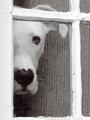
Peek by AleciaComment: YAY ALECIA!
Congrats on your ribbon! This is an excellent photo!
rob |
| Photographer found comment helpful. |
| 08/14/2003 09:20:19 AM |
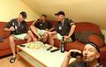
Cloning: Now I can really play with myself!by kiwinessComment: well, i'm throughly jealous that your shot did so much better than mine. i guess there aren't enough tennis fans on dpc. :)
congratulations on a great finish and a great shot.
your partner in cloning,
rob |
| Photographer found comment helpful. |
| 08/11/2003 08:59:23 AM |
|
| Photographer found comment helpful. |
| 08/11/2003 08:44:42 AM |
|
| Photographer found comment helpful. |
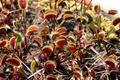
| 08/10/2003 10:49:33 PM |
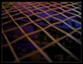
Sticks and Strawby cosmichaikuComment: Hi from the Critique Club --
The patterns and textures in this shot are just wonderful. I love the way the lines are all perpendicular, but don't interfere with each other. Very well composed and executed.
My only suggestion to help this out would be to try to bounce your lighting off of a white (or other semi-reflective surface) in order to minimize the glare. There's a large hot spot right in the center of the frame, and a couple of other shiny areas throughout. Bouncing light onto the subjects would result in fewer glares and more even lighting throughout.
Congrats on an excellent score and a great image.
Rob |
| 08/10/2003 10:46:41 PM |
Tightly Strungby KonadorComment: Hi from the Critique Club --
Ben, Ben, Ben...I should have known this was you. :)
As usual, the photograph is technically excellent and very pleasantly framed. This also would have been a great entry for Right Angles.
My only two comments are that the background, since it IS kind of abstract, might not have worked so well in this challenge because it pulls the eye from the subject. In a larger shot where we can see that it's actually the case, that might make more sense.
Secondly, I would like to see a version of this where the focus is on the very foreground and the racquet stretches out of the DOF into the distance. Just a thought....would be nice to compare the two.
Congrats on shooting my favorite sport! You should appreciate my Future entry if you're a fan as well.... :)
Rob |
| Photographer found comment helpful. |
| 08/10/2003 10:42:16 PM |
They're Everywhereby KevinRiggsComment: Hi from the Critique Club --
What I like: focus, clarity, and lighting are all outstanding in this shot. You did a really good job, technically.
What could be better: A couple of your comments were spot on IMO. A tighter framing of a few blossoms (? whatever they're called...) might be a more interesting shot. This would also take care of the narrow DOF, as you'd be focusing on fewer subjects. Don't get me wrong -- the DOF is great and I'm jealous 'cause my attempts at it always stink.
And, as someone else mentioned, for the "fill the frame" challenge, you'd probably do best not to leave a blank corner in your photo.
Overall, a very nice shot. |
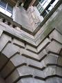
| 08/10/2003 10:33:30 PM |
Manor Masonaryby PaulMdxComment: Hi from the Critique Club --
I think this is a lovely shot and I really enjoy it.
What I like: angle, focus, and majority of the lighting are great. not too dark, which is great considering you look like you were in the shadows.
What could be better: the glares in the windows at the top distract from the photo. they pull the viewer's eyes up there where the less interesting parts of the photo are.
your friend was right in that this photo IS lacking a focal point, but you don't always have to have one, IMO. to me, the pattern of the rectangular blocks is the most interesting, and i think a fine photo could be made of that. as it is, there are too many differing patterns here to have any rhthym.
i would also like to see this in b/w (but, knowing me, i'd like to see just about everything in b/w). i think that would help even out the photo, eliminate the distractions caused by the moss, and reduce the impact of the glare in the windows.
Still, the striking angle of this photo is the best part.
Rob |
| Photographer found comment helpful. |
| 08/10/2003 05:50:48 PM |
|
| Photographer found comment helpful. |
Home -
Challenges -
Community -
League -
Photos -
Cameras -
Lenses -
Learn -
Help -
Terms of Use -
Privacy -
Top ^
DPChallenge, and website content and design, Copyright © 2001-2026 Challenging Technologies, LLC.
All digital photo copyrights belong to the photographers and may not be used without permission.
Current Server Time: 07/19/2026 12:22:15 AM EDT.