Hi from the Critique Club --
I think this is a lovely shot and I really enjoy it.
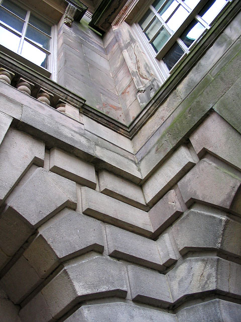
What I like: angle, focus, and majority of the lighting are great. not too dark, which is great considering you look like you were in the shadows.
What could be better: the glares in the windows at the top distract from the photo. they pull the viewer's eyes up there where the less interesting parts of the photo are.
your friend was right in that this photo IS lacking a focal point, but you don't always have to have one, IMO. to me, the pattern of the rectangular blocks is the most interesting, and i think a fine photo could be made of that. as it is, there are too many differing patterns here to have any rhthym.
i would also like to see this in b/w (but, knowing me, i'd like to see just about everything in b/w). i think that would help even out the photo, eliminate the distractions caused by the moss, and reduce the impact of the glare in the windows.
Still, the striking angle of this photo is the best part.
Rob |