| Image |
Comment |
| 07/08/2005 09:46:53 AM |
|
| 07/08/2005 09:45:57 AM |
|
 Photographer found comment helpful. Photographer found comment helpful. |
| 07/08/2005 12:23:40 AM |
Mayday ! Mayday !by taterbugComment: **critique club**
great shot, especially considering the camera :D
this has great lines and really good color to it. i would suggest adding another light from underneath and behind to further define the thickness of the guitar. right now it seems to blend into the background and looks almost fake-thin.
i'm sure the graphics on the guitar are cool, from this angle they do kind of distract. while the colors are great, the darker splotches detract from the photo overall.
finally, the backdrop should either be more prominent or removed. the blue ghosting in the background is almost enough to be distracting. |
| Photographer found comment helpful. |
| 07/08/2005 12:14:15 AM |
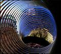
Line of the ringby FyzarlComment: **critique club**
great job on this shot. a macro AND a leading line to boot.
this photo has a very appealing composition to it. coloring is great (although a true black and white with some more contrast and, perhaps, noise would be fun to see too).
other than trying some different color variations, i don't know what else i can do to help you improve upon this. it's really well-done. |
| 07/08/2005 12:08:33 AM |
Where will the rails meet the wires?by redpandaComment: **Critique Club**
color in this shot is quite good. the yellow platform complements the blue and green nicely. however, i have to agree with what many of the other commenters have said: there are almost TOO many lines here to define which are supposed to be the focus.
"leading lines" are supposed to either draw you into the photo or draw your attention to look at something. this photo suffers from too many conflicting lines and doesn't lead the viewer anywhere. without the title, there wouldn't be much of a subject at all. |
| 07/07/2005 03:41:55 PM |
|
| Photographer found comment helpful. |
| 07/07/2005 03:41:31 PM |
|
| Photographer found comment helpful. |
| 07/07/2005 03:40:38 PM |
|
| Photographer found comment helpful. |
| 07/07/2005 03:39:43 PM |
Mooby whiteroomComment: this is beautiful and so very well colored |
| Photographer found comment helpful. |
| 07/07/2005 03:39:01 PM |
Refreshmentby TroyMosleyComment: it kind of looks like a stick of butter in a glass of 7-up. what's refreshing about that? LOL |
Home -
Challenges -
Community -
League -
Photos -
Cameras -
Lenses -
Learn -
Help -
Terms of Use -
Privacy -
Top ^
DPChallenge, and website content and design, Copyright © 2001-2026 Challenging Technologies, LLC.
All digital photo copyrights belong to the photographers and may not be used without permission.
Current Server Time: 07/24/2026 10:18:07 AM EDT.