| Image |
Comment |
| 07/12/2005 05:22:33 PM |
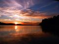
Painted with fireby tristaliskComment: B/W Club!
this is a striking shot and i totally agree with you that the color is much stronger than the b/w. gorgeous gorgeous color here -- no reason to mess with it. |
 Photographer found comment helpful. Photographer found comment helpful. |
| 07/12/2005 05:21:20 PM |
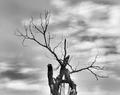
Deadwoodby TruegshtComment: B/W Club!
good range from black to white while limiting the "blown out" areas. i like the rule of thirds for the composition, but it could even be shifted left or right even more to break up the balance a bit.
a little more detail in the clouds and the bark would help as well. i think there are more tones in this that we can improve upon. |
| Photographer found comment helpful. |
| 07/12/2005 05:19:45 PM |
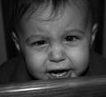
It just breaks your heart....by TruegshtComment: B/W Club!
this is a great photo. the full-frame works well, and the focus and composition are dead-on.
like others have said, it is quite dull and gray. i plan to use this as an example for the group because there is a TON of potential here that we can draw out. you'll have a real winner of a print on your hands soon! |
| Photographer found comment helpful. |
| 07/11/2005 03:04:28 PM |
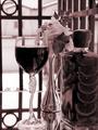
Intimate Settingby aboutimageComment: B/W Club!
i think this is a nice still life. i'm not sure that it makes the best duotone shot for a couple of reasons.
1) still lifes are normally color. i'm all about breaking rules, but one kind of "expects" to see them that way.
2) there are a couple of things in the photo that also are "expected" to be in color: the wine, flowers, and the oranges particularly. again, anything CAN be in black and white -- the challenge is deciding what SHOULD be.
i think the tones and contrast in this are pretty good. yeah, there are blown-out bits, but i have no problem with those. |
| Photographer found comment helpful. |
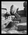
| 07/11/2005 02:57:55 PM |
The Thinkerby KaveyComment: B/W Club!
great shot and great title. the composition is good, but i would like to see deeper tones throughout -- it looks a little gray. i think having the solid black border so near the photo makes it look plain as well. making the shadows a bit darker and the highlights an oh-so-little-bit lighter would make the formation itself "pop" more.
i took the liberty of doing a few contrast adjustments. i'm not saying that my version is "better," but i think it more accurately describes what i'm talking about more than words could:
 |
| Photographer found comment helpful. |
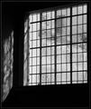
| 07/11/2005 02:48:48 PM |
Old Panesby KaveyComment: B/W Club!
i really enjoy the lines in this shot. it DOES look like the reflection is cut off to the left, but i understand why. i think a bit of a wider shot showing the reflection tapering off might help "explain" that to the viewer.
i don't know what's under the window, but i keep finding myself wondering. and i like the texture on the glass but would like to make it a bit more prominent. at this point in time, i can't see if it's etched or if there's like a grassy hill back there or what. and it seems rather gray. i think you could bump up the contrast a bit in the window to make the whites "whiter."
overall i love a good window shot, which this is. |
| Photographer found comment helpful. |
| 07/11/2005 11:50:08 AM |
|
| Photographer found comment helpful. |
| 07/09/2005 08:36:17 AM |
|
| 07/09/2005 08:32:25 AM |
|
| Photographer found comment helpful. |
| 07/09/2005 08:32:13 AM |
|
Home -
Challenges -
Community -
League -
Photos -
Cameras -
Lenses -
Learn -
Help -
Terms of Use -
Privacy -
Top ^
DPChallenge, and website content and design, Copyright © 2001-2026 Challenging Technologies, LLC.
All digital photo copyrights belong to the photographers and may not be used without permission.
Current Server Time: 07/23/2026 07:55:31 PM EDT.