| Image |
Comment |
| 11/21/2004 08:30:18 PM |
Layin' Back Da Bluesby ace flymanComment: The background on the right seems so close to the shade of the musician's coat... Would like to see it constrated more. The shadow play is very cool. |
 Photographer found comment helpful. Photographer found comment helpful. |
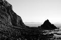
| 11/21/2004 08:26:20 PM |
One-Eye'd Willie's Last Stopby mirdonamyComment: This image, while interesting, I thin kwould do better as a color image. There doesn't seem to be strong enough lighting to retain even texture through the foreground rocks, and there isn't much contrast between the design elements. The addition of color, while excluding this image from this challenge, would help to add that much needed contrast. |
| Photographer found comment helpful. |
| 11/19/2004 09:59:32 PM |
Eyeby ggbudgeComment: The overexposure just washes out too much detail - not enough contrast. |
| Photographer found comment helpful. |
| 11/19/2004 09:54:17 PM |
|
| Photographer found comment helpful. |
| 11/19/2004 09:53:46 PM |
Mother & Daughter's Loveby miriam_mrbComment: Great family portrait - expressions are perfectly natural. Nice oighting as well. I like that the pose isn't cliche. Good change, and works well with the casual happiness exhibited by the ladies. |
| Photographer found comment helpful. |
| 11/19/2004 09:51:51 PM |
Montmartre by nightby GabrielComment: A bit too much exposure on the lights for me... Probably difficult to balance much better than you did though. |
| Photographer found comment helpful. |
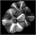
| 11/19/2004 09:51:07 PM |
The common weed Convolvulusby trainComment: Wow - I sincerely hope this ribbons. AMAZING! Great detail, perfect background, the framing and persepctive couldn't be better. 9 - I don't give many of these. The only reason I'm not giving a ten here is that the square aspect ratio doesn't feel as natural as a more traiditonal one - I somehow think I'd prefer this image in a different frame. |
| 11/19/2004 09:48:03 PM |
|
| Photographer found comment helpful. |
| 11/19/2004 09:47:05 PM |
|
| Photographer found comment helpful. |
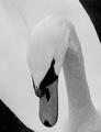
| 11/19/2004 09:46:33 PM |
Graceby charmayneComment: I like the composition, but I'm not seeing enough detail in the feathers for this to work for me... I really like the persepctive though - the framing is so creative. |
| Photographer found comment helpful. |
Home -
Challenges -
Community -
League -
Photos -
Cameras -
Lenses -
Learn -
Help -
Terms of Use -
Privacy -
Top ^
DPChallenge, and website content and design, Copyright © 2001-2026 Challenging Technologies, LLC.
All digital photo copyrights belong to the photographers and may not be used without permission.
Current Server Time: 07/17/2026 02:10:42 AM EDT.