| Image |
Comment |
| 02/22/2006 07:50:09 PM |
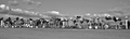
Mail Boxesby wisdomp11Comment: You may get comments on it being too small, despite the fact you used 640 pixels wide. I ran into that a few weeks back with a 640x213 image. But you won't hear it from me. I like it. Although, I may have had the mailboxes a little lower and shown more sky. |
| 02/22/2006 07:48:12 PM |
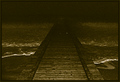
go on or give upby gazdiComment: This seems to be really dark and grainy. Also, I'm not a big fan of the centered composition. Perhaps if it were taken from a slight angle to have the bridge (?) leading in from one of the corners. |
 Photographer found comment helpful. Photographer found comment helpful. |
| 02/22/2006 07:45:08 PM |
|
| Photographer found comment helpful. |
| 02/22/2006 07:42:04 PM |
Wonderlandby whiteroomComment: I really like the effect here, but the picture seems like it cuts off at the top, well below where the frame starts. I don't know, it just looks funny to me. |
| Photographer found comment helpful. |
| 02/22/2006 01:28:20 PM |
|
| Photographer found comment helpful. |
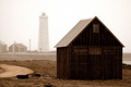
| 02/22/2006 09:56:32 AM |
Old fisherman's hutby ArnarHComment: Oddly, this looks like the front half of he photo (the hut) is duotone and the back half (the lighthouse) is still in color. Very interesting effect. Bonus point for the lighthouse. All lighthouses get a bonus point from me. |
| Photographer found comment helpful. |
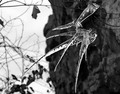
| 02/22/2006 09:54:35 AM |
Reaching in Vainby KatspetkatComment: Puts me in the mind of the cover of RangeFinder magazine a month or so ago. Very nice effect, but maybe a bit too orange for my taste. |
| Photographer found comment helpful. |
| 02/22/2006 09:50:46 AM |
|
| Photographer found comment helpful. |
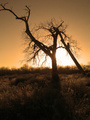
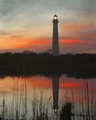
| 02/07/2006 07:53:14 PM |
Lighthouse At Sunsetby jrjrComment: Simply gorgeous and it doesn't hurt that it's a lighthouse. There are lots of lights in this free study for some reason (mine isn't one, but was taken while shooting a lighthouse). But that actually helps you with me. All lighthouses get an extra point.
The colors of the sky and the reflection are just tremendous. It never looks this good when I go to Cape May. It's always cloudy. |
| Photographer found comment helpful. |
| 02/07/2006 07:50:56 PM |
|
Home -
Challenges -
Community -
League -
Photos -
Cameras -
Lenses -
Learn -
Help -
Terms of Use -
Privacy -
Top ^
DPChallenge, and website content and design, Copyright © 2001-2026 Challenging Technologies, LLC.
All digital photo copyrights belong to the photographers and may not be used without permission.
Current Server Time: 07/17/2026 03:15:22 AM EDT.