|
|
|
Showing 981 - 990 of ~2507 |
| Image |
Comment |
| 04/27/2006 02:07:19 AM | Music Is Bloomingby moolacoolaComment: Very cool idea. Good point of view. I think the wrinkles in the background are probably hurtin' you some on this one. |  Photographer found comment helpful. Photographer found comment helpful. |
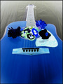
| 04/27/2006 02:01:26 AM | Orbby DefyTimeComment: This is a cool shot. Stimulating composition. Nice concept that works well for the negative image, IMO. |
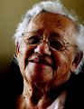
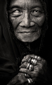
| 04/27/2006 01:47:00 AM | Nanas are always old ...by kari1Comment: Greetings from the Critique Club :-)
A very fitting entry for this challenge, I think. She is a very engaging character, and I think you have captured that character well. I like how you've really displayed the texture, and showcased all the wonderful years that this visage has experienced. A classic portrait head shot composition, and obviously works fine for this photo. Nice job with the background too.
I think the main thing I'd like to discuss here is the lighting of the shot. It's not bad, I think it seems purposeful and thought out, and is heading towards a goal, but a couple of things strike me about it. First of all, I like the sidelighting thing, going back to the texture, and I really like how it lights up the hair, adds a lot to the appeal of the character of Nana :-) However, it seems on the verge of being too harsh on the left. Not too bad, but I think what it does is really emphasize the dark areas in a slightly negative way, especially around the eyes. What I'm wondering is perhaps getting some reflected light from the bottom right area could lighten up the eyes and dark areas a touch, just enough to get back some of the detail there. This could even be as simple as having Nana hold white poster board or something out of the frame. Something to think on anyways maybe. A couple of commenters mentioned the tone, or slight hue. I can see that, but it is a minor thing I think. As graphicfunk pointed out, perhaps a slight drop in saturation could make a difference. Even just a little slight tweaking in levels, or selective color maybe?
Overall, a very nice, touching portrait. I think you've done a fine job of catching Nana's essence, and conveying your love and respect in the shot. I think this is a set of photos that years down the road, you will cherish and revisit many times :-)
If you have any questions or comments or anything, please feel free to contact me.
Happy shooting,
taterbug :-) | | Photographer found comment helpful. |
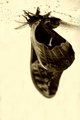
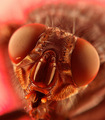
| 04/21/2006 02:04:48 AM | Night Crawlerby SJCarterComment: Now this shot, and especially your treatment of it Rocks, man! Very different, unique. Stands out to me amongst the multitudes of butterfly shots you see. It's quite interesting how you've given the image this (as a couple people point out) eery kind of feel. Very cool! | | Photographer found comment helpful. |
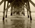
| 04/21/2006 01:55:12 AM | Naveby SJCarterComment: This is a very nice shot. Great point of view, and the treatment is very fitting for the image. Has a great feel! | | Photographer found comment helpful. |
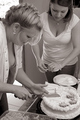
| 04/19/2006 06:28:07 AM | Mom Cutting Cake for Soon-to-Be Brideby fotomann_foreverComment: Hey Leroy, greetings from the Critique Club :-)
Well, this is your shot for 'Candid', and I think it definitely fits the challenge. You've captured a nice moment, a great memory to have, and will be great for your photo journal project. I have no doubt your future sis-in-law will love this.
The first thing that strikes me about this image is the tone, and feel of it. It for sure sets a lovely mood that fits the image well, IMO. I really like doing tri/quad tones myself, and I was pretty sure before even looking at your notes that this was a multi tone treatment. So, I actually quite like it. Here is something that you might want to try sometime, that I usually do with b/w and multi tones: I do a curves adj. toward the end (for example, in the workflow you have outlined, I would put it between the second autolevels and usm). I put 2 points on the curve, make a very sharp 'S' curve, then drop the opacity of that adj layer way down. Like I'll take it all the way to 0, then slowly slide back up til you just start to see a little bit of change. Like probably between 8 and 20 percent. I find it increases the tonal range just a bit and adds a little depth and pop to the photo. Anyway, something to try maybe if you're interested :-) And I guess I must confess here, yeah, I'm a guy, I also noticed the striking cleavage present :-) Which, also I might add, IMO is certainly not a bad thing!
Technically, the shot looks pretty good. Good focus, good exposure, even lighting and all that. The composition is sound, and it works. So, 5.38 is not a bad score, but why not higher? There are certainly no glaring flaws at all, but perhaps a few minor things that the dpc voters deducted minor points for. There are a couple of elements along the bottom and right edge that are 'cut off' and not really showing enough to contribute to the scene, like the veggie tray and cups. Also at the top left, the bright area, looks like it is maybe a window?, kind of pulls the eye up to it and off the subjects. Also, from some of the discussions on this challenge, I think perhaps a lot of voters were looking for a lot of emotion, excitement, and such in the shots. As one of your commenters put it- a bit more out of the ordinary. Maybe just a slightly different angle, to show a touch more of mom's face? Personally, I see the story, I think it's a great capture, but then I do have the luxury of seeing your notes on the shot :-) One last thing that possibly could impact a few voters, is the title. On the verge of being too much. Again, for me, very rarely (if ever) will I find a title to be detrimental to my opinion of the photo, but I do feel a good title can strengthen the presentation greatly. I could see where some voters could almost feel like being 'spoon fed' the message though. Sometimes less is more :-)
Overall, I like the shot. Nice treatment. It has a very nice, fitting feel to it. It is a great capture that will be very nice in your project. Good luck with it!
If you have any questions or comments or anything, please feel free to contact me.
Happy shooting,
taterbug :-) | | Photographer found comment helpful. |
| 04/16/2006 10:11:23 PM | ?!!!by TranquilComment: Nice candid! Has good interest, and his position relative to the lady at right and great dof isolates him quite nicely. This shot works fine, but I wonder if you tried a tighter crop from the left, getting him a little out of the center, how would that look? Good shot though :-) | | Photographer found comment helpful. |
| 04/14/2006 02:11:13 AM | Good times '02 !by eliniasComment: Greetings from the Critique Club :-)
Well, this shot obviously fits the challenge :-) I must admit I have been a bit perplexed since I pulled this shot from the queue for a critique a couple of days ago. Just puzzled over why a pretty decent photog with nice equipment, some great shots in their port (a 4th place among them) and a 5.75+ avg would want a formal critique on a shot taken with a p&s at a party 4 yrs ago, but anyways...
The first thing that strikes me is the wild expression. Kind of engaging at first, but starts to seem out of place with the nice, solid black backgroung. Makes sense when you read your notes, it fits for a party shot, that is what it comes across as. I wonder if maybe this might have scored better if there were a little detail in the background to give some context? Maybe not. Skin tone looks a tad bit on the yellow side. There are some harsh shadows, probably due to onboard flash? It's a bit disconcerting to me how her black top totally blends into the background, it makes her neck look kind of un-natural and almost cut n pasted like. Same with how we lose part of the earrings.
So overall, the expression has some interest, and captures your attention initially, but then the overall quality I feel allows the viewer to quickly be ready to 'move on', and leave wondering if this was perhaps a doctored up 'party shot'.
If you have any questions or comments or anything, please feel free to contact me.
Happy shooting,
taterbug :-) | | Photographer found comment helpful. |
| 04/14/2006 12:57:50 AM | The essence of an annoyance by PhilComment: Wow! Big congrats on your first ribbon :-) An amazing shot. I still stand by my comment made during the voting :-) | | Photographer found comment helpful. |
| 04/14/2006 12:51:47 AM | Stories of Her Life by librodoComment: Not surprised at all to see the blue ribbon on this totally incredible photo! Congrats, very, very well deserved :-) | | Photographer found comment helpful. |
|
Showing 981 - 990 of ~2507 |
Home -
Challenges -
Community -
League -
Photos -
Cameras -
Lenses -
Learn -
Help -
Terms of Use -
Privacy -
Top ^
DPChallenge, and website content and design, Copyright © 2001-2026 Challenging Technologies, LLC.
All digital photo copyrights belong to the photographers and may not be used without permission.
Current Server Time: 07/24/2026 07:15:35 PM EDT.
|