|
|
|
Showing 521 - 530 of ~2507 |
| Image |
Comment |
| 05/16/2007 11:56:59 PM | |  Photographer found comment helpful. Photographer found comment helpful. |
| 05/16/2007 01:34:17 AM | | | Photographer found comment helpful. |
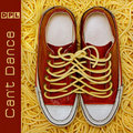
| 05/16/2007 01:32:28 AM | Devoted Pasta Lovers by De SousaComment: Wowsers, this is an awesome entry for the challenge. First, it's a really great photo. Visually, very appealing, technically very well done. Secondly, it's a good name, that works. Then, the album title, along with the name, and the concept of the image, all ties together and works great. The design is very good, I can really see this as an album cover, you should design them for real! :-) The colors all work great. I love how you've got the noodle laces of both shoes all tied together, it really drives the whole concept home. Super job! High score from me :-) | | Photographer found comment helpful. |
| 05/16/2007 01:25:32 AM | | | Photographer found comment helpful. |
| 05/14/2007 12:11:53 AM | | | Photographer found comment helpful. |
| 05/14/2007 12:07:22 AM | | | Photographer found comment helpful. |
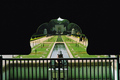
| 05/13/2007 11:52:46 PM | symmetry impromptu !by ashishparmarComment: Greetings from the Critique Club :-)
So this is your entry in Symmetry II. I think it works good for the challenge. I see symmetry in the shot. There are some things I really like here, but also some weak points, IMO. Let me start off with what I like.
The shape of the arch is great, it grabs my initial attention nicely, and hightens my desire to explore the image further. It serves as a nice framing element, and emphasizes the symmetry of the photo. You've lined up, and centered everything in the frame well. A great use of leading lines, and vanishing point to draw the viewer in, and take my eye into the shot, and to the structure at the end of the ponds.
A couple of your commenters have touched upon the negative space, the crop of the photo. I tend to agree here. All that space at the top doesn't seem to really be adding a lot to the image. In fact, to me, it almost gives an 'artificial' feel to the scene. I believe if the top were cropped down to just above the top of the arch, and I would even go so far as to suggest taking a touch off of each side, it could strengthen the composition significantly. You don't mention if you do any post processing to your photo. I think this is a case where a little bit of tweaking could be beneficial. One thing, I feel the photo could do with a little bit of sharpening, either usm, or smart sharpen are popular, or whatever your particular software has. Also, I don't really think there is a color cast, but...there is so much green in the shot, and with the lighting, it seems to be giving everything a bit of a green 'feel'. Even within basic editing rules, one can do a lot with color management on a shot. Again depending on specific software, but adjustments in either levels, curves, selective color, even hue/sat can be done. If this is something unfamiliar to you, there are lots of tutorials on the site, or ask in a forum. It really is very beneficial to learn at least basics when making great photos.
So, a good entry for the challenge. Nice subject, and interesting. 5.8 is not a bad score. I like your story of how you got the shot. :-) A very good eye here. I think post processing could be a key to taking a stride forward.
If you have any questions, or comments or anything, please feel free to contact me.
happy shooting,
taterbug :-) |
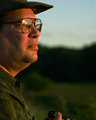
| 05/11/2007 05:27:39 PM | Waiting for the Lightby TooCoolComment: Dude! Cool shot!
An awesome model too. ;-)
I couldn't of picked a better shirt if I tried. The warm tones are great. That, and the look and composition, the reflections of the sun and even the title and all, it does all come together nicely. Too bad I wasn't holding my cam just a touch higher, just to add a little to the overall context. Nice job. I would of checked this out sooner, but last I knew, I remember you mentioning that you had this shot, but that you hadn't done anything with it yet. | | Photographer found comment helpful. |
| 05/10/2007 07:54:17 AM | Facelessby virtuamikeComment: This is a way cool shot. I have to agree about the lighting being a little funky, probably because it just 'splits' at the arms, real bright above, and dark below. Even though, I find this to be a highly interesting study of the magnificence of the human body. The chair/stand works really well here. I would say, do something a little different with the lighting, clone out that little handle, and this would definitely be a concept well worth exploring further. Really cool shot, man :-) | | Photographer found comment helpful. |
| 05/08/2007 02:59:38 AM | | | Photographer found comment helpful. |
|
Showing 521 - 530 of ~2507 |
Home -
Challenges -
Community -
League -
Photos -
Cameras -
Lenses -
Learn -
Help -
Terms of Use -
Privacy -
Top ^
DPChallenge, and website content and design, Copyright © 2001-2026 Challenging Technologies, LLC.
All digital photo copyrights belong to the photographers and may not be used without permission.
Current Server Time: 07/21/2026 07:40:26 PM EDT.
|