| Image |
Comment |
| 05/15/2004 12:45:57 AM |
She and Heby greslizzzComment: good idea. your focus seems off, can't see a lot of detail. I think you should of waited and try to catch them closer together. maybe a different background would improve this greatly. |
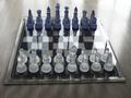
| 05/14/2004 01:16:04 PM |
Chess Anyone?by ChefbozComment: nice image. i think the light is just a little harsh coming in at the bottom. |
 Photographer found comment helpful. Photographer found comment helpful. |
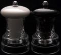
| 05/14/2004 01:14:52 PM |
S&Pby BooZonComment: A nice image. I thought of this too, but went with something else instead. I think maybe just a little lighter to bring out more detail would be nice. good shot. |
| Photographer found comment helpful. |
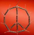
| 05/14/2004 01:07:13 PM |
Peaceful Explosionby peeteComment: very creative. nice choice of background, good contrast. a bold statement, i like it. |
| Photographer found comment helpful. |
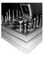
| 05/14/2004 01:04:49 PM |
The Gameby MrZedComment: I think this could be a lot better without the harsh lighting and glare. Also maybe straightening the board. |
| Photographer found comment helpful. |
| 05/14/2004 12:31:22 AM |
Bright Night in the Big Appleby janoComment: very blurry, maybe purposeful? It seems very busy, lacking any strong focal point. sorry, but I can't see the connection to opposites. |
| 05/14/2004 12:28:12 AM |
Formal or Casual.........??by bigjvoltageComment: nice idea, but it lacks interest. it looks like you just went to where the shoes are kept and just snapped a picture. try different arrangements, or different perspectives, |
| Photographer found comment helpful. |
| 05/14/2004 12:23:22 AM |
|
| Photographer found comment helpful. |
| 05/14/2004 12:19:30 AM |
|
| Photographer found comment helpful. |
| 05/14/2004 12:16:59 AM |
No Wake Zoneby gfkeenanComment: focus is off. jet ski i think should be either full in the frame or cropped out all together, same with the craft nosing in on the right. Maybe crop out some of the excess water in foreground. I think maybe framing less water, more of the tree behind the boats. sorry, but i don't see the opposites connection. |
Home -
Challenges -
Community -
League -
Photos -
Cameras -
Lenses -
Learn -
Help -
Terms of Use -
Privacy -
Top ^
DPChallenge, and website content and design, Copyright © 2001-2026 Challenging Technologies, LLC.
All digital photo copyrights belong to the photographers and may not be used without permission.
Current Server Time: 07/18/2026 07:56:48 AM EDT.