| Image |
Comment |
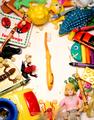
| 07/07/2004 02:33:07 PM |
The Most-est, Fun-est Part of the Dayby mattsempComment: I see what you are going for here, but I think your product doesn't stand out. It just get's lost with all the other images. I find my eye wandering all over the pic looking at the bright little interesting images. |
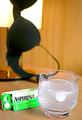
| 07/07/2004 02:30:29 PM |
Actimel - Refreshingly Good !!by derekComment: I think this shot would be better if the bottom half were cropped out. This would put the product into the rule of thirds and would emphasize it much more. It would also fill up the frame and lose what seems like a cluttered distracting background. |
| 07/07/2004 12:18:33 PM |
|
 Photographer found comment helpful. Photographer found comment helpful. |
| 07/07/2004 12:17:34 PM |
Toyota Tacoma. Tough enough to take you anywhere.by postoakinversionComment: This is a good idea. Nice composition. It does have a classic auto ad feel. I looked for several minutes trying to decide what it seemed to be lacking...i think if it were a little brighter, it would be better. Maybe a little more sunlight, without getting too bright and harsh. I realize, this is the truck you have, but Maybe a brighter color vehicle would pop more, especially with this scene/backdrop. |
| Photographer found comment helpful. |
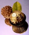
| 07/07/2004 12:12:04 PM |
Ferrero Rocher, Indulge Yourself...by tyt2000Comment: Nice composition. I like the reflection. The leaf is a very nice touch. The lighting seems to cast a bright spot across the candy. Wouldn't be too bad but it kind of washes out part of the label, which I think would be important in an advertising situation. |
| Photographer found comment helpful. |
| 07/07/2004 12:09:14 PM |
A Slice of Paradise could be yours!by biggood53Comment: This is a creative shot. I get your idea. Generally, I don't mind borders, however I don't think this one works well here. Perhaps it's too big, and the opacity just seems kind of distracting. |
| Photographer found comment helpful. |
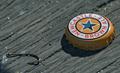
| 07/07/2004 12:05:46 PM |
Catch of the Dayby Hye5Comment: Great idea. Great composition. I like the title/slogan. Perfect background. The wood has great texture. You should send to Newcastle. I can envision this in a magazine ad! This has to be a top contender. One of my favorites. |
| Photographer found comment helpful. |
| 07/07/2004 12:02:16 PM |
|
| Photographer found comment helpful. |
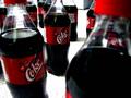
| 07/07/2004 12:00:14 PM |
Cherry coke surplusby altoidgreenComment: This is a good idea, but I'm not really finding a strong focal point. Perhaps a different arrangement, and really emphasize the label? |
| Photographer found comment helpful. |
| 07/07/2004 11:54:25 AM |
|
| Photographer found comment helpful. |
Home -
Challenges -
Community -
League -
Photos -
Cameras -
Lenses -
Learn -
Help -
Terms of Use -
Privacy -
Top ^
DPChallenge, and website content and design, Copyright © 2001-2026 Challenging Technologies, LLC.
All digital photo copyrights belong to the photographers and may not be used without permission.
Current Server Time: 07/18/2026 11:11:46 PM EDT.