| Image |
Comment |
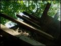
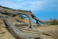
| 07/29/2005 12:10:29 AM |
Treetop Stepsby glad2badadComment: An interesting subject and the perspective is pretty cool. IMO, the lighting in this case is weakening the presentation a little. There seems to be a loss of a lot of strong detail in the darkness at right. And the flare of the sun on the right edge seems to be distracting. Perhaps the same shot taken at a different time of day, with the light coming in from a different angle could make a difference? |
 Photographer found comment helpful. Photographer found comment helpful. |
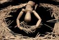
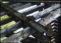
| 07/28/2005 05:37:05 PM |
They Were my Brothersby ArtysteComment: Some people come up with some very creative shots with woodies, and I find this to be a great example :-) Lighting is great, wonderful dof, good composition. I really like how not only have you pulled off humor, but some emotion as well out of a woodie shot. Overall, very clever, creative concept, executed quite nicely IMO. Nice job. thanks. |
| Photographer found comment helpful. |
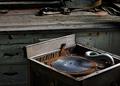
| 07/28/2005 05:29:02 PM |
Silenceby PippiComment: I find this to be a nice idea. Some of the topic 'police' people may hit it because they will think the main subject is the record, and not wood, but for me, I think it is a creative refreshing approach to the challenge. I find it has good interest factor to me. Compositionally, something seems to be lacking a little to me. I'm not saying this is bad at all, it is not, but something inside me is really saying that there is potential here for a much stronger presentation. Maybe because I do find it as a subject fresh and interesting. I wish I had a suggestion, but nothing immediate comes to mind that I can put my finger on, perhaps just a different perspective/angle. |
| Photographer found comment helpful. |
| 07/28/2005 05:12:46 PM |
|
| Photographer found comment helpful. |
| 07/27/2005 02:32:40 AM |
Sculptureby charmayneComment: Nice composition and an interesting subject. Looks a little flat though. Maybe a different time of day, or even some levels adjusting. Maybe try to bring out some mids and darks more? |
| Photographer found comment helpful. |
| 07/27/2005 02:29:47 AM |
Rural Graffitiby cheleComment: Good subject, and composed in an interesting manner. Appears to be some exposure problems though. The sky is really blown out, and there is some serious chromatic abbhorations along all the contrasting edges of wood and sky. Perhaps a different time of day would produce stronger results? Or maybe even under exposing with some fill flash. |
| Photographer found comment helpful. |
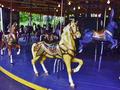
| 07/27/2005 01:34:40 AM |
My Little Ponyby cowboyComment: This is a good idea. A very nice, interesting subject. Something seems a little odd about the color here. Maybe oversaturated, or perhaps a white balance problem? Compositionally, I'm thinking that maybe a more dramatic angle/perspective or different framing could make for a much stronger presentation of this fine subject. The appearance here is that one just standed straight on and shot the carosel, kind of like just a snapshot. Maybe a tighter framing, or from a low angle or something like that. Maybe even from on the carosel itself could be cool, getting the horses and things in good focus, and the background blurred from the ride movement? |
| 07/27/2005 01:24:24 AM |
Laundry dayby smilebig4me1xComment: A good idea here. Nice subject. Composed nicely. I'm thinking, maybe some different lighting here could improve the presentation, the image seems a little flat. Also, maybe cropping the top a little tighter to the top of the washboard? I get a slight unbalanced feeling from the black space at the top of the photo, it doesn't seem to serve any purpose, or add to the image at all. |
| Photographer found comment helpful. |
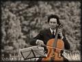
| 07/27/2005 01:19:28 AM |
Maple in Tree Minor by IvoComment: Very good presentation of a good idea here. Strong, clean composition. Nice editing job. I like your selective desat here, it serves a definite purpose and brings the attention to the instrument. Very well done. |
| Photographer found comment helpful. |
| 07/27/2005 01:15:48 AM |
Abandoned high chairby GinaRothfelsComment: A good idea here. Nice subject, framed well in the shot. Seems like the focus could be sharper though. Maybe you were going for soft focus, but if so, it just doesn't work for me in this case. The chair seems to be tilted or something, that seems to be a little distracting. The image seems a little dark and washed out. Some simple adjustments in editing, maybe levels and brightness/contrast, could perhaps strengthen the presentation. |
| Photographer found comment helpful. |
Home -
Challenges -
Community -
League -
Photos -
Cameras -
Lenses -
Learn -
Help -
Terms of Use -
Privacy -
Top ^
DPChallenge, and website content and design, Copyright © 2001-2026 Challenging Technologies, LLC.
All digital photo copyrights belong to the photographers and may not be used without permission.
Current Server Time: 07/26/2026 01:51:29 PM EDT.