| Image |
Comment |
| 08/22/2005 12:51:05 AM |
Laundry Dayby CEJComment: Great concept. Very cute and clever. Good composition and lighting. |
 Photographer found comment helpful. Photographer found comment helpful. |
| 08/17/2005 05:50:53 AM |
1814by p2jvrComment: You're right, I won the race :-) Double or nothing for the next one???
This is a good shot though. Didn't edge ya out by much :-) Mine snuck up some in the final hours. |
| Photographer found comment helpful. |
| 08/15/2005 03:57:51 AM |
|
| Photographer found comment helpful. |
| 08/15/2005 03:55:13 AM |
Summer Showersby idnicComment: Refreshing choice to go with tight framing for this shot. Works well for this image IMO. Good job. |
| Photographer found comment helpful. |
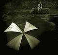
| 08/15/2005 03:53:14 AM |
Umbrella Blownby JPRComment: The thumbnail on this one even grabbed my attention. Very smart composition. I like your treatment of the image. Has a very interesting feel to it. |
| Photographer found comment helpful. |
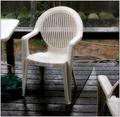
| 08/15/2005 03:50:01 AM |
Torn Screen — Morning Thunderstormby Bear_MusicComment: The torn screen is an interesting idea. But personally, I don't find the plastic deck chair (especially with the big upc sticker so prominent) a very strong subject. Also, with the busy background, and the hose and cut off table and other chair, it has the appearance of just a quick shot of whatever was in sight. |
| Photographer found comment helpful. |
| 08/14/2005 02:17:04 AM |
Barn w/ cloningby SCI 009Comment: Very nice. I think you did a good job with the cloning. I find this to be a simple, yet stimulating image. A very vivid presentation, a subject with a good interest factor. The building is placed well within the composition, and it's earthy neutral, stark tones stand out well against the bold grass and sky. A minor suggestion or 2, maybe try a very slight arbitrary rotation. The building seems to have just a wee tilt, if straightened, it may increase the boldness factor of the photo. Also, I'm normally alright with borders, I even use them a lot myself, usually my thoughts are they can strengthen an image, or just be there and are ok, but in this case, I don't think the bright green in the border works well here IMO. The reason being, the image itself is so vivid and strong, I feel like the green in the border is competing with the image and robbing some attention away. |
| Photographer found comment helpful. |
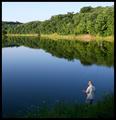
| 08/13/2005 04:48:31 AM |
Fly Fishingby kjenningsComment: Beautiful composition. The placement of the fisherman in your framing is perfect. The water is great, especially the reflections. I think it forms a great leading line bringing the eye to the fisherman. I have to agree, the sky looks a little washed out, especially compared to it's wonderful reflection in the water. A trick you could try in editing if you wanted, and of course depending on what you use, is selecting just the sky, pick out a nice blue for foreground color and apply a gradient, set on foreground to transparent, then drop the opacity til it looks right. Just have to watch and make sure it still matches the reflection. |
| Photographer found comment helpful. |
| 08/13/2005 04:37:09 AM |
Nasty Bendby kjenningsComment: Yes, nice composition. The selective desat in this case I think adds some interest to the shot. Definitely a nice 'S' curve going on. I agree with faidoi, I think some stronger darks could be an improvement. A good perspective, and I like the opposing clumps of trees, a good balanced feel. |
| Photographer found comment helpful. |
| 08/13/2005 03:50:26 AM |
1931by TammerComment: I think a tighter framing could strengthen the presentation of this very nice subject. |
| Photographer found comment helpful. |
Home -
Challenges -
Community -
League -
Photos -
Cameras -
Lenses -
Learn -
Help -
Terms of Use -
Privacy -
Top ^
DPChallenge, and website content and design, Copyright © 2001-2026 Challenging Technologies, LLC.
All digital photo copyrights belong to the photographers and may not be used without permission.
Current Server Time: 07/26/2026 11:59:37 AM EDT.