|
|
|
Showing 1111 - 1120 of ~2507 |
| Image |
Comment |
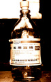
| 02/22/2006 12:45:19 AM | Jiu Jingby Green_PieceComment: Good idea, nice subject. I find the bright light at top a little distracting, maybe a more consistent background could be more effective? I'm thinking also maybe a little more care to the lighting could prevent the glare on the bottle label. It wipes out some detail, which it seems is what the shot is about. |  Photographer found comment helpful. Photographer found comment helpful. |
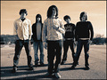
| 02/22/2006 12:41:51 AM | Middlecoast - the bandby Drummerjd356Comment: Very nice shot. Looks like it would make a great cd cover (which I'm pretty sure that is what you were going for :-) Exposure, focus, etc are pretty good. The duotone here I think works really well, you know, not just done for 'the sake' of doing it. It sets a good mood for this shot. With the sky, has a kind of 'surreal' look to it. I'd like to know if you specifically planned for the time of day of the shot. Why, is because I think the shadows add a lot to the shot IMO. A LOT! Gives depth, boosts interest a little, adds to the feel, and helps to give balance against the sky and creates a slight (very slight) vertical for the eye to follow across the image. Wonder, did you try a square crop? Might add to the cd 'feel' of the photo. Anyways, great job, a really nice shot, and well done. Good luck in the challenge :-) | | Photographer found comment helpful. |
| 02/13/2006 03:27:12 AM | | | Photographer found comment helpful. |
| 02/11/2006 01:14:17 AM | | | Photographer found comment helpful. |
| 02/11/2006 01:11:28 AM | | | Photographer found comment helpful. |
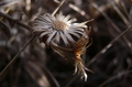
| 02/08/2006 01:51:43 AM | Micro Botanyby yantskiComment: This is a great choice for a subject I feel. I think the neutral tones could work well. Perhaps going for a different time of day, trying to get more of a raking light, could show off some texture. I agree about the focus, it does seem like it could be sharper. Depending on what editing software you have, maybe a little usm could help. There is good dof, blurring the background, but the main subject I think would be stronger if sharper. Also, in editing, some levels tweaking could strengthen the tonal range possibly. Centered compositions can work quite well with the right image, it isn't bad here, but I'm thinking it might be a stronger presentation by not centering the subject in this case?
Not totally terrible for a first entry :-), it could be a whole lot worse. You seem to have a good eye, you've isolated the subject well, and the shot seems to have purpose. It definitely doesn't come across as just a 'snapshot'. I'm sure you'll do well in the challenges, just keep shootin' and have fun!
:-) | | Photographer found comment helpful. |
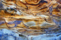
| 02/08/2006 01:06:43 AM | Natures Paletteby sherpetComment: This is a great shot. Yeah, it would have been great for abstract. I really like the flowing lines and forms. The neutral colors work really well with the blues. Very nice shot :-) | | Photographer found comment helpful. |
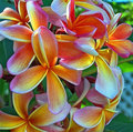
| 02/08/2006 12:36:26 AM | Frangipani Bouquetby sherpetComment: Beautiful colors. Such a great subject! I like how you've used the whole bunch in the comp, it has a kind of 'whimsical' air about it. I do think I agree with some of the previous comments. I can see moving a little to the left and more angled could be quite nice. It could eliminate the fence, and bring a little bit of dof into play. Maybe composing so the prominent foremost flower is more in the lower left corner, close to a thirds line could make the image 'pop' more. I also see the 'grain' mk is talking about. Did you process the photo much? It could be a high ISO setting. I have the Kodak DX7590, very much like your 6490 I believe. I think the main difference is the zoom and 4 vs. 5 mp? Anyways, I usually have pretty good luck staying at 80 ISO, unless I'm fighting poor light. Even then, I try longer shutter speeds. Anyways, nice shot though, it is quite vibrant and a very appealing subject. Oh, and the blue shirt looks great on you :-) | | Photographer found comment helpful. |
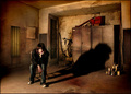
| 02/06/2006 01:32:49 AM | Confrontationby idnicComment: Very cool shot! Dig the concept. Nice clean, solid composition. I like it, even though that pose, the way you're sitting hurts me just to look at it :-) | | Photographer found comment helpful. |
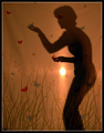
| 02/06/2006 01:20:32 AM | Butterfly Catcherby kteachComment: Very, very cool! Awesome idea. Very clever. Nice, solid composition. Very pleasing to look at. I like how your light source serves to look like a setting/rising sun in the image. Just very cool, I like this shot. Great job! | | Photographer found comment helpful. |
|
Showing 1111 - 1120 of ~2507 |
Home -
Challenges -
Community -
League -
Photos -
Cameras -
Lenses -
Learn -
Help -
Terms of Use -
Privacy -
Top ^
DPChallenge, and website content and design, Copyright © 2001-2026 Challenging Technologies, LLC.
All digital photo copyrights belong to the photographers and may not be used without permission.
Current Server Time: 07/26/2026 04:25:21 AM EDT.
|