|
|
|
Showing 1041 - 1050 of ~2507 |
| Image |
Comment |
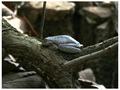
| 03/21/2006 05:29:25 AM | Natural Disguise... a rock?by gpalosComment: Greetings from the Critique Club,
Well, this is your entry in the 'Master of Disuise' challenge. I think you've met the challenge well. Nature offers up many masters of disguise, and you've definitely put that into play here. Fits the challenge very well.
My first impression of the shot is that you've met the challenge well, and the technicals are ok. You've used good dof. The subject is interesting and you've captured him in a good natural surrounding. Yes, I like the expression on his face. He does seem to be smiling :-) Lighting seems to be fairly level, although there is a bit of a hot spot along his back, but I don't feel that is major.
Your post processing doesn't seem too bad. Maybe a little usm, if you haven't already applied it would be nice. The image does seem just a wee bit flat, but by your comments, that is probably due to the lighting/exposure. And it's not too bad, it might even be a matter of taste.
I think compositionally, the image comes up just a little short of it's potential. I think the centered comp in this case is lacking dynamics. If you had framed the frog off centered, maybe close to a thirds intersection, I think it could have been a much stronger presentation. For one thing, it would have brought into play some nice leading lines I think from the branches, and given a nice way to lead the viewer across the photo. Also, as a couple commenters touched on, this would have added a little interest and allowed the audience to pause a bit longer on the image.
Overall, not a bad shot. Definitely meets the challenge, and ok interest factor. I think a dynamically stronger composition would have given a noticeable boost to your score.
If you have any questions or comments or anything, please feel free to pm me.
happy shooting,
taterbug :-) |
| 03/21/2006 04:06:24 AM | He Sees Angelsby m_martinhereComment: Greetings from the Critique Club :-)
I see this is your 2nd challenge entry. First off, welcome to DPC! This is a great place to learn about all things photography, if that is your desire. Probably more than you could ever even think possible :-P
Your shot here is technically pretty sound. It is nice and crisp and clear. Focus is good, sharp on the eye like a portrait type shot should be. Lighting is even, no harsh shadows or hot spots. The composition is nice. An interesting point of view, and you've nicely kept it clean and simple, no unwanted clutter or distracting elements. That is a nice expression you've captured, and I can see what you are saying in your photographers comments :-) This was a good choice for a b/w. I think that you've used negative space well, it gives the viewer a chance to follow the gaze of the child, but not drift off the image, and to come back to the subject. The shot seems balanced ok.
I'm wondering if you did much post processing other than your b/w conversion. There seems to be a little bit of 'splotchy', light patches in the background. Maybe a little selective color, or levels adjustments could clean that up a bit. Boosting the darks may at the same time add just a little depth and dimension and 'drama' to the main subject as well. Another tip when photographing people, if you can use some lighting (doesn't have to be fancy studio lights, there are lots of easily obtainable or ready alternatives) and get a catchlight in the eyes, it can make a bit of a difference. That helps to draw attention to the eyes, normally a big strong point in people shots.
Don't be discouraged by your score on this shot. Technically it is not too bad. To me, it comes across as definitely more than just a snapshot, I see some thought and purpose in the image. However, a thing to keep in mind is, with 'baby' shots, a public audience doesn't have any 'emotional' attachments to the child, and to get appreciation you normally have to really have 'wow' factor. Absolute technical brilliance, highly emotive, something to really peak the interest. You see, especially here with the voters, they are somewhat 'tainted' if you will. You get many people here that happen across the website and enter their terrible old snapshots of their kids, or pets and stuff, so you are kind of starting out with an uphill battle with this genre of photos :-) I'm sure this was a factor in your score. The other thing is the challenge topic. I can see where you are coming from in your comments. Perhaps a bit tenuous, but I can see the connection. However, you have to remember, during the voting, the voters can not see your comments, the photo has to basically stand on it's own in getting the idea across. (oh, and on a side note, many voters have a pet peave about shots that use a title to try and make a photo fit, and is normally not well received) A thing to keep in mind, the dpc audience is international and very diverse, in general, for a photo to score well here, not only does it need to be technically very well done, but it normally has to really nail the topic across the board. Something someone told me here when I was relatively new and I try to always remember: To get a high scoring photo here, it is not really about trying to take a shot that will get a lot of high scores, but taking a shot that will NOT get very many low scores :-) From the comments you received, I'm sure that this was a big factor in your score. If the challenge connection were stronger, I'm sure your score would be significantly higher.
Again, welcome aboard. You seem to have a good eye, and a good grasp on the technicals and composition. Keep brainstorming on ideas, keep participating and check out the forums. I'm sure you'll do great here.
If you have any questions, or comments or anything, feel free to pm me.
Happy Shooting,
taterbug :-) |  Photographer found comment helpful. Photographer found comment helpful. |
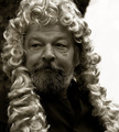
| 03/21/2006 12:53:47 AM | Judgeby phoenix46Comment: Greetings from the Critique Club,
So this is your entry in the 'Master of Disguise' challenge. IMO I can see how it fits the challenge, although the judicial wig is a part of many cultures, and I can understand how some voters could see it as somewhat of a stretch. My first reaction when looking at the photo is actually humorous. This obviously mature, normal seeming man wearing this flowing curly wig, with an expression on his face that looks like he even finds it ridiculous :-)
Technicals look good. Exposure seems fine. Focus is good, nice detail in his beard and face and the wig. Composition is ok. Classic off center filling the frame portrait type set up. The top of the wig is cut off in the top of frame, but in this case it seems minor. The bright blown out area at right though, keeps reaching out and violently grabbing my attention and yanking my eye over to the area. A shot like this really needs all attention to be on the subject, so the viewer can fully enjoy the detail and the wonderful expression on his face that the shot is all about. I can't tell what that bright area is or is caused from, maybe a window or bright light source? but that kind of thing, or patches of blown out sky and such really draw attention to them in photos. Might want to keep this in mind in the future if faced with a similar situation, maybe move yourself around to get a shot and avoid such distractions.
Your processing looks like maybe this is a duo/tri/quad tone? You've done a good job on the edit, but I'm not sure if I'm really crazy about the specific tone you've chosen in this case. I don't think it's necessarily detrimental to the image, but I also don't know if it really strengthens it either. Perhaps a different tone, or a little more subtleness could make a difference?
Overall, not a bad shot. You've captured an engaging and entertaining expression and the execution is pretty good. Not a bad score on it, and I think without the before mentioned bright area, perhaps it would of scored a bit higher. Nice job.
If you have any questions or comments or anything, please feel free to contact me.
Happy shooting,
taterbug :-) | | Photographer found comment helpful. |
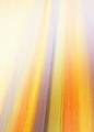
| 03/20/2006 06:48:31 AM | Merging Into The Oneby fiveriversComment: Greetings from the Critique Club :-)
This is your entry in the 'Afterlife' challenge. It could be easier to give a good critique, especially with this type of image if you had included photographers comments. I would then know exactly what you were going for, the technique used, etc. But I shall try and give you some thoughts on the photo. The first thing that strikes me about this image is the rich colors, and the flow from bottom to top at a slight pleasing vertical.
There is graininess here. Perhaps that was what you were going for? Hard to say, but it could be stronger if the flow was crisp and sharper. Going by some of the comments you received, I would say that is a factor in your score. When going for intentional grain, it has to really, really work for the image. At least here at DPC, if your goal is high scores. In general, this audience desires to see very crisp, clear, sharp images. I also note, that to the upper left in the photo, everything kind of washes out. I'm thinking that maybe the image would be stronger if the flow and colors remained consistent here.
You've got a few good comments there. As you probably understand already, abstracts are kind of a love/hate type of thing. There are definitely some real fans of the genre, but many people won't appreciate one. And abstracts in general I think tread a very fine line between great and garbage :-) It is very subjective to look at an abstract and tell what works and what does not. Personally, I like a good abstract, one of my higher scoring photos was from the 'Abstract' challenge. Generally, I think what makes a 'good' abstract is emphasis on color, form and flow. I think you've got a good thing going on with color in your shot. There is some flow, like I said , but I feel like in this shot, it starts to peak my interest, but comes up leaving me just wanting a little more out of it.
As for fitting the challenge, personally I see what you are saying with your image, and I think it fits well. As one of your comments say, I think this challenge subject is geared nicely for abstract renderings. Unfortunately, for the voters here, concepts like this aren't always readily acceptable across the board. They are a very diverse crowd. In general, the real high scoring shots usually really nail the topic for the broadest amount of people. Abstracts are cool, it's good to see people willing to venture out and bravely tread in uncertain waters.
If you have any questions, or comments or anything, feel free to contact me.
happy shooting,
taterbug :-) |
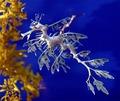
| 03/20/2006 05:47:20 AM | Leafy Sea Dragon by shadowdoc31Comment: Greetings from the Critique Club :-)
Congrats on your first ribbon! A fine shot. That is an amazing looking creature. Well, this is your entry in the 'Master of Disguise' challenge. I think it is easy to say that your shot definitely fits the challenge. My first impression when looking at this photo is wow, what an incredible creature. And presented in such a vivid and strong manner. Also, assuming it is probably an aquarium shot, and knowing the conditions of most aquariums (lighting, glass, people and such) I figure a lot of care and effort went into getting this beautiful image.
Technically, a superb job. Dof is great, the animal is crisp and clear, and plenty of detail present. Your processing is good. Lovely colors, and as I said initially, a very vivid and eyecatching image. You've put together a wonderful composition, IMO. Full framed subject, and it makes a great vertical across the image. I like that you have included the plants at left. I believe they are a strong element to the image. They provide context to the scene. They add a little something more to look at and the way the bottom kind of curves around and subtly frames the sea dragon, I think they help to keep the viewer engaged on the main subject. Without them, you would still have this nicely detailed, fascinating animal, but just him on a blue background, and I just don't think nearly as strong a presentation.
So, yes there is the plant, or whatever the thing is that is behind and to the right of his head. But it is a minor, very minor distraction. It is not noticeable at first glance, and is only seen once the viewer gets into studying and appreciating the photo. By that time, you have already won over the audience and they would be quite forgiving of that little flaw. The only other thing I might point out is, and again, it is very minor, just left of center almost to the bottom of the plant, there is a whitish spot on the blue, between the plant leaves. Looks like it could possibly be just a touch of glare or something. If you were say, getting this ready for a print, perhaps you might want to try and clone out that spot and the before mentioned plant to the right of the head.
This is a very stunning photo. Grabs your attention and demands you stay and look for awhile. I think it would make a beautiful print. A very fine job, and very well deserving of the ribbon. Congratulations again.
If you have any questions, or comments, or anything, feel free to contact me.
taterbug :-) |
| 03/18/2006 02:44:50 AM | playfulby CreativeFlyPhotoComment: Greetings from the Critique Club,
First off, this is your entry in the 'Square Crop' challenge, and it fits the challenge quite well, as it is indeed a square crop :-) The first impression that I get from the shot is nice vivid colors and good technicals. Focus and lighting are good. The bright colors grab my attention quickly, but then I find my interest waning fairly quickly. In other words, a technically well done shot, but lacking that ever elusive 'wow' factor everyone is always talking about. I see no glaring flaws. The shadows that are present I feel actually add to the image. There does seem to be some green on the edge of the yellow die (a reflection it looks like), but that is very minor.
The composition is ok. Maybe a slightly looser crop/framing could be a little stronger, allowing just a little space for the subject to 'breath'. A thing to perhaps try, would be to set the dice in a more 'ordered' fashion. Maybe going for some symmetry, which seems to often work very well in the square crop format.
Any post processing you did seems fine. The shot's general appearance looks good. No flaws, good color management and all. The image obviously doesn't look heavily edited or anything.
Your score is certainly not bad on this one. I think this is an image that could be more appreciated by fans of the macro genre. Technically well done, but a tough subject to get a "wow" from people across the board. I would think this is the only thing that held your score to the mid '5's. The bright colors I think are definitely a big strong point in the presentation.
Hope you find at least some food for thought in my opinion. If you have any questions or comments or wish to discuss this at all, please feel free to contact me.
Happy Shooting,
taterbug :-) | | Photographer found comment helpful. |
| 03/17/2006 02:36:58 PM | Air Brakesby o2bskatingComment: Greetings from the Critique Club,
You have the distinct honor of recieving my first official and formal critique :-) I hope you are cool with that. The good thing is, that I will be checked up on, so if I am totally full of baloney I'll hear about it! (just kidding :-), I shall try to give you a good view of my opinion)
This is your entry in the 'Square Crop' challenge. First off, your shot definitely fits the challenge well, easy to discern in this case, since it is indeed a square crop. I happen to be a fan of the square crop. I look for an image though that works well and/or is strengthened by it. I feel in this image, it works very well. Your composition forms a nice vertical across the square, and lets the eye travel nicely over the photo, and then that is a great capture of the bird to keep the viewer anchored on the shot with interest.
The exposure looks pretty good, and I like the subtle backlighting that shows in the wings and tail. The sky has a nice natural gradation to it, and a nice blue that I think goes nicely with the light colors of the bird. As noted in several of the comments on the entry, there does appear to be a fair amount of noise/grain present, and the body of the bird seems to not be too sharp. At first, I thought maybe you had to go with a high ISO to get fast enough shutter speed to catch the action, but I see your ISO was 100. One might think that focus was just off a little, due to the bird being hard to capture in flight, but seeing the grain in the sky, I might guess that you did aggressive cropping? I don't see what lens was used, but an extreme crop could cause graininess perhaps. If that is the case, maybe a little looser crop would of still worked well and made for a little stronger presentation. I think that, by the comments given, the noise/grain issue was a big factor in your final score.
Definitely a great capture, catching him with the wings in that position. Great action, and a stimulating composition. I'm sure without the grain issue, this shot would of scored much higher.
If you have any questions, or comments, or wish to discuss any of these points, or if you have any feedback at all concerning this critique, feel free to pm me.
Happy shooting,
taterbug :-) | | Photographer found comment helpful. |
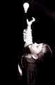
| 03/17/2006 01:59:37 PM | Capturing the Magic Momentby karmatComment: hehehe, very cool :-) Very clever idea. It took me a second to get it, then my own little lightbulb went on :-P I hope you don't suffer from speed voter-itis. Maybe you were going for soft focus, kind of looks like it, but I'm thinking for this particular image, maybe sharper might make it a little stronger. B/w works ok, it was done nicely, but color may be nice in this case also. The composition works. Overall, not a bad execution of a very good idea IMO. Nice job :-) | | Photographer found comment helpful. |
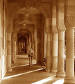
| 03/17/2006 01:51:04 PM | Pillars of Knowledgeby GIS_boyComment: Oh what a very nice shot! I love the tonality of this, wonderful post processing job. The composition is great, awesome leading lines and use of repetition. Good exposure too, I like the rays of light, I think they add to the image nicely. The placement of the girl is great, nice timing. How long did you have to wait for someone to come along? :-) Fits the challenge well, and I think this photo stands on it's own very well outside of this challenge also. Very good job, well done! :-) | | Photographer found comment helpful. |
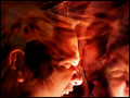
| 03/17/2006 05:15:55 AM | Dante's Infernoby RikkiComment: Very cool Rikki! I am a fan of images like this, and ...hmm, uh- unorthodox ? techniques. Yes, very cool, and thanks for the great write up on how you did it. Cool :-) | | Photographer found comment helpful. |
|
Showing 1041 - 1050 of ~2507 |
Home -
Challenges -
Community -
League -
Photos -
Cameras -
Lenses -
Learn -
Help -
Terms of Use -
Privacy -
Top ^
DPChallenge, and website content and design, Copyright © 2001-2026 Challenging Technologies, LLC.
All digital photo copyrights belong to the photographers and may not be used without permission.
Current Server Time: 07/25/2026 02:30:41 PM EDT.
|