| Author | Thread |
|
|
03/20/2006 06:48:31 AM |
Greetings from the Critique Club :-)
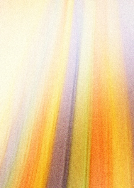
This is your entry in the 'Afterlife' challenge. It could be easier to give a good critique, especially with this type of image if you had included photographers comments. I would then know exactly what you were going for, the technique used, etc. But I shall try and give you some thoughts on the photo. The first thing that strikes me about this image is the rich colors, and the flow from bottom to top at a slight pleasing vertical.
There is graininess here. Perhaps that was what you were going for? Hard to say, but it could be stronger if the flow was crisp and sharper. Going by some of the comments you received, I would say that is a factor in your score. When going for intentional grain, it has to really, really work for the image. At least here at DPC, if your goal is high scores. In general, this audience desires to see very crisp, clear, sharp images. I also note, that to the upper left in the photo, everything kind of washes out. I'm thinking that maybe the image would be stronger if the flow and colors remained consistent here.
You've got a few good comments there. As you probably understand already, abstracts are kind of a love/hate type of thing. There are definitely some real fans of the genre, but many people won't appreciate one. And abstracts in general I think tread a very fine line between great and garbage :-) It is very subjective to look at an abstract and tell what works and what does not. Personally, I like a good abstract, one of my higher scoring photos was from the 'Abstract' challenge. Generally, I think what makes a 'good' abstract is emphasis on color, form and flow. I think you've got a good thing going on with color in your shot. There is some flow, like I said , but I feel like in this shot, it starts to peak my interest, but comes up leaving me just wanting a little more out of it.
As for fitting the challenge, personally I see what you are saying with your image, and I think it fits well. As one of your comments say, I think this challenge subject is geared nicely for abstract renderings. Unfortunately, for the voters here, concepts like this aren't always readily acceptable across the board. They are a very diverse crowd. In general, the real high scoring shots usually really nail the topic for the broadest amount of people. Abstracts are cool, it's good to see people willing to venture out and bravely tread in uncertain waters.
If you have any questions, or comments or anything, feel free to contact me.
happy shooting,
taterbug :-) |
|
Comments Made During the Challenge  |
|
|
03/14/2006 08:07:18 AM |
|
 Photographer found comment helpful. Photographer found comment helpful. |
|
|
03/14/2006 12:37:58 AM |
Hmmm. Not sure what to make of this one. I can kind of get an abstract sense of light flowing upward into the heavens? Abstract is tricky. I personally don't do it very often, if at all, and certainly not for challenge entries. ;^)
From a technical standpoint the colors and composition could work. What really knocks this down is the noise. If this was cleaner/crisper...???
Good luck in the challenge. |
|
| Photographer found comment helpful. |
|
|
03/12/2006 10:01:53 AM |
|
I don't get the meaning, and the image is all grainy. |
|
| Photographer found comment helpful. |
|
|
03/10/2006 03:22:59 PM |
|
I love this verticle abstraction, and how the color tends to merge near the top. Like your choice of golds, purple and white. My favorite of the challenge for depicting life/energy without bodies. 10 |
|
| Photographer found comment helpful. |
|
|
03/09/2006 03:35:41 PM |
|
Reall nice image, a bit noisy, but still really nice. |
|
| Photographer found comment helpful. |
|
|
03/08/2006 11:10:00 PM |
|
| Photographer found comment helpful. |
|
|
03/08/2006 05:49:50 PM |
|
I don't know what the hell I'm looking at. Cool. |
|
| Photographer found comment helpful. |
|
|
03/08/2006 02:23:27 PM |
|
Creative and colorfully abstract. |
|
| Photographer found comment helpful. |
|
|
03/08/2006 06:12:05 AM |
|
Impressionistic/abstract renderings fit this challenge specially well. Very nice! |
|
| Photographer found comment helpful. |
Home -
Challenges -
Community -
League -
Photos -
Cameras -
Lenses -
Learn -
Help -
Terms of Use -
Privacy -
Top ^
DPChallenge, and website content and design, Copyright © 2001-2026 Challenging Technologies, LLC.
All digital photo copyrights belong to the photographers and may not be used without permission.
Current Server Time: 06/30/2026 04:34:13 PM EDT.