| Image |
Comment |
| 04/19/2005 05:58:38 AM |
Post Crisisby patty_oziComment: Couple comments:
Met the challenge, that's for sure, but a few things could have used improvement, such as using a polarizer to help darken the sky (if shot at the right time of day), The roof line is a bit tilted to the right (and may be exactly like that, but titled images never seem to fair well in a challenge) and last, try taking the image into Photoshop (assuming you have it), and in the Hue/Saturation adjustments, take the yellow channel hue and saturation to the right a little (may 10 pts) and bright the lightness down a bit (10-20 pts) to give the yellows more of a darker, richer green look, and bring the red saturation up just a little.
|
| 04/19/2005 05:55:20 AM |
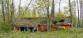
Decay in Springtimeby mannjuditComment: May not have been a good vantage point to shoot this from, but the image seems more about the foliage than the building. |
| 04/19/2005 05:54:05 AM |
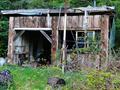
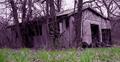
this old shedby lightningComment: Met the challenge head-on!
A little high on the contrast side.
As a suggestion, try taking the image into Photoshop (assuming you have it), and in the Hue/Saturation adjustments, take the yellow channel hue and saturation to the right a little (may 10 pts) and bright the lightness down a bit (10-20 pts) to give the yellows more of a darker, richer green look, and bring the red saturation up just a little. |
| 04/19/2005 05:51:35 AM |
and along came a mudslide (May 18, 1980)by lawreeComment: A little on the centered-side composition-wise.
A suggestion: If using PS (or similar editing software) try going into the Hue/Saturation adjustments, and slightly increase the Yellow Hue & Stauration (maybe 10pts), then bring the Yellow brightness down a little. This will help the yellows appear a deeper, richer green. |
| 04/19/2005 05:48:46 AM |
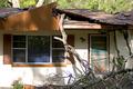
Abandoned Since Hurricane Charleyby joyinlightComment: Shame people had to endure those storms are were left with this.
Kind of busy shot, with my eyes going alll over, trying to find the focal point. Not sure if a different perspective would have helped as I can't tell how much worse it was to the right or left. |
| 04/19/2005 05:45:55 AM |
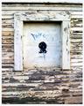
Boarded Upby rookComment: Interesting artistic interpretation to the challenge with the artwork on the boarded-up window. A bit on the contrasty side and a slightly lower point of view (shooting angle) woud have helped the lower boards be a bit more horizontal. (4) |
 Photographer found comment helpful. Photographer found comment helpful. |
| 04/19/2005 05:43:36 AM |
Forest Ambushby SchuffComment: Though meeting the challenge, the toning & selective desaturation & re-toning don't work for me in this shot. Looks kind of like PS gone mad! (please don't take that personally - not meant to offend and apologize if it comes across that way)
A clean B&W conversion with a little more sharpness woud have helped. Still, meeting the challenge, I gave you a 4.
Regards, |
| Photographer found comment helpful. |
| 04/19/2005 05:40:34 AM |
Old Queensland Homesteadby BrianRComment: Hope I am not the only one to give you some bad news (hate doing that).
This image is very small (274x180 pixels) and will suffer in a challenge where we can upload as large as 640x640 pixels. Image is also lacking in sharpness and is slightly tilted to the left.
The site has some great tutorials on how to prepare a shot for submission in the Forum drop-downs under Tutorials. if you need further help, please PM me now or after the challenge and I can direct you to some great sources of help.
You did meet the challenge and gave you a 3 for effort.
|
| 04/18/2005 07:13:29 PM |
|
| Photographer found comment helpful. |
| 04/18/2005 07:13:08 PM |
old,old,placeby chusterComment: Image seems to be well composed, but looks to be a lot of image compression/resampling artifacts. Take a look in the DPC Forum heading (//www.dpchallenge.com/forum.php) and scroll down to the Tutorial Section (//www.dpchallenge.com/forum.php?action=list&FORUM_SECTION_ID=13) and in the 7th listing down is one called Using Photoshop to Prepare Photos for DPC Challenges (//www.dpchallenge.com/forum.php?action=read&FORUM_THREAD_ID=114522) for an excellent step by step to prepare your images for the site's challenges.
Hope this helps. |
Home -
Challenges -
Community -
League -
Photos -
Cameras -
Lenses -
Learn -
Help -
Terms of Use -
Privacy -
Top ^
DPChallenge, and website content and design, Copyright © 2001-2026 Challenging Technologies, LLC.
All digital photo copyrights belong to the photographers and may not be used without permission.
Current Server Time: 06/19/2026 01:19:31 PM EDT.