| Image |
Comment |
| 04/25/2005 07:50:28 PM |
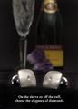
Diamond Cuff Linksby cajayComment: Nicely designed advertisement with a good text to support it.
Background is effective here, showing class, without taking over the image.
Well Done! |
 Photographer found comment helpful. Photographer found comment helpful. |
| 04/25/2005 07:50:12 PM |
|
| Photographer found comment helpful. |
| 04/25/2005 07:49:54 PM |
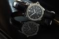
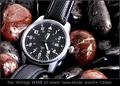
History In The Makingby RedOakComment: Nicely laid out and composed shot.
Background works well here and the placement and font style used work well here.
The rocks & drops say outdoor & rugged. Lighting was great and no reflections on the watch crystal.
Nicely done! |
| Photographer found comment helpful. |
| 04/25/2005 07:33:11 PM |
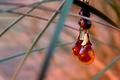
Amber Sunsetby ZoomdakComment: Nice composition and ligting used, but the strands running through this shot are quite a distraction in my opinion. |
| Photographer found comment helpful. |
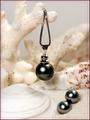
| 04/25/2005 07:32:09 PM |
Fijian Black Pearlsby dkubinComment: Very nice composition and nice choice of using a very light background in this.
Good job on retaining the details in the background while not making it center stage. |
| Photographer found comment helpful. |
| 04/25/2005 07:30:11 PM |
Suggestiveby mrmorrisComment: Unique take on this challenge.
Offset compopsition works, though the lighting on the metal is a bit harsh (tough one to do). |
| Photographer found comment helpful. |
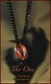
| 04/25/2005 07:29:02 PM |
The Oneby jperez1690Comment: The red in the border is a bit of overkill in my opinion.
Perhaps had this been edited with another layer, desaturate the reds, and then brush them back in on the ring only may have worked better (remving the red from the chain only). |
| Photographer found comment helpful. |
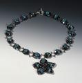
| 04/25/2005 07:27:06 PM |
Starflower Necklace of Beadsby photomComment: Perhaps a bit too centered/symmetrical for a good advertisement.
Shadows are a minor distraction (not too bad though), yet the lighting is decent as is the clarity. |
| Photographer found comment helpful. |
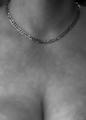
| 04/25/2005 06:01:03 PM |
All You Need Is Goldby Mr_PantsComment: Skin that blurry gives an unnatural feeling to this image.
Composition is too much on the botom of the shot vs. the focal point on the top in my opinion. (or was the intent to draw the focal point to the cleavage?)
Detail & lighting on the necklace are good. |
| Photographer found comment helpful. |
| 04/25/2005 05:58:35 PM |
|
| Photographer found comment helpful. |
Home -
Challenges -
Community -
League -
Photos -
Cameras -
Lenses -
Learn -
Help -
Terms of Use -
Privacy -
Top ^
DPChallenge, and website content and design, Copyright © 2001-2026 Challenging Technologies, LLC.
All digital photo copyrights belong to the photographers and may not be used without permission.
Current Server Time: 06/20/2026 07:45:15 AM EDT.