| Image |
Comment |
| 05/01/2005 09:56:57 PM |
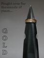
Gold - Fought over for thousands of years....by theSajComment: I had to study this for a bit to understand it, and had no idea that was a sword/dagger at first. Main focal point is lesson the gold band than the sword and in my opinion, should be the other way around. Mixed feelings on the text / font. (5) |
 Photographer found comment helpful. Photographer found comment helpful. |
| 05/01/2005 09:54:00 PM |
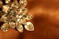
Elementalby utroComment: Composition & lay out was good, but detail & focus a bit too shallow on the jewelry.
Background material areas in focus on upper & lower right sides a little distracting. (5) |
| Photographer found comment helpful. |
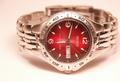
| 05/01/2005 09:52:22 PM |
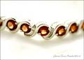
Garnet Tennis Braceletby shutterflyComment: Nice control on the lighting / shadows.
Detail & clarity are good and the overall layout is nice.
Effective text/font used. (6) |
| Photographer found comment helpful. |
| 05/01/2005 09:51:20 PM |
Ocean's Mystery Braceletby SondaComment: Perhaps one of the more unique shots in this challenge.
The high-contrast Black & White works well in an advertisement composition, though the lower bracelet is a bit lost. Effective text/font used. (6) |
| Photographer found comment helpful. |
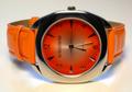
| 05/01/2005 08:43:44 PM |
TIME to buy new jewelryby mischffComment: Nicely done.
The tone & lack of glare help this shot a lot, as well as the blueish backlighting behind it.
In my own opinion, a vertical alignment would be better so the viewer wouldn't have to tip their head to read the watch face. (6) |
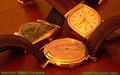
| 05/01/2005 04:00:52 PM |
Hamilton Watch Company circa 1958by bcobleComment: I have absolutely no suggestions or ideas how to arrange 3 watches in a shot to make it interesting, so I can't say good or bad about the composition. Overall a bit dark and lacking in contrast. Green text is far too much of a clash for the shot in my opinion. (5)
|
| Photographer found comment helpful. |
| 05/01/2005 03:58:21 PM |
|
| Photographer found comment helpful. |
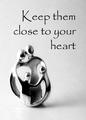
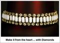
| 05/01/2005 04:19:13 AM |
Keep them close to your heartby dsa157Comment: B & W works well here, and I like the offset comosition of this shot.
Your text / font is a style that seems to work with this, as it's not gawdy, nor too big.
Overall a pretty decent shot with one minor distraction: The black spots on the metal. (6)
|
| Photographer found comment helpful. |
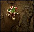
| 05/01/2005 04:16:03 AM |
*by Moose101Comment: As I sat here looking at this shot, I struggled to figure out what it was that was so different about it then it suddenly hit me - the white border/framing.
This is a case of the border/framing actually working for the shot instead of against it. An advertisement would/could look very similar to this kind of lay out.
Composition is decent and the red in the background adds dimension instead of the jewelry floating in space. Overall, a pretty good take on the challenge. (6)
|
| Photographer found comment helpful. |
| 05/01/2005 04:12:03 AM |
Take the Leap: Buy Me!by dsidwellComment: Pleasant shot to look at, with natural colors.
Background is complimentary with a natural feel and the lighting on the jewelry brought out it's colors. Detail level is good as is composition.
The title may be a bit too "cute" for advertising. (6) |
| Photographer found comment helpful. |
Home -
Challenges -
Community -
League -
Photos -
Cameras -
Lenses -
Learn -
Help -
Terms of Use -
Privacy -
Top ^
DPChallenge, and website content and design, Copyright © 2001-2026 Challenging Technologies, LLC.
All digital photo copyrights belong to the photographers and may not be used without permission.
Current Server Time: 06/20/2026 01:35:30 PM EDT.