|
|
|
Showing 3231 - 3240 of ~5638 |
| Image |
Comment |
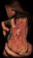
| 10/20/2005 11:53:37 PM | Civilizationby peterishComment: Greetings from the Critique Club Peter!
"...Devote your photographic energies to making us feel good about ourselves and our lives."
This challenge was a bit tough to please everyone, every time. What made one person feel good about themself may not have been globally understood, nor accepted by the voters. Your submission generated acceptance as well as negativity and lack of understanding. Thanks goodness we have evolved from the dark days of eating in such a manner.
Composition:
Your composition pulls the eye right to the main focal point - the raw fish, which I am sure if not studied, appeared to many as a piece of raw beef. There is a leading lines effect here, as the eye first gets pulled to the fish, then draws attention upwards to the dark nose.
Lighting:
Your lighting on this was the key factor to the effect, and was done well. Dark & moody away from the main subjet, yet just enough on the outside to be suportive in the effect to show eating happening.
Post-Processing:
The post-processing here was in my opinon, very well done. White balance looks correct as well as the color balance. Colors are not over-saturated, and the darkness at the nose area was just right to allow it to be seen, but not take center stage. Detail level was good, not over-sharpened, nor noisy.
Suggestions/Improvements:
This image fell near the bottom of the challenge rankings, as I suspect was due to several reasons. One, many voters did not understand this, nor feel it met the challenge and Two, the appeal factor turned away many members. This was a dark humor shot with a touch of gross factor, as I am sure you were aware of submitting it. Thinking outside the box is a new-fangled term for creativity, which this shot defined. Mass appeal on an image like this is not generally going to happen here.
Keep your creativity flowing and by all means, keep shooting!
I hope this was useful to you, and please feel free to contact me via PM if you have any questions regarding this critique or anything else relating to the site in general.
Regards,
Brad |  Photographer found comment helpful. Photographer found comment helpful. |
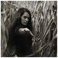
| 10/20/2005 07:09:58 PM | Come This Wayby rscorpComment: Oh now this is a great shot.
Not only is the composition and setup good, the toning used was great! | | Photographer found comment helpful. |
| 10/20/2005 04:51:01 PM | My bologna has a first name...by dmmontyComment: I think the color cast played a huge effect on the challenge results, as this was
a very creative and well composed shot (considering it IS bologna) 
I did a quick edit to show the difference:
 
------------Original------------------Edited------------
(open each and switch between them in the taskbar to see differences) | | Photographer found comment helpful. |
| 10/20/2005 03:07:09 AM | | | Photographer found comment helpful. |
| 10/19/2005 11:40:36 PM | Forbidden vegetable by LevTComment: What can I say?
Congrats on the Yellow Red Lev.
Somethin very wrong about ANY vegetable that looks like this... LOL | | Photographer found comment helpful. |
| 10/19/2005 02:27:58 AM | | | Photographer found comment helpful. |
| 10/19/2005 12:26:01 AM | Parking Attendant by whiteroomComment: Woo hoo - she rocks!
Hang up your paintbrushes and let your turpentine evaporate!
Portraits is your calling. | | Photographer found comment helpful. |
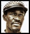
| 10/18/2005 01:26:57 PM | African Refugeeby CutterComment: This has a home in the Post Card rack at the zoo. Great shot!
Greeting Card challenge material - oops - just missed it!
| | Photographer found comment helpful. |
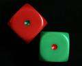
| 10/18/2005 12:51:44 PM | Snake Eyesby JeniYComment: Greetings from the Critique Club!
"...try to use two complementary colors to compose your photograph."
This seemed to be a very subjective challenge for those submitting as well the voters. The "intended" focus of this challenge was to photograph something with 2 opposite colors in the color wheel. This can esily be checked in most photo-editing programs by simply inverting the colors and seeing what the opposite of a certain color is.
Composition:
Your composition is simple and to the point with no distractions.
Lighting:
Your subject is well lit, and soft in manner without glaring relections, nor hotspots.
Post-Processing:
Colors are clean focus appears slightly soft, not necessarily being a bad thing though. Black levels are good and without artifacts and background items to see.
Suggestions/Improvements:
This image fell nearly dead-center in the challenge rankings, perhaps because it was so simplistic in content. 2 of any item is generally less pleasing to the eye than say 3, but in this case, 3 die would not have worked properly. I did notice the green die being slightly off-level (1.4 degrees approx). Trying to figure out what could be done to improve this is a difficult task. Too centered perhaps? Dual lighting sources? Different angle shot? It is a stock type of shot, of a rather mundane subject - dice. You met the challenge, with an average vote, in a difficult and subjective challenge. many new members on this site wish they could score a 5.5 on a second challenge.
Keep on shooting!
I hope this was useful to you Jeni, and please feel free to contact me via PM if you have any questions regarding this critique or anything else relating to the site in general.
Regards,
Brad | | Photographer found comment helpful. |
| 10/18/2005 05:16:39 AM | Hibiscusby luv2photoComment: Greetings from the Critique Club!
"...try to use two complementary colors to compose your photograph."
This seemed to be a very subjective challenge for those submitting as well the voters. The "intended" focus of this challenge was to photograph something with 2 opposite colors in the color wheel. This can esily be checked in most photo-editing programs by simply inverting the colors and seeing what the opposite of a certain color is.
Composition:
Your composition pulls the eye in two different directions here. The stamen and it's shadow in the red portion of the Hibiscus. Difficult to do under any conditions, trying to bring two vibrant colors to the table and not have a conflict. Complementary and conflict almost go hand in hand here. This is a wonderful floral macro, regardless of it's challenge ranking.
Lighting:
The lighting here works, as the shadows add the dimension of depth to your photograph. Perhaps a bit too bright, particularly the yellows.
Post-Processing:
A couple possibilities that could have richened this up a bit.
In Photoshop, levels can be a blessing. Try this: Open the image (as I did) in Photoshop, and go Image, Adjustments, Levels, and you should see the histogram. On the bottom of the graph are three set points. Left being Black point, center being Neutral and right being White point. Take the center pointer and slide it to the left until you see the number in the center box reach approx. 0.75 - this darkened the image, but is different than just darkening. The results are better and more neutral, and gave a bit more definition to the stamens.
Suggestions/Improvements:
This image fell in the lower 25% of the challenge rankings, primarily due to the lack of really meeting the intended challenge, and am sure you realize what happened by now. Even a simple color/hue shift could have got this closer to meeting the challenge, though would not have been realistic. Keep your eyes on the forums to see discusssions so often associated with challenge descriptions.
Keep shooting!
I hope this was useful to you, and please feel free to contact me via PM if you have any questions regarding this critique or anything else relating to the site in general.
Regards,
Brad |
|
Showing 3231 - 3240 of ~5638 |
Home -
Challenges -
Community -
League -
Photos -
Cameras -
Lenses -
Learn -
Help -
Terms of Use -
Privacy -
Top ^
DPChallenge, and website content and design, Copyright © 2001-2026 Challenging Technologies, LLC.
All digital photo copyrights belong to the photographers and may not be used without permission.
Current Server Time: 06/22/2026 02:57:08 PM EDT.
|