| Image |
Comment |
| 01/20/2006 12:24:46 PM |
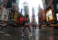
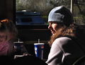
He Singled Himself Outby seebrownComment: This is a cute shot - lol.
Challenge-wise, kinda' doesn't meet the challenge in that he isn't selected out of a crowd by minimal depth of field. His face is also so dark/in the shadows and it hurts this image. (4) |
| 01/20/2006 12:22:57 PM |
Play Timeby livitupComment: Not sure the noise/image grain works real well on this, at least for me.
Challenge was well met.
The black shadow/vignetting on the bottom and left side is a bit distracting. (6) |
 Photographer found comment helpful. Photographer found comment helpful. |
| 01/20/2006 12:20:54 PM |
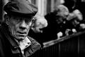
Market Manby e301Comment: Though the man here is singled-out perhaps more by the distance than minimal dof, this is a very nice image, and a great choice for B&W. (6) |
| Photographer found comment helpful. |
| 01/20/2006 12:19:29 PM |
Fish Marketby cabaComment: Very nice lighting on this and a clear image.
Crop may have been a little stronger if all the sign on the left would be in the shot, or have it out completely, and perhaps a little less of the foreground material/paper showing. (7) |
| Photographer found comment helpful. |
| 01/20/2006 12:16:14 PM |
Unwilling Modelby elemessComment: Interesting point of view.
No people here/no crowd - don't really think the chairs count as a crowd. (4) |
| Photographer found comment helpful. |
| 01/20/2006 12:14:38 PM |
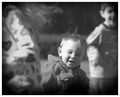
Quiet Lunchby RolandBComment: Great lighting - side lighting and people can be tough to do.
Girls on the left a little noisy and fairly in focus though. (5) |
| Photographer found comment helpful. |
| 01/20/2006 12:12:55 PM |
Coupleby lecafeComment: "...and single-out a person in a crowd as your source of composition."
Oops - miss the key word - person.
Great picture though! |
| Photographer found comment helpful. |
| 01/18/2006 04:02:11 PM |
winter blues by ursulaComment: WOW.
Magical is the best I can come up with.
Congrats on the  |
| Photographer found comment helpful. |
| 01/15/2006 12:46:42 AM |
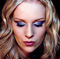
Colorfull meby unnevaComment: Holy moly - colorfull is right!
As I scrolled down, the image looked better in my opinion with about 90-100 pixels off the top, making your forehead tone even.
Something along these lines maybe?
 Message edited by author 2006-01-15 00:51:31. Message edited by author 2006-01-15 00:51:31. |
| Photographer found comment helpful. |
| 01/15/2006 12:20:50 AM |
|
Home -
Challenges -
Community -
League -
Photos -
Cameras -
Lenses -
Learn -
Help -
Terms of Use -
Privacy -
Top ^
DPChallenge, and website content and design, Copyright © 2001-2026 Challenging Technologies, LLC.
All digital photo copyrights belong to the photographers and may not be used without permission.
Current Server Time: 06/23/2026 07:30:09 AM EDT.