|
|
|
Showing 601 - 610 of ~1853 |
| Image |
Comment |
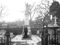
| 01/26/2006 10:19:33 PM | Goodbyeby Shiva DasComment: Very nice composition, however, the photo is too white washed/over-exposed for me... |
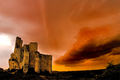
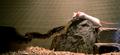
| 01/26/2006 10:12:45 PM | The Fortressby DamianComment: Nice, very reminiscent of BobsterLobster's castle from last year. A little curved from the wide angle but quite nice... |  Photographer found comment helpful. Photographer found comment helpful. |
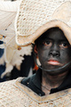
| 01/26/2006 06:18:19 PM | Ati-atihan, Philippinesby flip89Comment: ::: Critique Club ::: [The Saj]
First Impressions: At first I noticed the wonderful textures and white and then a mere moment later I was drawn to the boys face.
-------------------------------------------------------------
Composition: The composition is well done and works well in the positioning of the head covering & leaves and the chest piece. However I almost feel a touch cut-off on the right hand side. I'd have to see the original scene to really determine if it was the best position to crop.
Subject: Excellent choice of subject. Solemn expression on the boy combined with excellent surrounding textures. Very good contrast between the light and the dark tones.
Technical (Colour, focus, and light): I feel the lighting and color is spot on. The focus is good, with the background strongly blurred but all of the foreground remaining well reasonably well focused. However, even with the background nicely blurred there background elements are still a bit distracting.
-------------------------------------------------------------
Summary: Overall, a very nice take with just a few minor distractive elements. It does fall a bit to the "poster child feel" thanks to the main subject's expression. And that might create a "we've been here many times feel". However, I feel the wonderful textures of woven reeds and leaves greatly diffuse such concern.
To improve?: I am wondering if this is the best expression to have captured? It looks like a ceremony or celebration, in which I'd expect a bit more expression. But I am ignorant and for all I know this may be a funeral procession and thus a very applicable expression.
The only other two items I would point to is the right side edge, I just keep feeling as if I want a little bit more. And the background elements. There is obviously a similar leaf type structure in the background. Though it is nicely blurred there is not enough contract between the foreground leaf elements and the background leaf elements to distinguish them from one another clearly.
As this was an entry in the singled out challenge, it might have been better to have zoomed out a bit to show more of the scene.
-------------------------------------------------------------
It is my hope that these insights are helpful, and constructive. If you have any questions regarding this critique, please feel free to PM me.
- Jason "The Saj"
|
| 01/18/2006 12:40:44 PM | Tree of lifeby olbolComment: ::: Critique Club ::: [The Saj]
First Impressions: At first I liked this photo but something gnawed at me and it did not come across quite as pleasing as I would have figured it to be. And I scored it a little low. Perhaps lower than I should (In general, I seemed to have been a little more critical in my Shapes II scoring than average. That said.
-------------------------------------------------------------
Composition: The composition avails itself to an almost abstract manner that would be very appealing in a painting; but I am not so sure about it's use in this photo is fully affective.
The capture of the breast itself is very pleasant. But my eye keeps drifting and being lost when it looks at the rest of the composition and I believe this is in part what most hurt this photograph's score.
Subject: Superb.... the subject is a thing of beauty. Your girlfriend's areola stands out strongly and the nipple is well defined lending to a very good model for a breast shot.
Technical (Colour, focus, and light): The sharpness and focus of this shot is quite nice. I found the lighting and shadowing to provide an excellent accent. The color tones are especially appealing IMHO, but also very subject to personal taste.
-------------------------------------------------------------
Summary: There is a lot of potential with regards to the photographer's skill's and his particular choice of model for this shot. However, certain aspects of the composition throw the feel of the image off. A lot of potential. I gave it a (4) when I voted and I was in a critical mood. I think it was only a few points aspects of composition that kept me from giving this photo a 6 or maybe even a 7.
To improve?:
I believe that in part what is happening is that we are losing a bit of the definition of the human form with this composition. The breast is an obvious sign of the human form, however, the way the rest of the body is captured provides little definition. Perhaps an arm coming across the belly or zooming out in order to widen the shot may resolve this. Another alternative might be to change to a landscape shot and move up a couple of inches to capture some of the collar bone region as well.
Also, there is a lateral line showing in the photo, it creates a visual border about an inch from the left side of the photo. This also added a distracting element.
If these items were addressed I believe this photo would be on it's way to excellency. The lighting, the capture of the details of the breast, are all wonderfully executed.
It looks like you still have some time to do additional shooting with this model while she is pregnant and I highly encourage you to do so. You've got very good grasp on the lighting and capture and a wonderful model.
BTW.... Pozdravleneeya
Supposed to be "Congratulations" but my Russian is ochin plocha!
Keep warm....I hear it's beyond freezing in Moscow right now.
------------------------------------------------------------
It is my hope that these insights are helpful, and constructive. If you have any questions regarding this critique, please feel free to PM me.
- Jason "The Saj" Message edited by author 2006-01-18 12:42:06. | | Photographer found comment helpful. |
| 01/18/2006 09:23:52 AM | | | Photographer found comment helpful. |
| 01/16/2006 04:29:54 PM | | | Photographer found comment helpful. |
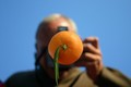
| 01/16/2006 03:17:03 PM | Focus on Fruitby LeejpComment: ::: Critique Club ::: [The Saj]
First Impressions:
My first impressions with this photo was "wow...that's a cool shot". And I still think that to be the case. ;-)
BTW...I gave this photo a 7 in voting.
-------------------------------------------------------------
Composition:
The composition is strong. Some might object to this photo being very centered, but I think it works in this case. Though you might also want to consider cropping off the top 1/2" and perhaps 2" from the left. This gives it a strong "rule-of-thirds" commitment and seems to make the orange stand out a bit more.
Subject:
Excellent subject. The orange is well placed and very distinct, the long leaf is a great addition (although I notice upon further inspection that I can see a reflection of this, which helps to answer my question about how this shot was composed. I presumed it is an orange set on a mirror with blue ceiling or sky above?)
Of note, the placement of the model's (namely, you the photographer) hand, was well placed, and well posed.
Technical (Colour, focus, and light):
Focus is sharp on the orange and nicely blurred on the photographer. Lighting is good but might be better. The left side of the photographer is a bit dark .
The focus also gives a very 3D feel allowing the orange to simply lift off the photo.
The colours are bright and cheery, with the background colors are a bit more subdued helping the background subjects to nicely fall into the background of the photo and not detract from the main subject.
Creativity: This was a fun photo. Creative, bright, and juicy. ;-)
-------------------------------------------------------------
Summary: A fun photo with good clarity. Perhaps not the best entry category (I imagine it'd have done surprisingly well under "Fruit") but overall not a bad entry for the "shapes" challenge.
To improve?: Try a tight crop, remove a bit of the blue toward that top and most of the portion to the left of the photographer. A few minor distractions, namely the shoulders. On the left there is a dip and a rise again. This creates a distracting element. I also believe lowering your left elbow would have helped by reducing the appearance of the shoulder so as to provide more clear space. There are a few minor artifacts, the most noticeable of which is found on the photographer's hand as it holds the camera...was this reflection? I cannot tell...but it is very minor and expected in basic challenge entry.
You should feel good about this entry, it was a great endeavor!
-------------------------------------------------------------
It is my hope that these insights are helpful, and constructive. If you have any questions regarding this critique, please feel free to PM me.
- Jason "The Saj" |
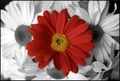
| 01/16/2006 01:31:00 PM | Look at me!by idemaerschalkComment: Why I gave you a 5, by Doctor Fritz B. Banzai (a.k.a. The Saj)
The composition was nice, and you have a natural "color de-selection" photo which is also nice.
However, flowers are a tough one to score with. There are just so many flower entries.
Second, the focus is a bit lacking on the center flower. |
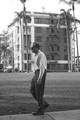
| 01/15/2006 03:24:27 PM | Encumbered Walking Manby wisdomp11Comment: ::: Critique Club ::: [The Saj]
First Impressions: I am back in San Diego....(or some place that feels very close). At first glance this photo shouts potential but I feel there are several elements that just hold it back. It could have been a suberb era shot.
-------------------------------------------------------------
Composition: I really like the placement of the building. The angle, etc. However, I am unsure of the crop regarding the tree. Secondly, I feel as if the man was shot a moment too late. If he was an inch or so closer to the right so as to be stepping "into" the frame.
Subject: The pose and expression on the foreground subject is excellent. It has made a good capture of that age of retirement (but not yet elderly). The gentlemen's shirt and pants match the white and dark colors of the building quiet nicely. The building also is interesting; from it's place of the fire escape, white porches and white stone trim. Provides a very strong secondary subject.
Technical (Colour, focus, and light): This is the second area that I feel this photo takes a major hit on. THe sky is blown out and over exposed. Even in B&W this is exceedingly noticeable by the loss of detail in the white washed trees. Focus could be a little sharper on the man in front. But that can be difficult with very wide angle shots.
-------------------------------------------------------------
Summary: Overall it was a nice capture. Has a very antiquated feel which adds a lot of character to the photo. However, the handful of technical & compositional issues prevent this shot from reaching it's full potential. I very much like the choice in subjects. And I think capturing the main subject in mid-step was done very well.
To improve?: Be mindful of over-exposure. It's far easier to enhance detail that is already in the photo. It's near impossible to bring it out when it's been washed. Just be mindful of your sky exposures in the future.
-------------------------------------------------------------
It is my hope that these insights are helpful, and constructive. If you have any questions
regarding this critique, please feel free to PM me.
- Jason "The Saj" |
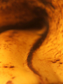
| 01/13/2006 12:34:56 PM | Shapesby eyeronikComment: ::: Critique Club ::: [The Saj]
First Impressions: What is it? Okay, interesting line and a pleasant curve....where is the photographer trying to bring me? Do like the curve though....
These were my first initial thoughts. It's a very abstract photo. I am making the assumption that is what you were aiming for? In the future, it is helpful to state a little bit regarding the goals you are aiming for with regards to a photograph. Helps the critiquer out in measuring how well those were achieved.
-------------------------------------------------------------
Composition: I believe the composition for this appeals to the abstract nature quite nicely. Particularly, in how the composition provides a good emphasis of curvature along the brown line. It appears to follow similar curves as Edvard Munch's "Scream"
Subject: As the challenge topic was shape, I am not quite sure this subject was the best choice for conveying such emphasis. The line does clearly denote curvature but the overall feel of the photograph is so strongly abstract that "shape" is not what leaps up to me as a major attribute.
Technical (Colour, focus, and light): The colors in this photograph naturally work well, both are subdued earthtones so they don't leap out at you.
You've mentioned you experimented with varying DOF and did not like how the deeper DOF appeared. I believe the shallow DOF is the better choice if you were looking for a very abstract photo. And I do not believe your composition would have worked well if all was in focus as it would come across as merely a close up photograph of a banana peel.
The lighting seems to have been very natural in it's feel - that is a nice quality.
Creativity: You've created a very nice abstract image from a simple everyday object. That shows a good idea at taking advantage of what is around you.
-------------------------------------------------------------
Summary: I am left with the overall feeling of a nice abstract but a photo that seems a bit out of place in the challenge it was entered. I also feel that the image may not be strong enough to stand on it's own. (Albeit, the nice curvature line reminiscent of "The Scream" is an interesting feature.) I do see this image providing a superb backdrop for incorporation as a graphic design element. Beyond their own artistic merit, these types of abstract imagery are often needed and sought after for album covers, advertisements, etc.
To improve?:
Consider your audience, I believe this photo did not do all that well in the challenge because it was outside the scope of the audience's expectation. It may be or may have "shape" but it didn't convey the concept of "shape" the way most of DPC voters perceived. Had this been submitted in an abstract challenge such as the "Impressionist" challenge a while back - it would have done well.
Another consideration. When I first saw this image and tried to figure out what it was, I was greatly reminded of various representations of "hyperspace" I've seen in such shows as Babylon 5. It might be of interest to play with some "hue" adjustments and see how the results come out.
It is my hope that these insights are helpful, and constructive. Message edited by author 2006-01-13 12:55:52. |
|
Showing 601 - 610 of ~1853 |
Home -
Challenges -
Community -
League -
Photos -
Cameras -
Lenses -
Learn -
Help -
Terms of Use -
Privacy -
Top ^
DPChallenge, and website content and design, Copyright © 2001-2026 Challenging Technologies, LLC.
All digital photo copyrights belong to the photographers and may not be used without permission.
Current Server Time: 07/18/2026 04:59:19 AM EDT.
|