Salvation Chromeby
TejComment: ::: Critique Club ::: [The Saj]
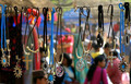
First Impressions: Colorful and festive
-------------------------------------------------------------
Composition: Composition is a bit mixed on this one. I feel that the crop creates a several minor distracting elements. On the bottom left we see a white line on dark but no context. Likewise a weird white blotch in the bottom right corner. Now I could understand such minor inclusions had it been for the purpose of including the lowest hanging pendent, but this appears to be cut off. So then I am left asking why you didn't crop it either slightly higher or slightly lower, as either choice would have benefited the shot. Likewise, I'd have expanded the borders to each side a millimeter or two just to include the entirety of the pendants and not clip off miniscule amounts. I might have however cropped a tiny bit of the top/top left portion.
The other element that kinda puts me off a little to this photo is the background. It's just very noisy. Maybe if it was blurred just a little bit more. Though if the intention was to include the people in the background then it was nicely blurred.
Subject: The subject is interesting and well captured but I'm not sure it conveys much emotionalism. It's a photo of a vendor's rack. A nice photo but not the most stand out subject.
Technical (Colour, focus, and light): Color is very strong and diverse in this shot and I think that is one of this photos stronger elements. The focus and lighting is also strong. You did do a good job of focusing on the foreground and blurring the background to nicely create two layers of depth.
-------------------------------------------------------------
To improve?: Be mindful on your crop and try not to cut off edged of elements. Or if you go that route, at least ensure that you remove distracting artifacts/elements.
Not sure if it were possible, but if you were able to change the angle so that all the background was of the lighter tone. (As opposed to it being much darker on the left) It might make for a less distracting background element. But this may very well not have been possible. Just something to keep in mind.
Summary: Not a bad photo, not bad at all. But the subject matter does lack some punch. However, if I was a vendor and wanted to display my wares on the web or in print, you've done an excellent job of capturing.
-------------------------------------------------------------
It is my hope that these insights are helpful, and constructive. If you have any questions regarding this critique, please feel free to PM me. Also feel free to PM me with any feedback on this critique. And please remember to mark it "Helpful" if you found it so.
- Jason "The Saj"