|
|
|
Showing 231 - 240 of ~1853 |
| Image |
Comment |
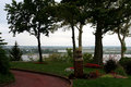
| 10/03/2006 02:27:23 AM | Follow the brick roadby Grace4allComment: ::: Critique Club ::: [The Saj]
First Impressions: Needs work...
-------------------------------------------------------------
Composition: Composition is unclear. Your title states the road as the focus. But the road seems to be a secondary element. Without looking at the title I am left wondering what is the subject. Is it the pillar?
Subject: Is not emphasized in the photo.
Technical (Colour, focus, and light): Color is nicely captured. Focus is good. Lighting is good. However, the photo is a bit dark and could benefit from some brightness as the trees are much too shadowed.
-------------------------------------------------------------
To improve?: To be honest, there is much too improve. But don't be discouraged. You have come to the right place. I see that this is your first entry. DPC will help you improve your photographs by leaps and bounds. I've been on for about 2 yrs now. My scores have improved somewhat. But my knowledge and photography have improved quite a bit (as noticed by my friends).
Now back to the photo. I'd consider perhaps a closer view capturing the road in more detail in order to heighten the path of lines. If you were to crop the rightside so as to include the pillar on the right as opposed to center. And cropped out the tree on the left which just becomes distracting as it is half cut. This would provide a much stronger focus on the road.
Also, lowering your point of view closer to the ground would have increased the visualization of the brick road and also added emphasis.
Summary: It's not a ribbon but it's also a first entry. The photographer should not be discouraged. This is an excellent environment to learn and improve.
-------------------------------------------------------------
It is my hope that these insights are helpful, and constructive. If you have any questions regarding this critique, please feel free to PM me. Also feel free to PM me with any feedback on this critique. And please remember to mark it "Helpful" if you found it so.
- Jason "The Saj" |  Photographer found comment helpful. Photographer found comment helpful. |
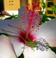
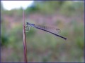
| 10/03/2006 02:12:24 AM | Shadows & Echoesby hihosilverComment: ::: Critique Club ::: [The Saj]
First Impressions: Oh no...not another flower. Oh wait..there's more! :)
-------------------------------------------------------------
Composition: Composition is good on the foreground (flower & hopper). The biggest issue I see with the composition is the background which is very distracting.
Subject: Subject is of a nice flower could be considered typical. However, the placement of a secondary subject (hopper) makes this entry stand out beyond the normal flower entry.
Technical (Colour, focus, and light): Focus is good. Color and lighting is good. However I feel the image could be brighter and might benefit from an increase in hue saturation, particularly in the green.
-------------------------------------------------------------
To improve?: Consider a different background. This may seem crazy, but you could hold a white piece of paper behind the flower.
Summary: An interesting capture. I like the shadow of the flower overlooking the hopper. Background is overly distracting.
-------------------------------------------------------------
It is my hope that these insights are helpful, and constructive. If you have any questions regarding this critique, please feel free to PM me. Also feel free to PM me with any feedback on this critique. And please remember to mark it "Helpful" if you found it so.
- Jason "The Saj" | | Photographer found comment helpful. |
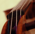
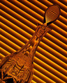
| 10/03/2006 02:02:01 AM | Stringsby SiggavComment: ::: Critique Club ::: [The Saj]
First Impressions: Ah...a violin
-------------------------------------------------------------
Composition: Composition leaves me a bit mixed. The DOF is so shallow that there is minimal detail to focus on. Further parts of the violin become mostly colored blurs.
Subject: The subject, "violin", is a beautiful instrument. However, I find the colored strings to be extremely distracting.
Technical (Colour, focus, and light): Color tones is nice. The focus leaves a bit to be desired. Lighting is well done.
-------------------------------------------------------------
To improve?: Increase the depth of field. Desaturates the magentas, reds, cyans to see if you can reduce the colors of the strings.
Summary: Not a bad endeavor but not very strong. As it was for the challenge "leading lines" I would have expected the lines to have been a stronger focus. Where as it stands now they are blurred and secondary to the photo.
-------------------------------------------------------------
It is my hope that these insights are helpful, and constructive. If you have any questions regarding this critique, please feel free to PM me. Also feel free to PM me with any feedback on this critique. And please remember to mark it "Helpful" if you found it so.
- Jason "The Saj" | | Photographer found comment helpful. |
| 10/03/2006 01:56:06 AM | Rapunzel's Greatest Desireby ndsComment: ::: Critique Club ::: [The Saj]
First Impressions: Well done...
-------------------------------------------------------------
Composition: Good composition. Well positioned with no real elements to distract.
Subject: Subject is well placed. However, the subject's eyes are not focused as well as they could be IMHO. They expose too much of the whites. Perhaps having the model look at a slightly different angle to reveal her iris' more.
Technical (Colour, focus, and light): Nice tones in processing. Good focus and well lit. The tone of this foto gives a nice metallic "retro-modern" feel which goes well with the theme. Of note, a secondary light to reduce the shadow on the shoulder and to fill in the left eye a bit would be beneficial.
Creativity: A fun photo with a nice creative touch in processing.
-------------------------------------------------------------
To improve?: An additional lightsource. That said, the ring from an artistic standpoint is a bit distracting. The color tone doesn't quite fit.
Summary: Well done, fun, and nicely exposed.
-------------------------------------------------------------
It is my hope that these insights are helpful, and constructive. If you have any questions regarding this critique, please feel free to PM me. Also feel free to PM me with any feedback on this critique. And please remember to mark it "Helpful" if you found it so.
- Jason "The Saj" | | Photographer found comment helpful. |
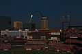
| 10/03/2006 01:47:25 AM | Night Baseballby mpreslarComment: ::: Critique Club ::: [The Saj]
First Impressions: Very nice skyline composition
-------------------------------------------------------------
Composition: Great capture of the skyline. The building on the left is a bit of a distraction. Too flat in a photo of lots of subjects. Also, there is too little of the field. This becomes a distracting element that keeps gnawing on me.
Subject: I would have expanded the view of the baseball field. There is so little as to make it irrelevant, but since it is so prominent it becomes mentally distracting.
Technical (Colour, focus, and light): Colors are nice. Sky tones and reflections especially. Good contrast. I'd say the shot is overall a bit too dark though.
-------------------------------------------------------------
To improve?: Try to brighten, perhaps dodge/bur a little. Expand the view a bit.
Summary: A rather unusual and interesting skyline shot with an added touch with the baseball game. Enjoyable. Well done but with room for improvement.
-------------------------------------------------------------
It is my hope that these insights are helpful, and constructive. If you have any questions regarding this critique, please feel free to PM me. Also feel free to PM me with any feedback on this critique. And please remember to mark it "Helpful" if you found it so.
- Jason "The Saj" | | Photographer found comment helpful. |
| 10/02/2006 10:05:51 AM | | | Photographer found comment helpful. |
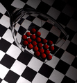
| 10/02/2006 10:04:11 AM | patternsby ralphComment: Ack....I'll let you slide on the two objects and call the checkerboard background (which it is)...
;) |
| 10/02/2006 10:03:18 AM | | | Photographer found comment helpful. |
| 10/01/2006 12:55:21 AM | | | Photographer found comment helpful. |
| 10/01/2006 12:54:15 AM | | | Photographer found comment helpful. |
|
Showing 231 - 240 of ~1853 |
Home -
Challenges -
Community -
League -
Photos -
Cameras -
Lenses -
Learn -
Help -
Terms of Use -
Privacy -
Top ^
DPChallenge, and website content and design, Copyright © 2001-2026 Challenging Technologies, LLC.
All digital photo copyrights belong to the photographers and may not be used without permission.
Current Server Time: 07/16/2026 11:54:00 PM EDT.
|