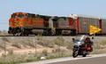
DPChallenge: A Digital Photography Contest You are not logged in. (log in or register
 
Browse Settings
Currently viewing:
Registered Userphotom

Show comments:

Per page:

Order:

Comments:


Comments Made by photom
Pages:   ... [246] [247] [248] [249] [250] [251] [252] ... [328]
Showing 2481 - 2490 of ~3272
Image Comment
No Passing Zone
05/10/2004 07:37:40 PM
No Passing Zone
by hannafate

Comment:
* Greetings from the Critique Club *

Proportion was a wonderful challenge - with a great many excellent entries. So - don't feel bad if your entry didn't appear to do well in such stiff competition.

The selection of subject matter was excellent - trying to show the relative size of the bike to the train. Your exposure seems to be near perfect.

I have several suggestions on how this image could have been improved - both during shooting and post-processing.

1. Lighting was not your friend. The sun was high in the sky producing no shadows that would have given a better feeling of depth. Due to this, the colors appear very "flat" and uninteresting. You could try taking the same shot in very early morning or late in the afternoon. (Try taking your rides then!) An alternative could be the use of a warming filter, but I doubt if that would have helped that much.

2. Compositionally - the train track comes very close to duviding the picture in half, which makes the shot very static. Consider this, shoot it VERTICALLY with the bike in the bottom (front) of the frame and the train behind. Move in closer to the bike when you do this.

The yellow "no passing" sign is a bit of a detractor that doesn't help tell the proportion story. If you were using it to show the train was passing the bike in a no passing zone, that's a different challenge. As it is, it just attracts un-deserved attention.

3. Post processing - you have a real mess in the sky area. You most likly tried to compress the jpeg a bit too much. Looking at the image properties, it is just 53K bytes. Suggest you try to save the image in a filesize that is closer to the "limit" of 150k. This will eliminate the jpeg compression problems.

I see this is just your second challenge entry - but hope you will continue to share your vision with us.
Photographer found comment helpful.
Out of Proportion
05/10/2004 06:16:56 PM
Out of Proportion
by dccloss

Comment:
* Greetings from the Critique Club *

This image has a lot going for it - I'm surprised it didn't finish higher. But as you know, there were a great many excellent entries to compete with.

One of the common weaknesses of many entries is the lack of impact - but your image does not suffer from that. It reaches right out to the viewer and shouts "proportion" quite loudly. I don't necessarily agree with the comment that it "barely" shows proportion as the left eye is about 1.5 times the size of the right eye.

Your presentation is well done - placing the subject on a diagonal line adds some tension.

Techically, the exposure looks to be right on and the "printing" shows good black and white qualities - good clean crisp whites and some black blacks with a nice tonal range between.

I'm a bit confused by the tech data shown on the image - an f-stop of 2.8 and a shutter speed of 1/10th. I would not have thought the focus on the right ear would have remained sharp at 2.8 - given the focus is most likely centered on the eyes. And a shutter speed of 1/10 most lkely required a very still model and a tripod.

The lighting is a bit "troublesome" as well - with two catchlights in the larger eye - but just one in the smaller one.

The only minor improvement I would suggest is the removal of the bright spots just to the right of the eyelid and in the upper right corner of the image.

Overall - a great effort all the way.
Photographer found comment helpful.
Ben A`an at twilight
05/10/2004 10:10:45 AM
Ben A`an at twilight2nd Place
by geewhy

Comment:
Such SPECTACULAR lighting! Perfect composition. I usually try to make a suggestion on how to improve an image, but in this case - you've done it so well, I'm speechless. Get ready for a ribbon.
Photographer found comment helpful.
abstract
05/06/2004 06:30:54 PM
abstract
by rhipster

Comment:
Effective composition, lines, texture, colors. The black between your shapes makes the rusted color pop. If you need a border at all (which I doubt) - my guess is that it should match the black color in the image. This one competes with your subject matter.
Photographer found comment helpful.
Rust never sleeps. (now we know why)
05/06/2004 06:27:22 PM
Rust never sleeps. (now we know why)
by Brad

Comment:
Simple yet effective. Great colors and texture. While a black border is probably appropriate for this image - it's way too big for me.
Photographer found comment helpful.
Past Times
05/06/2004 06:22:45 PM
Past Times
by TrollMan

Comment:
Nice composition and beautiful lighting on the cement building. Too bad the rusted object is in shadow.
Photographer found comment helpful.
sheet rust
05/06/2004 06:21:40 PM
sheet rust
by beckettboots

Comment:
Your image, intentional or not, is an optical illusion. Sometimes it looks like the ruty area is the object and other times like the green area is the object. Nice rust and texture therin. If you rotate it 90 degrees counter clockwise it may be a stronger image - kinda like a human figure. If you re-shoot try to tone down the background a bit by making those bright yellow / orange objects fall into a shadowed area.
Photographer found comment helpful.
Rusty links in the chain
05/06/2004 06:17:50 PM
Rusty links in the chain
by mariaksteinsson

Comment:
Definitely rusted. Nice textures and lines. You are the victim of being one of many, many "chain link" images so competition is tough. The best advise I'd offer on your entry is to do the exact same thing again when you have some dramatic lighting. The flat lighting here nakes it pretty mundane.
Photographer found comment helpful.
Just A Little Rusty After The Winter
05/06/2004 11:29:58 AM
Just A Little Rusty After The Winter
by Mona

Comment:
An original concept on "rusted" - glad it's not another chain link or lock. You need more depth of field if possible. The white in the background and the frame are both detractors.
Photographer found comment helpful.
Junkyard Beauty
05/06/2004 11:27:15 AM
Junkyard Beauty
by Jesuispeure

Comment:
The blue flower is really vibrant against the dark background. Unfortunaely most of the rustry areas are not sharp. Seems a bit too contrived.
Photographer found comment helpful.
Pages:   ... [246] [247] [248] [249] [250] [251] [252] ... [328]
Showing 2481 - 2490 of ~3272


Home - Challenges - Community - League - Photos - Cameras - Lenses - Learn - Help - Terms of Use - Privacy - Top ^
DPChallenge, and website content and design, Copyright © 2001-2025 Challenging Technologies, LLC.
All digital photo copyrights belong to the photographers and may not be used without permission.
Current Server Time: 11/26/2025 09:54:26 AM EST.