| Image |
Comment |
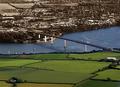
| 06/23/2004 10:43:39 PM |
The other sideby AndelainComment: I love the idea here! It's one of the most intriguing uses of selective desat in the group. It is also appropriate that you put the farmland in green and the city in grayscales. Exposure right on, composition ok (but i'd prefer the river - and therefore the entire scene -a bit more diagonal.) This should finish within sight of ribbonsville. |
 Photographer found comment helpful. Photographer found comment helpful. |
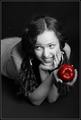
| 06/23/2004 10:12:22 PM |
Ol' Blue Eyesby SamTComment: Wow - the blue eyes really sparkle - an exceptional pface and portrait. I would suggest however that you remove the books next time - especially the bright ones.
(Try to imagine what it would look like with just a dark area behind the models head.) |
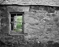
| 06/23/2004 10:10:08 PM |
Outside in by geewhyComment: A study in textures very well done! Exposure and focus on the building is perfect with a strong tonal range. It looks like you may have removed some of the color in the green backgroud - which was a goiod choice. As it is - it adds to the image - if it were bright green it would draw the viewer away from the great textures. |
| Photographer found comment helpful. |
| 06/23/2004 10:06:52 PM |
Loungin' Aroundby jmleliiComment: Unusual perspective that works well. Not sure, but it may be stronger with jsut one of the umbrellas in color. |
| Photographer found comment helpful. |
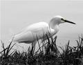
| 06/23/2004 10:05:41 PM |
Hidingby CamComment: Just a hint of color works very well. May be a buit stronger if there was more spavce in front of the egret. |
| Photographer found comment helpful. |
| 06/23/2004 10:04:06 PM |
In the Beginning ...by magnetic9999Comment: Nice idea - the theme and apple are great. I'd like it better if your model was interacting with you more. Nice exposure and rendering. |
| Photographer found comment helpful. |
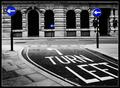
| 06/23/2004 10:02:37 PM |
Making A Pointby e301Comment: The print quality is right on. Bright crisp whites and dark blacks - with plenty of tonal range between. Everything else works too - focus, composition, and the desaturization. If it were mine - I would not use the white line as part of the border. |
| Photographer found comment helpful. |
| 06/23/2004 09:58:01 PM |
Avocado treeby AndrewTOComment: I resally like the lighting and your use of the vertical blinds - it really makes the leaves stand out nicely. It's a simple effective image. |
| Photographer found comment helpful. |
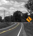
| 06/23/2004 09:56:30 PM |
Curveby indianzfanComment: You have an excellent compositiion and have exposed it very well. It has a nice "country" feel to it. I can't decide if I would like it better with either the sign or the yellow line in color, but not both. A very minor annoyance is the 2 white dots on the left edge (headlights?) Strong submission that should do well. |
| 06/23/2004 09:53:00 PM |
Eyes of the Catby CantiqueComment: The eyes are great - as is the entire left side of the image. But the bright white on the right side really takes over, not what you wanted.
|
| Photographer found comment helpful. |
Home -
Challenges -
Community -
League -
Photos -
Cameras -
Lenses -
Learn -
Help -
Terms of Use -
Privacy -
Top ^
DPChallenge, and website content and design, Copyright © 2001-2026 Challenging Technologies, LLC.
All digital photo copyrights belong to the photographers and may not be used without permission.
Current Server Time: 07/26/2026 11:14:42 AM EDT.